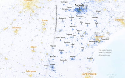
Chenxiao Guo, a PhD candidate in geography who goes by the name Atlas,…
Nathan Yau
-
Helene power outages mapped
-
Members Only
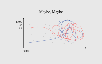
Communicating Probability and Odds to People
As election day in the United States draws closer, the probabilities, odds, and forecasts are in full swing, which gives us a chance to check the ways in which we currently communicate the fuzzy numbers.
-
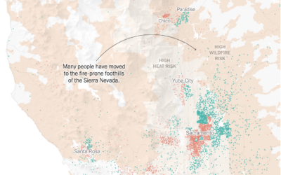
Maps showing migration out of cities
Mira Rojanasakul and Nadja Popovich, for The New York Times, mapped migration out…
-
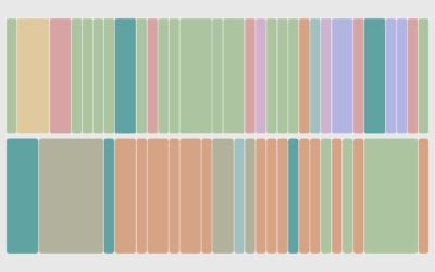
Jobs of a Certain Age
There are hundreds of occupations, and while the exact number varies by classification system, most U.S. government organizations list about 500 of them. These are the standouts.
-
Jimmy Carter’s longevity compared to other U.S. presidents
Jimmy Carter, the 39th president of the United States, turned 100 years old.…
-
Reordered baseball lineup over decades
Baseball’s batting lineup has changed from what seemed to make sense to what…
-
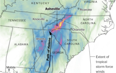
Rainfall in the path of Hurricane Helene
Western North Carolina got the brunt of Hurricane Helene with two feet of…
-
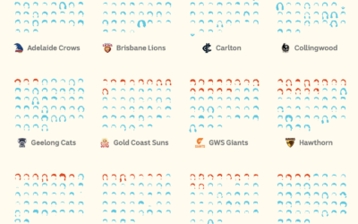
Counting mullets in the AFL
The mullet has grown popular in the Australian Football League. ABC News counted…
-
Trash balloons released by North Korea landing in South Korea
North Korea has been releasing thousands of trash bags into the air with…
-
Hurricane categories, visually explained
As Hurricane Helene approached Florida, it grew from a tropical storm to a…
-
Members Only
Visualization Tools, Datasets, and Resources – September 2024 Roundup
Here’s the good stuff for September 2024.
-
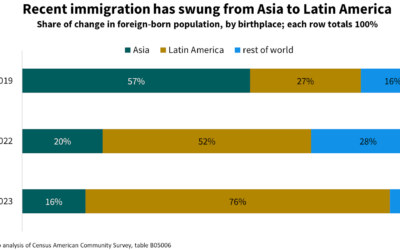
Statistical challenges of measuring immigration
Jed Kolko, the former Under Secretary of Commerce for Economic Affairs of the…
-
Q&A with Amstat News
Fourteen years ago, I did a short Q&A with Amstat News, where apparently…
-
Election game to win the White House against other readers
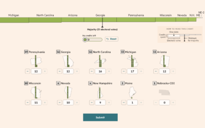
For Financial Times, Sam Learner, Oliver Roeder, and Irene de la Torre Arenas…
-
Energy used to generate an email with AI
For The Washington Post, Pranshu Verma and Shelly Tan illustrate the scale of…
-
Environmental cost of food
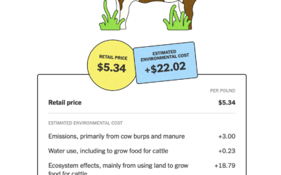
The New York Times highlights the work of True Price Foundation, a group…
-
Members Only
How to Map with Contour Lines and GeoTIFF in R
GeoTIFF data can provide high granularity but make it hard to see patterns when data is sparse. Contour lines provide an aggregated view that makes patterns easier to see.
-
Grocery owner territories
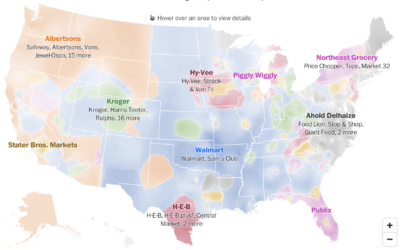
Any day is a good day for a map of predominant commercial chains.…
-
Immigration in Democrat counties
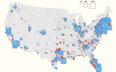
For Bloomberg, Elena Mejía and Shawn Donnan use a transitioning cartogram to show…
-
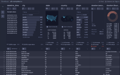
Rowboat for fast CSV exploration
Fathom Information Design, known for client visualization-centric projects, introduced Rowboat. It’s a tool…








 Visualize This: The FlowingData Guide to Design, Visualization, and Statistics (2nd Edition)


