This week we highlight visual metaphors and use charts to have an informal chat.
Nathan Yau
-
Members Only
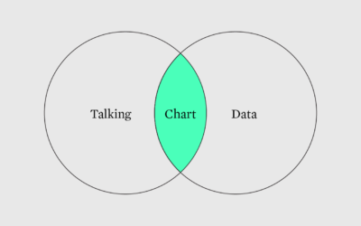
Conversational data graphics
-
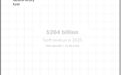
Tariff revenue is nowhere close to enough
The administration continues to add expenses for the country and insist tariff revenues…
-
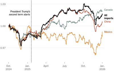
Impact of tariffs on cost of goods
One year into these tariffs, Ana Swanson for the New York Times has…
-
Jobs reports delayed, because government shutdown
Ben Casselman reporting for the New York Times:
The Bureau of Labor Statistics… -
Firefox will provide option to turn off AI features
The next version of Firefox will have controls to turn off AI features.…
-
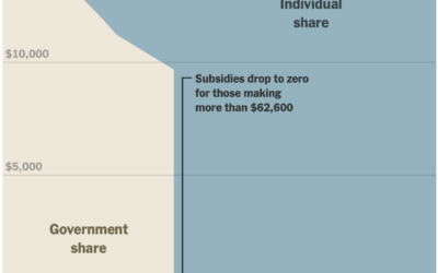
Financial cliff of health subsidies
In January, the scale for U.S. healthcare subsidies changed, which reintroduced a cliff.…
-
Trying to make US postal workers count people for decennial census
Under the supposed premise of saving money, the administration proposes that US postal…
-

Isometric New York pixel art
Speaking of SimCity, Isometric NYC by Andy Coenen is part curiosity and part…
-

Cumulative measles rising with South Carolina outbreak
In 2000, measles in the United States was declared eliminated by the World…
-

Voter U-turns
To show shifts in net support for the president, the New York Times…
-

Population drops and gains in every state
Most states gained population, but a few saw more people move out than move in, based on the newest estimates from the Census Bureau.
-
Members Only
Visualization tools and resources, January 2026 roundup
Here is what happened in January.
-

IsoCity, an open source city building game
If you’re a fan of SimCity, then you’ll appreciate IsoCity, an open source…
-
Age verification on Roblox using AI is not good
Roblox is a game mostly for kids. In an effort to make the…
-

Cuts to science and research in the U.S. over the past year
The administration cut science funding, withheld grants, and eliminated jobs in research areas…
-
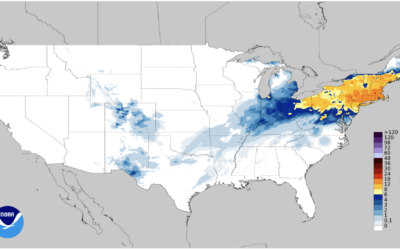
Gridded snowfall data
The National Weather Service has current and historical snowfall data in various file…
-

Trump family crypto accumulation
In 2023, most of the family’s wealth, about 79% of it, was tied…
-

Big pile of money
From the New York Times editorial board, an animated big pile of money:…
-

Awful and better, Venn diagram
We focus on the bad, because that’s where it can and will get…
-

Pentagon Pizza dashboard to track activities
There is a dashboard for pizza places around the Pentagon.
The Pentagon Pizza…
Recently for Members
Second Edition
 Visualize This: The FlowingData Guide to Design, Visualization, and Statistics (2nd Edition)
 Visualize This: The FlowingData Guide to Design, Visualization, and Statistics (2nd Edition)
New tools, refined process.
Browse by Chart Type See All →