You’ve probably seen the maps of Earth at night. It gives you a…
Nathan Yau
-
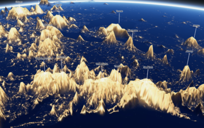
Night lights mapped as terrain
-
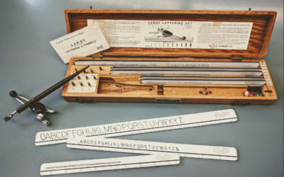
Visualization in the 1980s, just before the rise of computers
Graham Douglas, a data journalist at The Economist, looks back on the days…
-
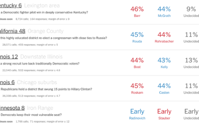
Live polling results for transparency and a way to learn about the process
In a collaboration with Siena College, The Upshot is showing live polling results.…
-
Members Only
Make It Mean Something or It Didn’t Happen
Visualization as template-filling content is lazy visualization that no one draws benefit from. Give people a reason to care.
-
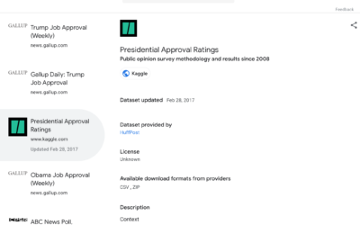
Google Dataset Search now in public beta
Datasets are scattered across the web, tucked into cobwebbed corners where nobody can…
-
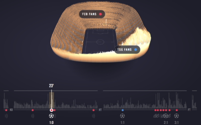
Experience a soccer game through crowd noise
Sports visualization and analysis tends to focus on gameplay — where the players…
-
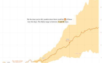
Hotter days where you were born
It’s getting hotter around the world. The New York Times zooms in on…
-
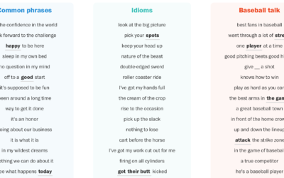
Counting baseball cliches
Post-game sports interviews tend to sound similar. And when you do say something…
-
Weaponised design
When the web was relatively new, things were more of a free-for-all. Everything…
-
Members Only
Better than Default
Defaults are generalizations to fit many datasets, which means you usually get barebone charts. For analysis, all well and good. However, data graphics for presentation require more care after the initial output.
-
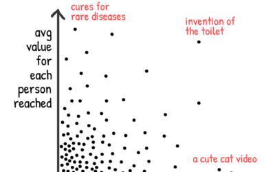
Considering the “valuable-ness” of the things we make
Nicky Case ponders the “valuable-ness” of the things he makes as the product…
-

Algorithmic art shows what the machine sees
Tom White is an artist who uses neural networks to draw abstract pictures…
-
Members Only
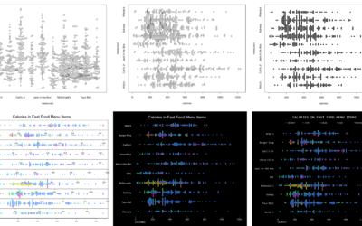
How to Make Better-Looking, More Readable Charts in R
Defaults are generalized settings to work with many datasets. This is fine for analysis, but data graphics for presentation benefit from context-specific design.
-
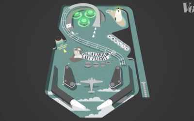
Pinball isn’t random
Pinball feels like a game of chance that is uncontrollable from any angle.…
-
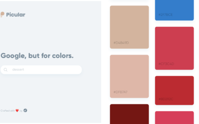
A search engine for color palettes
Picular is a simple tool that lets you search for a topic, and…
-
Weighing the risk of moderate alcohol consumption
A research study on mortality and alcohol consumption is making the rounds. Its…
-
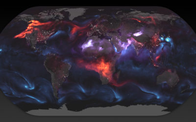
World map shows aerosol billowing in the wind
Using a mathematical model based on satellite data, NASA shows an estimate of…
-
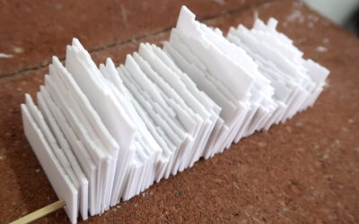
3-D-Printed Time Series Plates
After seeing a 1950s physical visualization, I wondered if I could follow a similar process using modern techniques.
-
Members Only
Charting Pitfalls, Flexible Guidelines, Exceptions to the Rules
It can feel like there’s so many rules of visualization that it’s impossible to make a proper visualization. The key: Nothing is absolute.
-
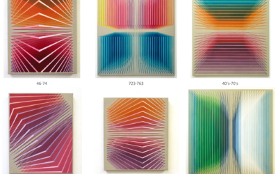
Synesthesia used to paint numbers through color
Lucy Engelman has synesthesia, which is a perceptual response where one sensory pathway…
Recently for Members
Second Edition
 Visualize This: The FlowingData Guide to Design, Visualization, and Statistics (2nd Edition)
 Visualize This: The FlowingData Guide to Design, Visualization, and Statistics (2nd Edition)
New tools, refined process.
Browse by Chart Type See All →


