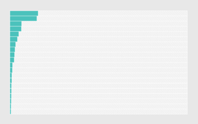
For The Upshot, Alicia Parlapiano and Quoctrung Bui scaled down the federal budget…
Nathan Yau
-
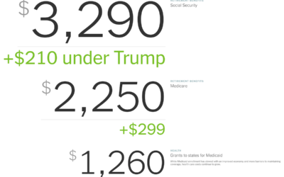
Federal budget scaled to per person dollars
-

Blanket visualizes daily high and low temperatures
Reddit user quantum-kate used daily high and low temperatures in Denver in 1992…
-

A tour of the king’s tattoos
DR used a 3-D model to recreate King Frederick the 9th’s ink:
King… -
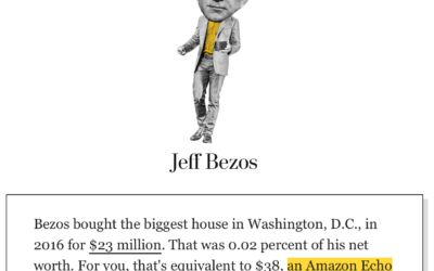
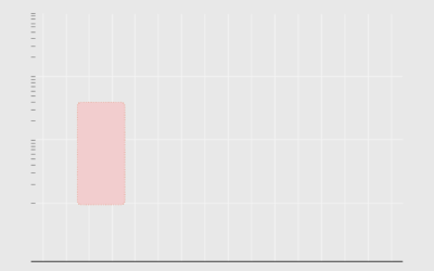
Billionaire’s spending scaled to your net worth
We hear about billionaires spending millions of dollars on ads, acquisitions, etc. It…
-
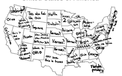
Good state naming
From @haru_cchii on the Twitter:
Local German Gets Bored And Tries To Name… -
Data problems in Iowa caucus results
It wasn’t just issues with an app. There appears to be many more…
-
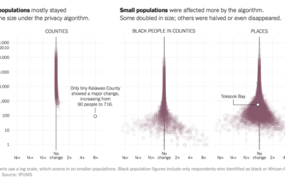
Privacy algorithm could lead to Census undercount of small towns
To increase anonymity in the Census records, the bureau is testing an algorithm…
-
Members Only
Misleading or Not? A Chart Showing Coronavirus Fatality Rate (The Process #75)
Welcome to another episode of Misleading or Not? where we look at a chart and decide if it’s misleading or not.
-
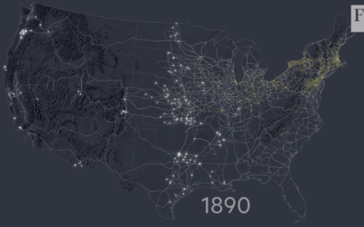
Mapping the construction of railroads in America
For the Financial Times, Alan Smith and Steven Bernard traced the history of…
-

CineShader, for cinematic shaders
From Lusion, CineShader is a fun editor for those who are familiar with…
-
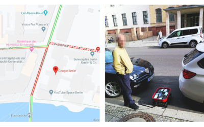
Faking traffic on Google Maps with a wagon of 99 smartphones
Google Maps incorporates data from smartphones to estimate traffic in any given location.…
-
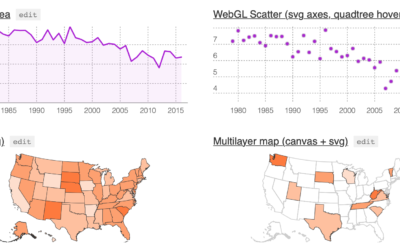
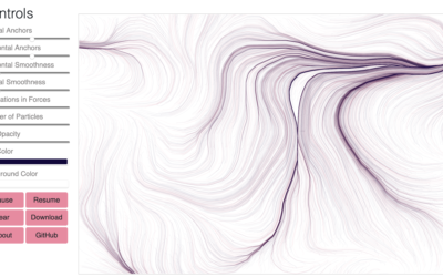
Layer Cake, a graphics framework for more flexible web graphics
Michael Keller released a new version of Layer Cake:
Layer Cake is a… -
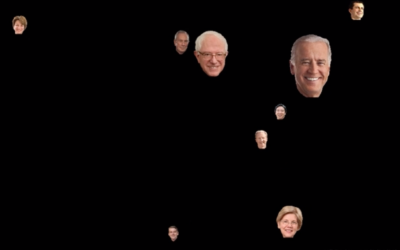
Presidential Hopefuls screensaver bounces heads around based on polling data
I know you don’t get enough election coverage these days and are probably…
-
Members Only
Visualization Tools, Datasets, and Resources — January 2020 Roundup (The Process #74)
Every month I collect resources and tools to help you better visualize data. Here’s the good stuff for January 2020.
-
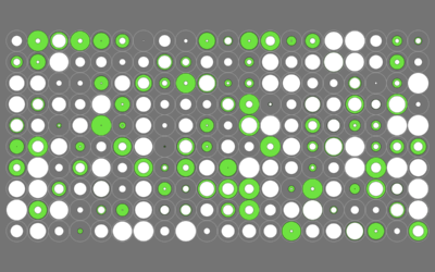
Flow Fields, a generative art tool
Flow Fields, a generative art tool by Michael Freeman, lets you adjust various…
-
Nationwide database of credibly accused Catholic clergy
For ProPublica, Ellis Simani and Ken Schwencke compiled an interactive database that you…
-
Dataset for rejected license plate applications
Noah Veltman just posted a dataset of 23,463 personalized license plate applications that…
-

Questionable science diagrams
Sometimes illustrating scientific findings is a challenge. Sometimes the illustrations are published anyways,…
-
Google Dataset Search moves out of beta
Over a year ago, Google released Dataset Search in public beta. The goal…
-
Members Only
Making the Name Guesser (The Process #73)
Using one of my recent projects as an example, I describe my non-elegant process of making a quick chart.
Recently for Members
Second Edition
 Visualize This: The FlowingData Guide to Design, Visualization, and Statistics (2nd Edition)
 Visualize This: The FlowingData Guide to Design, Visualization, and Statistics (2nd Edition)
New tools, refined process.
Browse by Chart Type See All →


