Based on estimates from public health researcher James Lawler, The Upshot shows the…
Nathan Yau
-
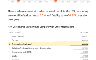
Possible coronavirus deaths compared against other causes
-
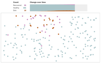
Simulations for virus spread with social distancing
Social distancing is the game plan these days. Try to stay at home…
-
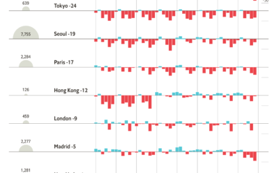
Change in foot traffic in outbreak cities
From The Economist, this chart shows the (mostly) decrease in foot traffic in…
-

Coronavirus, a Visual Rundown – The Process 080
We’re seeing a lot of visual to help explain what’s going on. Here’s the main stuff: what it is, who is affected, the spread, and what we can do.
-

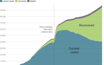
A view of the coronavirus outbreak through data
There’s a lot of figures and numbers floating around about the coronavirus disease.…
-

How gears work
Bartosz Ciechanowski took a deep dive into how gears work and the physics…
-

Coronavirus life cycle
For The New York Times, Jonathan Corum and Carl Zimmer describe how the…
-

Map of all the trees and forests
EarthArtAustralia mapped all of the trees and forests in the United States, based…
-

Visual explanation of exponential growth and epidemics
3Blue1Brown explains exponential growth and epidemics and answers the question of when the…
-
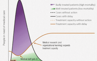
Flatten the coronavirus curve
The coronavirus can possibly infect a lot more people than there are those…
-
All data is wrong
Vicki Boykis riffing off the George Box quote, “All models are wrong, some…
-
Dataset as worldview
Hannah Davis works with machine learning, which relies on an input dataset to…
-
Responsible coronavirus charts
Speaking of responsible visualization, Datawrapper provides 17 charts and maps you can use…
-

Responsible mapping
We’re seeing a lot of maps now about coronavirus. There are a lot…
-
Members Only

Uncertain – The Process 079
These past few weeks, and especially this one, has been full of uncertainty. Probabilities, odds, and rates. In this issue of The Process we talk about ways to visualize this uncertainty.
-

Machine learning to help you not touch your face
The CDC recommends that you do not touch your face to minimize the…
-

How different groups voted on Super Tuesday
The New York Times has a rundown of what happened on Super Tuesday,…
-
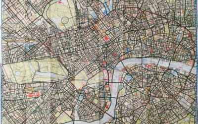
Cycling and mapping all the streets in London
Davis Vilums set a goal to cycle every street in London on his…
-
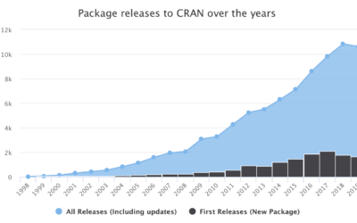
R turned 20 years old
R turned 20 last week. The first public release of R was on…
-

SVG and CSS animations, without JavaScript
Andrew Wang-Hoyer built over 200 animations on and off over two years. They…
Recently for Members
Second Edition
 Visualize This: The FlowingData Guide to Design, Visualization, and Statistics (2nd Edition)
 Visualize This: The FlowingData Guide to Design, Visualization, and Statistics (2nd Edition)
New tools, refined process.
Browse by Chart Type See All →


