Matt Hong used a stacked bar chart over time as the frame for…
Nathan Yau
-

Data comic shows an average American day
-
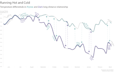
A long distance relationship between a temperature difference
Everyone’s story is a little different. Alyssa Fowers tracked her long-distance relationship in…
-
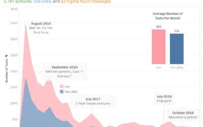
Texting history after the first swipe
Speaking of relationship timelines, Chris Lewis used texting history with his girlfriend after…
-
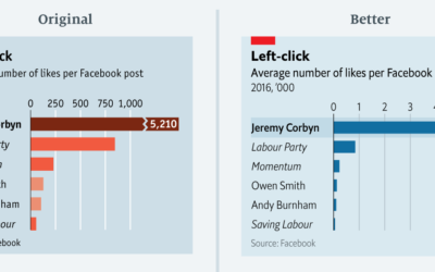
Remaking charts from The Economist, by a journalist at The Economist
Sarah Leo, a visual journalist at The Economist, looked through the archives and…
-
Members Only

Visualization Tools, Datasets, and Resources – March 2019 Roundup (The Process #34)
Every month I collect practical resources, new tools, code, and datasets. Here’s the good stuff for March.
-
Mapping the cheapest flights to everywhere, given your location
Sometimes you really do need to get away. Escape, part search engine and…
-
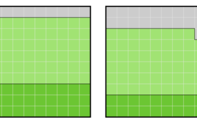
Happiness and Health
When one goes down, so does the other. If only there were a way to keep more people healthy.
-
Members Only
How to Make a Bump Chart in R
Visualize rankings over time instead of absolute values to focus on order instead of the magnitude of change.
-
The Stages of Relationships, Distributed
Everyone’s relationship timeline is a little different. This animation plays out real-life paths to marriage.
-
Data for 200M traffic stop records
The Stanford Open Policing Project just released a dataset for police traffic stops…
-
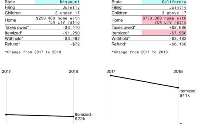
Tax changes for different groups
There’s less than a month until taxes are due. It’s the most wonderful…
-
Members Only
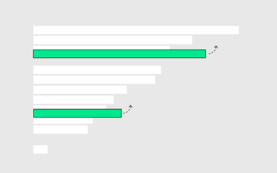
A Familiar Chart with a Twist (The Process #33)
There’s a new hotness in chart town. It’s a bar chart. But it moves to show rankings over time.
-
Robocalls map
Other than calls from my wife, I can’t even remember the last call…
-
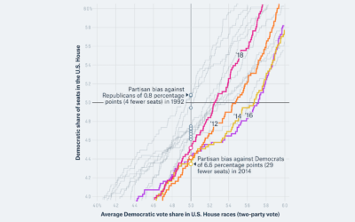
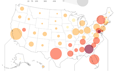
How to spot a partisan gerrymander
For FiveThirtyEight, William T. Adler and Ella Koeze describe how a metric called…
-
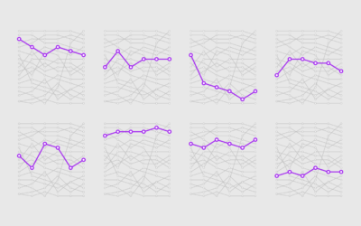
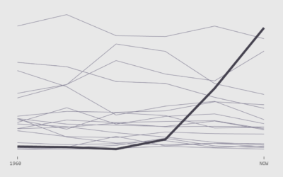
The Relationship Timeline Continues to Stretch
We know that people are marrying later in life, but that’s not the only shift. The whole relationship timeline is stretching.
-
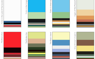
Colors of Tintin
Marian Eerens charted the colors of each Adventures of Tintin book cover. The…
-
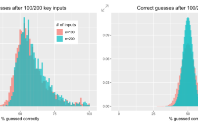
A game to test your ability to pick random numbers
Compared to a computer’s pseudo-random number generator, we are not good at picking…
-
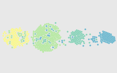
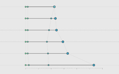
Shifts in How Couples Meet, Online Takes the Top
How do couples meet now and how has it changed over the years? Watch the rankings play out over six decades.
-
Case of the 500-mile email
Trey Harris, a previous tech administrator for a university, tells the story of…
-
Members Only
Forcing You to See the Data
John Tukey wrote, “The greatest value of a picture is when it forces us to notice what we never expected to see.” Not everyone wants to see though.
Recently for Members
Second Edition
 Visualize This: The FlowingData Guide to Design, Visualization, and Statistics (2nd Edition)
 Visualize This: The FlowingData Guide to Design, Visualization, and Statistics (2nd Edition)
New tools, refined process.
Browse by Chart Type See All →


