Ash Ngu for ProPublica and Sophie Cocke for Honolulu Star-Advertiser show the harm…
Nathan Yau
-
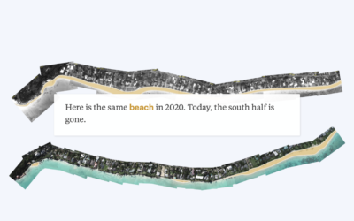
Mapping disappearing beaches in Hawaii
-

2020.
Last year, in 2019, my main goals for FlowingData and work were to…
-

Reconstructing the killing of Breonna Taylor
The New York Times reconstructed the night. Based on a collection of court…
-
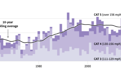
Climate change in 2020
It used to be that climate changed seemed like something far off in…
-
Members Only

Visualization Tools and Resources Roundup – December 2020
Here’s the good stuff for December in the last issue of the year.
-

Best Data Visualization Projects of 2020
It’s been a year. We saw a lot of charts. These are the best ones.
-
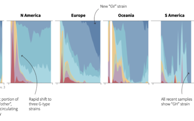
Evolution of coronavirus strains
Reuters looked at how seven main strains of the virus evolved around the…
-
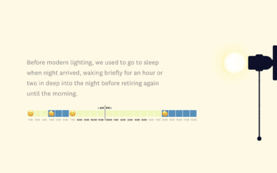
Historical cost of light
These days, most of us don’t have to do much to turn on…
-
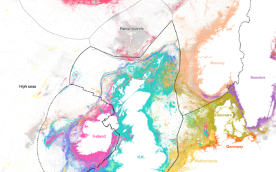
Who catches the most fish
Using data from Global Fishing Watch, Hayley Warren and Ian Wishart for Bloomberg…
-
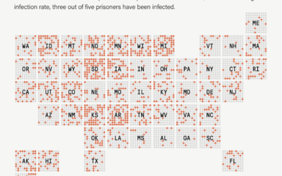
1 in 5 prisoners had Covid-19, a grid map
The Marshall Project and The Associated Press report on the Covid-19 rates in…
-
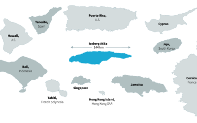
Tracking world’s biggest iceberg
The world’s biggest iceberg, A68a, is on track to crash into a remote…
-
Members Only
Knowing Nothing (Process 119)
Obviously, knowing nothing can be a negative, but some of my favorite work came about when I didn’t know how to do something or what to expect.
-

Blob Opera is a machine learning model you can make music with
David Li, in collaboration with Google Arts and Culture, made a fun experiment…
-
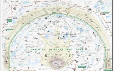
Basketball court designed as a national park map
Kirk Goldsberry, whose basketball charts you might recognize, made the Naismith International Park…
-
Members Only

How to Make an Animated Beeswarm Chart
Beeswarm charts are useful to highlight individual categories or entities. Animating them can help highlight change over time.
-
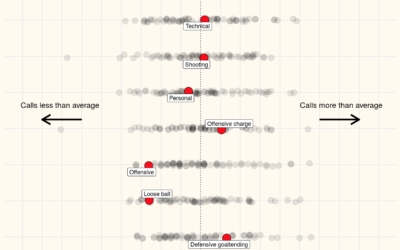
Data for all of the referee calls in NBA games
Owen Phillips compiled per game and cumulative foul calls for all NBA referees…
-

Infrared to show air particles from your talk hole
I’m sure you know this already, but just in case, air particles come…
-
Unemployment and Occupation
Unemployment has hit some industries more than others. Here’s how the most recent estimates compare against last year’s.
-
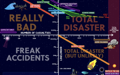
Charting and ranking apocalyptic events
For Domain of Science, Dominic Walliman attempts to chart all of the deadly…
-
Members Only
The Process 118 – Maybe a Bar Chart Really Would Be Better
As visualization practitioners, we tend to sway towards the novel, but bar charts are still good.
Recently for Members
Second Edition
 Visualize This: The FlowingData Guide to Design, Visualization, and Statistics (2nd Edition)
 Visualize This: The FlowingData Guide to Design, Visualization, and Statistics (2nd Edition)
New tools, refined process.
Browse by Chart Type See All →


