FlowingData turned 14 years old last week. Is that old? It feels old.…
Nathan Yau
-
Still Flowing at 14
-
Introduction to Modern Statistics
Introduction to Modern Statistics by Mine Cetinkaya-Rundel and Johanna Hardin is a free-to-download…
-
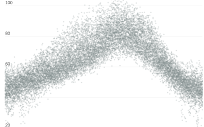
Historical context for the heat in the Pacific Northwest
It’s been hot in the Pacific Northwest the past few days. NYT’s The…
-
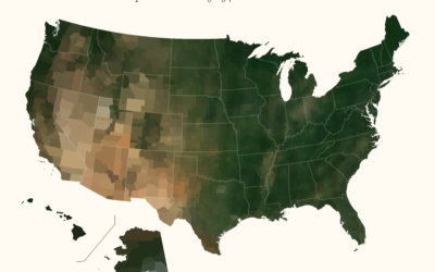
Average color of geographic areas
Based on satellite imagery, Erin Davis found the average color of places around…
-
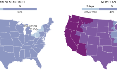
Mail slowdown
Postmaster General Louis DeJoy proposed new standards for first-class mail, which would slow…
-
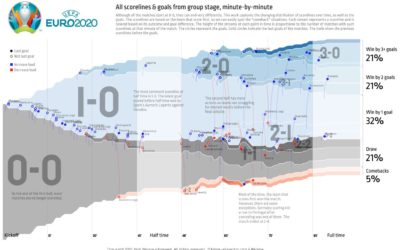
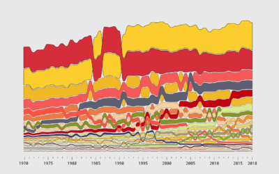
All the matches from Euro 2020 in one chart
To see all the matches from the group stage of Euro 2020 in…
-
Members Only

Visualization Tools and Resources, June 2021 Roundup
Here’s the good stuff for June 2021.
-
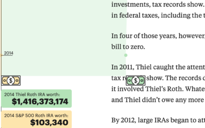
How the ultrarich use a Roth IRA to get more rich
ProPublica continues their analysis of an anonymous IRS tax records dump. In their…
-
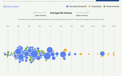
Scoring hospitals by billing quality
Using data collected by Johns Hopkins University, Michelle McGhee and Will Chase for…
-

Delaying motherhood
The New York Times mapped birth rates, which are down almost everywhere, especially…
-
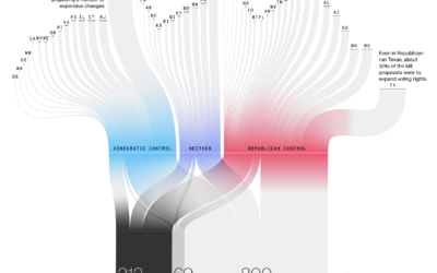
Passing restrictive voting bills
Bloomberg used a Sankey diagram to show the path of over a thousand…
-
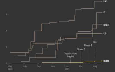
India vaccine procurement compared to other countries
Prasanta Kumar Dutta and Manas Mishra reporting for Reuters on the slow rollout…
-
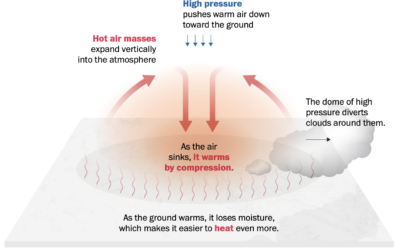
Welcome to heat dome
It’s hot here in the western United States, and it’s only mid-June. From…
-
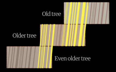
Measuring centuries-old droughts through tree rings
To measure drought in the present day, we use data from sensors that…
-
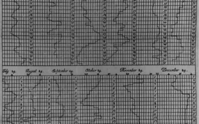
Graphs before anyone knew what they were
Michael Friendly and Howard Wainer have a new book out: A History of…
-
Members Only
Breaking Down a Chart Design – The Process 144
This week I broke down one of my projects and explained as many of the design choices as I could.
-
Spatula, a Python library for maintainable web scraping
This looks promising:
While it is often easy, and tempting, to write a… -
Members Only
How to Make Alluvial Diagrams
Here’s how to do it in R from start to finish, plus editing in illustration software. Make design choices and trade-offs for more readable charts.
-

Collapse of Mexico City Metro explained
The New York Times investigated the collapse of the Metro, which killed 26…
-
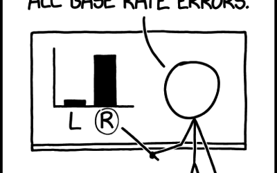
xkcd: Base Rate
xkcd points out the importance of considering the baseline when making comparisons:…
Recently for Members
Second Edition
 Visualize This: The FlowingData Guide to Design, Visualization, and Statistics (2nd Edition)
 Visualize This: The FlowingData Guide to Design, Visualization, and Statistics (2nd Edition)
New tools, refined process.
Browse by Chart Type See All →


