Finding the New Age, for Your Age
You’ve probably heard the lines about how “40 is the new 30” or “30 is the new 20.” What is this based on? Are they just lines to make older people feel younger? Is it based on how you feel? Is there science involved?
In my quick searching a couple of weeks ago, the results showed a mix of reasons.
For example, “50 is the new 20” was especially common because there was some article that cited some research that suggested those who were 50 years old could still be as fit as a 20-year-old. The article was published and republished in various places.

“70 is the new 30” also showed up because of some research snippet floating around, but it was also used just as a headline to indicate an industry shifting back towards an older generation.
In 2002, Gayle Kaufmana and Glen H. Elder Jr. published research in the Journal of Aging Studies, which asked older people how old they were and how old they felt. On average, respondents reported feeling about 8 years younger than they actually were.
So there tends to be some subjectivity when “some age is the new age.”
I wondered if I could estimate more objectively. Having looked at mortality data now and again, I just went with it.
Here’s what I did, based on decade data from the Social Security Administration.
Finding the New Age
Look to the past and find an equal probability of death.
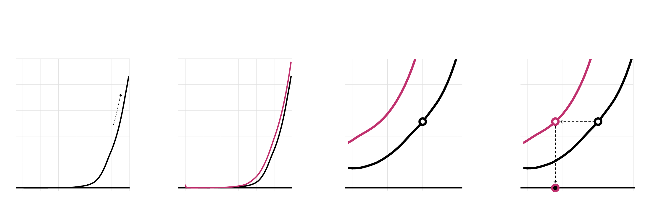
This is the probability of dying in 2020 within a year, by age, for females.
Compare the curve for 2020 against the curve for 1950.
Zoom in, focusing on the age range from 20 to 50 years old.
Start on 2020 curve, and find the equivalent on the 1950 curve to get the new age.
100%
100%
There is a shift to higher probabilities when you go back in time. People died younger.
The gap between the curves is the difference between your age and the new age.
80%
80%
20%
20%
Find equal probability on the past curve…
60%
60%
“40 is the new _____?”
1950
The older you are, the higher the chances of death. Makes sense.
2020
40%
40%
10%
10%
…then get the new age.
20%
20%
“40 is the new 27.”
0%
0%
0%
0%
0
20
40
60
80
100
120
0
20
40
60
80
100
120
20
30
40
50
20
30
40
50
Years old
Years old
Years old
Years old
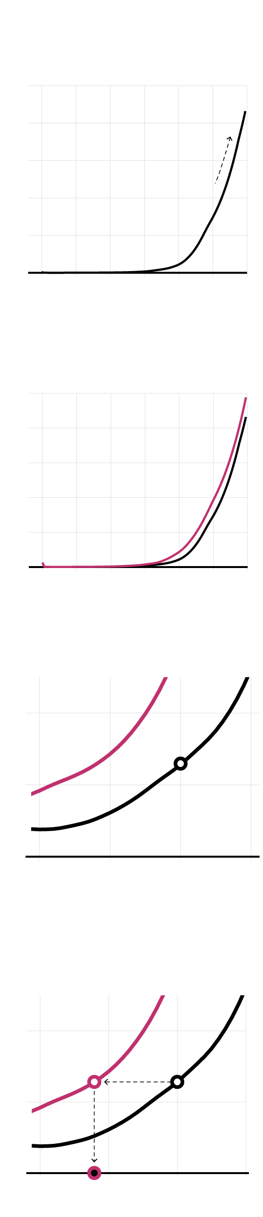
This is the probability of dying in 2020 within a year, by age, for females.
100%
80%
60%
The older you are, the higher the chances of death. Makes sense.
40%
20%
0%
0
20
40
60
80
100
120
Years old
Compare the curve for 2020 against the curve for 1950.
100%
There is a shift to higher probabilities when you go back in time. People died younger.
80%
60%
1950
40%
2020
20%
0%
0
20
40
60
80
100
120
Years old
Zoom in, focusing on the age range from 20 to 50 years old.
20%
“40 is the new ___?”
10%
The gap between the curves is the difference between your age and the new age.
0%
20
30
40
50
Years old
Start on 2020 curve, and find the equivalent on the 1950 curve to get the new age.
20%
Find equal probability on the past curve…
10%
…then get the new age.
“40 is the new 27.”
0%
20
30
40
50
Years old
That seems fine, but the chances of dying in a year, given your age, has changed over the decades. As you would expect, the chances were higher in 1930 than in 1950, which were higher than they were in 2000.
If the curves keep changing, what do you use as the baseline comparison? The curves are also different for males and females, as the former tends to die sooner.
At the root of “this age is the new age” question is that you’re comparing your current age to something in the past.
Going back to Kaufman and Elder, what does it mean when someone says they feel 8 years younger than they actually are? Are they comparing to a memory of what they were like 8 years ago? Are they imagining what it would be like to go back in time? Does their 8-years-younger self also feel 8 years younger, which in turn makes the current self feel 16 years younger? I don’t know about you, but I’m kind of getting worried about the space-time continuum.
Let’s all calm down.
In terms of life expectancy probabilities, it seemed fair to compare values for the present against those for the decade a person was born. So if you’re looking for “50 is the new _____”, you compare against the 1970 curve. In this case, 50 is the new 41.
Do that for all of the ages and sexes, and here’s what you get.
It’s interesting that the median difference between actual age and the “new age” is 9 years, which isn’t that far off from the Kaufman and Elder result. Maybe the curve comparison isn’t totally worthless for answering our question.
Check out your new age below.
There are caveats. These life expectancy numbers are not adjusted for our current situation. I used life tables from an actuarial study from the Social Security Administration. The numbers are part historical data and part projection. There’s variation at each age, and these chart show averages and aggregated data. Higher life expectancy doesn’t always match with quality of life. There’s likely more variation if we were able to look at further demographic breakdowns. And so on.
All that said, it’s an interesting look, and I think there’s a lot more to dig into here.
Become a member. Support an independent site. Make great charts.
See What You GetFlowingData is made possible by supporting members. Since 2007, I, Nathan Yau, a real person, have been analyzing and visualizing data to help more people understand and appreciate it in their everyday lives.
If you liked this or want to make similar data things, please consider supporting this small corner of the internet. You get unlimited access to visualization courses, tutorials, and extra resources. Thanks. — Nathan
Chart Types Used

