Here’s the good stuff for October.
Nathan Yau
-
Members Only
Visualization Tools and Resources – October 2020 Roundup
-

Illustrations show how to reduce risk at small gatherings
Risk of coronavirus infection changes depending on the amount of contagious particles you…
-
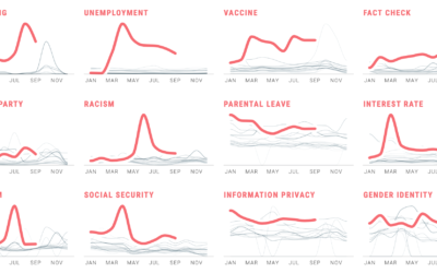
Political search interest in 2020
In Waves of Interest, a collaboration between the Google News Initiative and Truth…
-
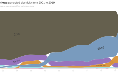
How your state makes electricity
The way we make electricity in America is changing. For The New York…
-

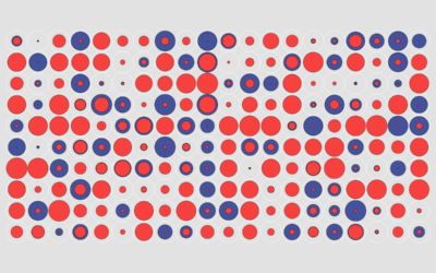
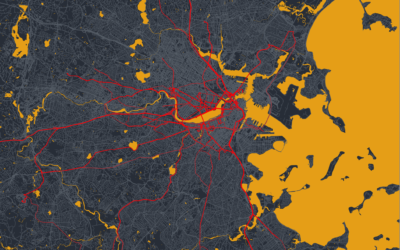
Maps of Home
Dots on a map can feel like, well, just a bunch of dots.…
-
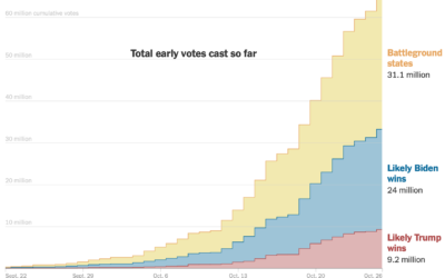
Early voting volumes
As you might expect, early voting volume is high across the country. In…
-
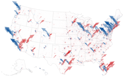
Money raised for the presidential election – by geography, time, and demographic
The New York Times analyzed campaign finance data from April to October, mapping…
-
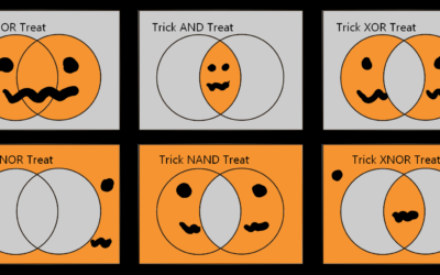
Halloween logicals
From Kaz Miyamol, these Venn diagrams present very important information about Halloween.…
-
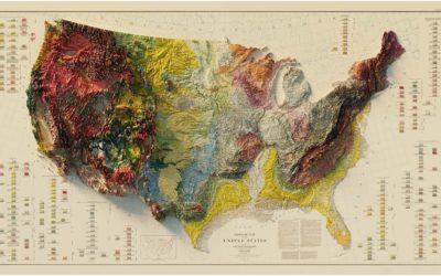
Vintage relief maps
Muir Way updates vintage relief maps with a third dimension. Pretty. The above…
-
Members Only

The Process 112 – Statistics Without Awareness, Virtual Reality, and a Bar Chart Race
Look around. Take it in.
-
Members Only
How to Make Symbol-based Glyph Charts, with R Examples
Using geometric shapes as an encoding can provide another dimension to your charts.
-
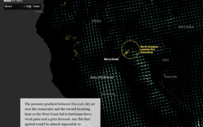
Fires in the west and climate change
This is some advanced mapping and scrollytelling from the Washington Post. The piece…
-
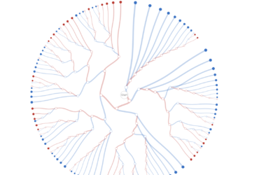
Decision tree for the presidential election result
While we’re on the topic of election scenarios, Kerry Rodden provides a radial…
-
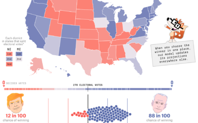
Using the FiveThirtyEight model, see how the election odds shift with different scenarios
With each model update, FiveThirtyEight runs 40,000 simulations, or what-ifs, to calculate the…
-
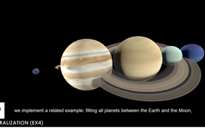
Making map art in R
If you can make maps in your software and customize the aesthetics, you…
-
Tips for not letting polls and forecasts occupy your mind for two weeks
For FiveThirtyEight, Nate Silver provides tips to stay less stressed staring into the…
-
Interactive data essays on climate change
In their second issue, Parametric Press focuses on climate change with a set…
-
Data visualization in virtual reality
Virtual reality puts you in a digital world that can feel like a…
-
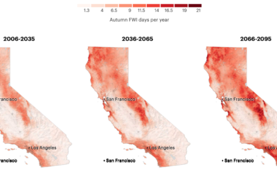
More fire weather days coming
It’s been smoky this season. Based on research from Michael Goss et al.,…
-

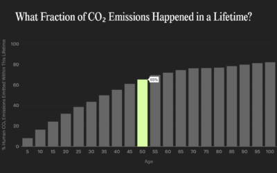
Lifelines
Using estimates from a report by the Well Being Trust and the Robert…
Recently for Members
Second Edition
 Visualize This: The FlowingData Guide to Design, Visualization, and Statistics (2nd Edition)
 Visualize This: The FlowingData Guide to Design, Visualization, and Statistics (2nd Edition)
New tools, refined process.
Browse by Chart Type See All →


