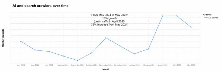
• What if you were on a roadtrip and every ten seconds a large group of people decided which way to turn? Internet Roadtrip by Neal Agarwal will show the way.

    A street view shows where you are, and a map at the bottom shows where you’ve been. The steering wheel is used to vote on going straight or turning. You can also vote to change the radio station.

    I always enjoy Agarwal’s combo of imagination, fun, and technical know-how. The trip appears to be headed out of Boston as of this writing.

  • A promise behind AI is that it will do all the hard work so that you’ll never have to. The trouble with that is that a big part of living is the process. For the Guardian, Joseph Earp focuses on the process of making:

    And I certainly do not want AI to write my books for me, or paint my pictures. Not only would the work be terrible: it wouldn’t even be work. As all creatives know, there is limited joy in having written a book – as soon as it is done, most of us are on to the next thing. The thrill, the joy, the beauty, is in the writing of a book. If you outsource your creative work to a computer, you are not a creative. Someone who merely churns out product is not an artist – they are a salesperson. The artist is the person who makes, not who has made.

  • The Sean “Diddy” Combs trial started. There have been 78 lawsuits filed against him, and the Washington Post outlined the accusations, lawsuit statuses, and people involved. CW

    Amid this deluge of shocking developments are more than 100 people — accusers, attorneys, associates and alleged accomplices — entangled in his legal troubles. The Washington Post analyzed every lawsuit against Combs to map the key players and unravel the intricate web of alleged wrongdoings tied to the rapper’s name. The Post will continue to update this file on a monthly basis.

  • For the New York Times, Josh Holder, Niraj Chokshi, and Samuel Granados use a step chart, with arrivals in 2024 and 2025, to show why the decline in European travel to the U.S. might not be as dramatic as previously reported.

    International arrivals did drop more than 10 percent in March compared with last year, but this was largely because Easter fell unusually late this year, pushing back a popular travel window for European tourists. More recent figures from April show that travel over the holiday looked similar to previous years.

    Contrast the above with reports showing a sudden and steep decline, based on a year-over-year percentage change. What seemed obvious is not so straightforward, for now. You have to watch out for those denominators.

  • The Information is Beautiful Awards, brought back with the help of the Data Visualization Society, announced the shortlist recently. It is a collection of 89 entries narrowed down from almost one thousand by a judging group comprised of visualization professionals.

    A nice surprise: My work on age and everyday life made the cut in the People, Language, and Identity category.

    While the judges decide the final list, IIBA opened a community vote so that you can have your say too. At the least, you’ll want to check out the showcase for inspiration, spanning a wide range of topics and applications.

  • The Deportation Data Project, launched by a group of researchers and lawyers, is an effort to keep track of what seems to be growing more secret.

    The U.S. government logs every individual immigration arrest, immigration detention book-in, immigration court outcome, and deportation. But this information is nonetheless difficult to use for three main reasons: 1) infrequent and inconsistent data releases, 2) insufficient linking across datasets, and 3) insufficient documentation. The Deportation Data Project aims to help on all three fronts.

    The data is available for download as individual logs and in aggregate. It was the data source for the recent Bloomberg piece on shuttling detainees.

  • As more people are detained, they are sent to detention centers in the South and Southwest, despite the distance and cost. Some areas are more likely to deport detainees. From Bloomberg:

    A Bloomberg analysis of more than a decade of government data shows that 70% of immigrants detained in Louisiana and New Mexico end up deported, which is almost twice the rate of those detained in the Northeast, and is well above the national average of 53%. Immigration judges in Texas, Louisiana and Mississippi are also among the least likely to grant asylum applications, according to a Bloomberg investigation last year.

    The lines are animated to show the flows of flight, which indicates higher counts from the northeast headed south.

  • Big universities more often make the news, but the freeze in federal funding could affect research across the country. For the New York Times, Andrea Fuller, Zach Levitt, and Isabelle Taft use a Dorling cartogram and a beeswarm chart to show how funding is distributed, based on data from the National Center for Science and Engineering Statistics.

  • Mark Zuckerberg, in a podcast with Dwarkesh Patel, envisions a future where we are friends with AI:

    Here’s one stat from working on social media for a long time that I always think is crazy. The average American has fewer than three friends, fewer than three people they would consider friends. And the average person has demand for meaningfully more. I think it’s something like 15 friends or something. At some point you’re like, “All right, I’m just too busy, I can’t deal with more people.”

    But the average person wants more connection than they have. There’s a lot of concern people raise like, “Is this going to replace real-world, physical, in-person connections?” And my default is that the answer to that is probably not. There are all these things that are better about physical connections when you can have them. But the reality is that people just don’t have as much connection as they want. They feel more alone a lot of the time than they would like.

    The gut reaction is that this is ridiculous. I agree. Fifteen friends? No way.

    But really, AI companions in their current state seem far fetched. Definitely possible. But applicable to a few for now.

    What if AI were packaged with some cute form like R2-D2 from Star Wars? Still creepy or maybe kind of cool? It seems like that’s where we’re headed. I probably won’t partake, but I hope if/when that happens, we stay skeptical enough to scrutinize the companies slurping up and processing all the data.

  • Joseph Palitano breaks down the contribution of tariffs to the shrinking economy.

    The US economy shrank at the beginning of 2025 for the first time since the recession scares of early 2022—GDP contracted at a 0.3% annualized rate, a major downgrade from the 2.4% growth registered at the end of last year. The culprit was the massive economic drag from trade wars, with companies and consumers forgoing business-as-usual to stock up on foreign goods before Trump’s massive tariffs took effect. The trade deficit expanded to record highs in Q1, with investment jumping as American businesses stored or installed their imported goods.

  • Members Only

    Chart selection can be a mechanical process that fits into a simple flow chart, but this limits your possibilities.

  • Despite what some say, the measles vaccine saves lives and is not associated with autism. For Our World in Data, Saloni Dattani charts the effectiveness.

    Side effects, like a mild fever or rash, do happen but are usually minor and short-lived. More serious reactions can occur, but these risks are rare and less likely than if the child actually got measles. It’s also important to be clear about what isn’t linked to the vaccine. The comprehensive evidence we have shows no association with autism, developmental delays, brain damage, or other conditions like asthma or diabetes.

  • News outlets tend to highlight the first 100 days of a new administration, and they like to show the changes with charts. It gives a feel for a true direction instead of empty claims and where we might be headed for the next few years. This time around was no exception.

    For Bloomberg, Mark Niquette and Gregory Korte charted the economy, which is complex and can’t be shown with a single metric, so they showed several, such as inflation expectations:

    For Axios, Jacque Schrag and Natalie Daher used a timeline of events, color coded by type:

    Irineo Cabreros and Aatish Bhatia, for NYT’s the Upshot, used eight charts, closing with approval rating:

    Not to be outdone, the Washington Post used ten charts and made sure to number them. On executive orders aimed at the bureaucracy:

    Financial Times (paywalled) also went with ten charts to show the first 100 days. Reuters used 47 photos instead.

    I am sure there were many more, but you get the picture.

  • Each year, poverty thresholds are calculated based on the cost of living, so thresholds rise over time with inflation. However, the federal minimum wage hasn’t changed since 2009 in the United States, which means the minimum wage is now a poverty wage:

    When the minimum wage was created as part of the Fair Labor Standards Act in 1938, the policy was intended to protect the nation from “the evils and dangers resulting from wages too low to buy the bare necessities of life.”1 The federal wage floor is clearly not fulfilling this objective anymore because of a historically long period of inaction by Congress. The last time Congress increased the federal minimum wage was in July 2009, meaning that as prices have risen over the last 15 years, the value of the minimum wage has fallen by 30%.

  • You have to pick up a bottle of wine but don’t know what to get. You see a bunch of animals on the labels. Do that bird or amphibian tell you anything about the quality of the wine? For the Pudding, Fox Meyer with Jan Diehm analyzed wine price and quality to find out.

    Most animal categories followed a similar curve, but these guys tended to avoid the bottom right corner. This means very few bottles with frogs, snakes or lizards are good deals, and should be avoided if that’s your priority.

    I’m going to need some real-world tests to verify.

  • For the Guardian, Nesrine Malik warns of generative AI leading towards a reality where we don’t know what to trust with our own eyes:

    But whatever the intent of its creators, this torrent of AI content leads to the desensitisation and overwhelming of visual palates. The overall effect of being exposed to AI images all the time, from the nonsensical to the soothing to the ideological, is that everything begins to land in a different way. In the real world, US politicians pose outside prison cages of deportees. Students at US universities are ambushed in the street and spirited away. People in Gaza burn alive. These pictures and videos join an infinite stream of others that violate physical and moral laws. The result is profound disorientation. You can’t believe your eyes, but also what can you believe if not your eyes? Everything starts to feel both too real and entirely unreal.

    Social feed algorithms were already pointing us in this direction, but that was at least an aggregation of reality. The sheer volume of generated artificial images, video, audio, and text only speeds up the convergence.

  • iPhone parts are manufactured and assembled by different countries, which makes it tricky to define where an iPhone, the singular product, is made. Financial Times breaks the phone into pieces to show where they come from, which includes China, India, South Korea, and Japan.

    “In the beginning it was about low labour costs — companies went to China because it was cheap,” says Andy Tsay, professor of information systems at Santa Clara University’s Leavey Business School. “But they stayed in China, and now they are stuck with China for better, or for worse. China is fast, flexible and world class, so it’s about much more than low labour costs now.”

    Kind of like cars and a lot of other things in your home.

  • Many household items in the United States are almost entirely from China, making it a challenge to imagine a life where Americans buy everything domestically. For the New York Times, Pablo Robles, Agnes Chang, and Lazaro Gamio use a sketched floor plan color-coded by the percentages.

  • Nikola Jokic of the Denver Nuggets has been showing up in highlight reels for his no-look passes. For the Ringer, Michael Pina breaks it down as a proxy for basketball IQ.

    According to Sportradar, this season, Jokic recorded 143 potential assists and 89 actual assists when his line of sight was at least 40 degrees different from the path of his pass (both marks rank in the top 10 in the league). They come from myriad locations, flung to outside shooters, weakside cutters, and airborne lob threats.

    Sportradar tracks the location of a player’s ears and nose to approximate line of sight. They track everything now. How long before we know energy, hydration, stamina, and court awareness in real-time offered by an NBA League Pass premium-data-plus-pro-super-duper plan?

  • Pope Francis’ papacy started in 2013 and lasted 12 years and 39 days. For Axios, Jacque Schrag shows the duration against past pontificates since the 20th century. The rare Gantt chart makes an appearance.