I looked back and picked my favorite projects for 2021. It was a long year.
2021
-
Best Data Visualization Projects of 2021
-
Members Only
Visualization Tools and Resources, December 2021 Roundup
In the last roundup of 2021, here’s the good stuff for December.
-

Church of the 95% Confidence Interval
This is Hallgrímskirkja, a church in Reykjavík, Iceland. It will now also be…
-
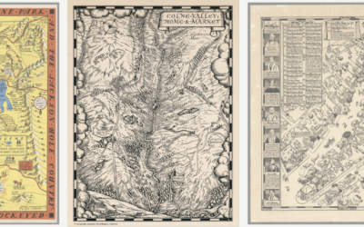
David Rumsey Map Center, cataloging historical works
The David Rumsey Map Center at Stanford houses hundreds of thousands of maps…
-
Anonymized data is rarely anonymous
Justin Sherman for Wired points out the farce that is anonymized data:
Data… -
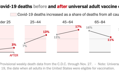
Covid-19 mortality before and after vaccine eligibility
Denise Lu and Albert Sun for The New York Times show the shifts…
-
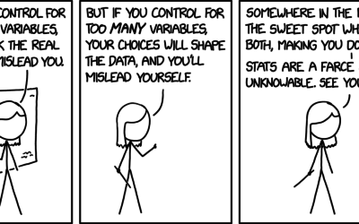
xkcd: Unknowable truth
xkcd makes Statistics so fulfilling. George E. P. Box comes to mind.…
-
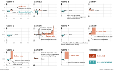
World Chess Championship in charts
Magnus Carlsen continued to assert his dominance at the World Chess Championship. FiveThirtyEight…
-

Virtual proctoring simulation
Many colleges use virtual proctoring software in an effort to reduce cheating on…
-
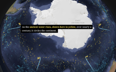
Shifting currents and melting ice in the Antarctic
Based on data from autonomous sensors floating in the oceans, researchers are able…
-
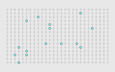
Members Only
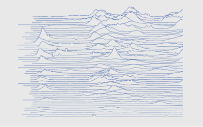
How to Make Frequency Trails in Excel
Also known as ridgelines, use the method to create a compact visualization where you can easily identify major patterns and outliers.
-
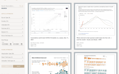
A catalog of all the Covid visualizations
The COVID-19 Online Visualization Collection is a project to catalog Covid-related graphics across…
-
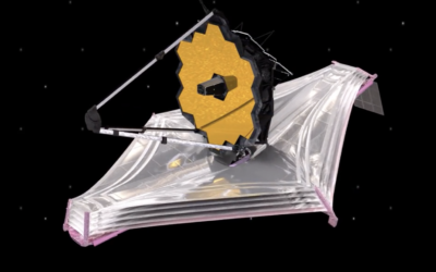
Launching a telescope to explore the Big Bang
NASA is launching the James Webb Space Telescope on December 22, 2021 with…
-
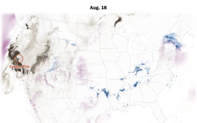
Mapping the weather disasters of 2021
Zach Levitt and Bonnie Berkowitz for The Washington Post mapped and animated the…
-
What works in visualization, scientifically speaking
Steven L. Franconeri, Lace M. Padilla, Priti Shah, Jeffrey M. Zacks, and Jessica…
-
Why we listen to the same Christmas songs
You know it’s the holiday season when Mariah Carey starts singing about wanting…
-
Members Only
Sorting Usefully – The Process 169
A little bit of sorting and organization can make a big difference in readability.
-

NASA solar probe touched the sun
NASA launched the Parker Solar Probe in 2018 in an effort to explore closer to the sun.
-
Vaccination rates compared against country wealth
Vaccine supply is only part of the equation. For The New York Times,…
-
Flowchart for pandemic supply chain issues
Lazaro Gamio and Peter S. Goodman for The New York Times used a…
Recently for Members
Browse by Chart Type See All →


Browse By Topic
Get the Book
 Visualize This: The FlowingData Guide to Design, Visualization, and Statistics
 Visualize This: The FlowingData Guide to Design, Visualization, and Statistics
Available now.