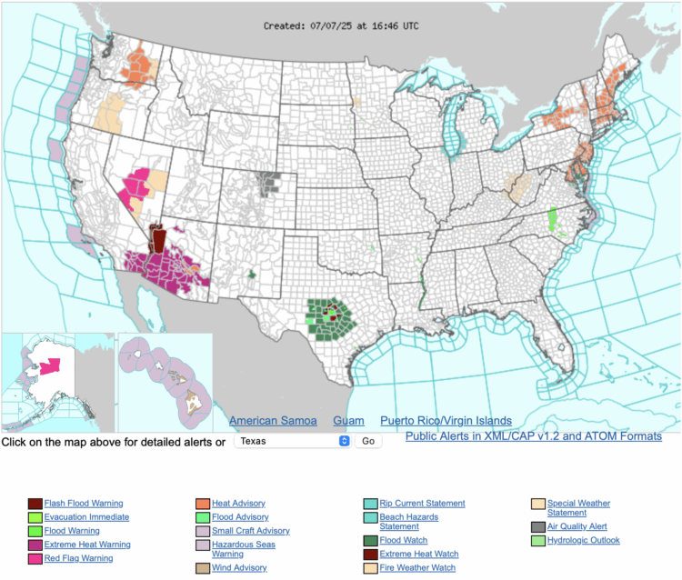
• The Numbers Game on National Geographic

    April 29, 2013 to Statistics by Nathan Yau

    Jake Porway, the founder of DataKind, has a new show on the National Geographic channel called The Numbers Game. I unfortunately don't have the channel, so the clips on the site will have to suffice for now.

    Keep in mind this show is for a wide audience though. Jake notes:

    Now for those of you who have been writing to me excited that Big Data is finally getting its own TV show, I should point out that this show is a lot more like a science show than a show about data. You won’t find discussions about Hadoop, machine learning, or even the basics of correlation vs. causation here. Instead, the show tries to make the latest statistics accessible to a wide audience of people who may just be dipping their toes in to this new world of data. It’s more Guy Fieri than Carl Sagan, but it’s a blast.

    The first of three episodes aired last week, and the second is on tonight. You should watch it.

  • Insecurities of age through the eyes of Google Suggest

    April 26, 2013 to Miscellaneous by Nathan Yau

    In this straightforward video, Marius Budin offers a look at our insecurities as get older through the eyes of Google Suggest. If anything, it's clear that there's one thing we fear throughout: loneliness. Although, the suggestions in the early years worry me.

  • A thorough Facebook analysis by Stephen Wolfram

    April 25, 2013 to Statistical Visualization by Nathan Yau

    Facebook networks

    Stephen Wolfram analyzed the Facebook world, based on anonymized data from the Wolfram|Alpha Data Donor program. He visits topics from how people friend, how the Facebook world compares to the real one, and how people change with age.

    People talk less about video games as they get older, and more about politics and the weather. Men typically talk more about sports and technology than women—and, somewhat surprisingly to me, they also talk more about movies, television and music. Women talk more about pets+animals, family+friends, relationships—and, at least after they reach child-bearing years, health. The peak time for anyone to talk about school+university is (not surprisingly) around age 20. People get less interested in talking about "special occasions" (mostly birthdays) through their teens, but gradually gain interest later. And people get progressively more interested in talking about career+money in their 20s. And so on. And so on.

    Worth the full read.

  • Binify for hexagon binning in Python

    April 25, 2013 to Software by Nathan Yau

    Hexagon binning

    As an alternative to dot density maps, Binify by Kevin Schaul allows you to map with hexagon binning in Python.

    Dot density maps are a straightforward way to visualize location data, but when you have too many locations, points can overlap and obscur clusters and trends. That's where binning comes in. Generally speaking, the goal is to look at an area on a map and then count how many points are within that area. Do that across the entire area.

    Grab the package on GitHub and go to town.

  • Stop motion video: Food you can buy for $5 in different countries

    April 24, 2013 to Infographics by Nathan Yau

    This stop motion video from BuzzFeed shows how much food you can buy for $5 USD in different countries. For example, five bucks will get you 7 pounds of rice in the United States and 12 pounds in China. The video is straightforward, but the animation of food appearing and disappearing — or rather, added and taken away — lends well to the context that you wouldn't get from a quick chart.

    The gut instinct seems to be "Hey, we should all move to China." Better follow that up with non-Chinese salaries.

  • Flowchart for movie time travel

    April 23, 2013 to Infographics by Nathan Yau

    Time travel flowchart

    Mr. Dalliard provides this handy flowchart to organize time travel movies. And yes, I immediately looked for Back to the Future and backtracked.

  • Orbiting planets found by NASA Kepler mission

    April 22, 2013 to Infographics by Nathan Yau

    The Kepler mission by NASA has discovered more than 100 planets that orbit stars. Jonathan Corum for The New York Times visualized the ones with known size and orbit using small multiples. Scroll all the way down for our solar system as a point of reference.

    Kepler's tally of planets

  • Shot charts show evolution of Lebron James

    April 19, 2013 to Mapping by Nathan Yau

    Lebron James in 2013

    With the start of the NBA playoffs tomorrow, it's worth coming back to Kirk Goldsberry's analysis on the evolution of Lebron James' shot preference. James used to hang around the 3-point line a lot, but he spends a lot more time in the low post these days.
    Continue Reading

  • Time-lapse: Package shipped with a hidden camera

    April 18, 2013 to Data Art by Nathan Yau

    Designer Ruben van der Vleuten was curious about the shipping process, so he did what anyone would do. He installed a camera in a cardboard box and shipped it to himself. Below is a time-lapse video of the package's journey.

    [via Co.Design]

  • Fictional villains chart

    April 17, 2013 to Visualization by Nathan Yau

    Villains

    No comment necessary. [Thanks, Tom]

  • Flexible data

    April 17, 2013 to Statistics by Nathan Yau

    Data is an abstraction of something that happened in the real world. How people move. How they spend money. How a computer works. The tendency is to approach data and by default, visualization, as rigid facts stripped of joy, humor, conflict, and sadness — because that makes analysis easier. Visualization is easier when you can strip the data down to unwavering fact and then reduce the process to a set of unwavering rules.

    The world is complex though. There are exceptions, limitations, and interactions that aren't expressed explicitly through data. So we make inferences with uncertainty attached. We make an educated guess and then compare to the actual thing or stuff that was measured to see if the data and our findings make sense.

    Data isn't rigid so neither is visualization.

    Are there rules? There are, just like there are in statistics. And you should learn them.

    However, in statistics, you eventually learn that there's more to analysis than hypothesis tests and normal distributions, and in visualization you eventually learn that there's more to the process than efficient graphical perception and avoidance of all things round. Design matters, no doubt, but your understanding of the data matters much more.

  • Wealth distribution in America

    April 16, 2013 to Infographics by Nathan Yau

    This video clearly describes the distribution of wealth in America using a set of transitioning charts. The graphics are good. The explanation is better.

  • Visualizing the Paris metro system

    April 15, 2013 to Mapping by Nathan Yau

    Parisian subway

    Data visualization group Dataveyes looks closer at the Paris metro system from a time and crowd point of view.

    This visualization offers to challenge the way we traditionally view our 2D metro maps. Métropolitain takes on an unexpected gamble: using cold, abstract figures to take the pulse of a hectic and feverish metropolis. The metro map is no longer arbitrarily dictated by the spatial distance between two points. By playing around with two extra variables — time and crowds — users can transform the map, view it in 3D and unveil the true reality behind their daily commute.

    No doubt inspired by the Travel Time Tube Map of the London Underground by Tom Carden, Métropolitain lets you select a station and the lines morph to represent how long it takes to get to other stations. A layer underneath is a heatmap that shows annual incoming traffic per station.

    Finally, you can switch between 2-D and 3-D. I'm not sure if the extra dimension adds much from an understanding point of view, but it is fun to play with. [via infosthetics]

  • Locations of every photo from International Space Station

    April 12, 2013 to Visualization by Nathan Yau

    ISS photos

    Over the last 12 years, astronauts have taken a lot of pictures from the International Space Station. About 1.1 million of them. And they're all archived on NASA's servers. Nathan Bergey mapped them.

    Most of the photos are taken of land. Coastlines, islands and cities seem to be popular targets. So much so that it’s possible to make out basic continents. This makes sense, photos of clouds over an otherwise blank ocean get old after a while. I'm sure every astronaut has taken at least one photograph of the town they grew up in.

    Above is the use of small multiples to show pictures taken during separate missions.

  • Personal space per person in various countries

    April 11, 2013 to Infographics by Nathan Yau

    Personal space

    How much space is there per person in different countries? Andrew Bergmann for CNNMoney took a look.

    Population density measures the amount of people in a given area, generally per square kilometer or mile. It's difficult to get a clear image of what these vast spaces actually represent, so I thought that it would be interesting to flip the equation on its head and figure out how much space there is on average per person.

    The interactive shows 20 countries and each is represented by a circle sized by average square feet per person. Of course, as with population density, this data is broad with land distribution and usage to consider, but it's informative from a general viewpoint. Although the math might be slightly off in the square feet calculation. Or maybe that's just rounding.

    I'm surprised I haven't seen something like this before. See population density from the more traditional point of view here, here, and here. Oh, and here. I think the last one is my favorite.

  • Analysis of baseball ticket pricing

    April 10, 2013 to Statistical Visualization by Nathan Yau

    Baseball ticket pricing

    If you've ever looked at ticket prices for sporting events, you probably noticed the disparity in prices of when your team plays a popular team or a rival versus a less than stellar team. Last time I looked a ticket to watch the Golden State Warriors play the Lakers or Heat was twice as much as when they played the Kings. David Yanofsky for Quartz noted the same pricing strategy in baseball.

    The heat map above shows the effect of visiting teams on ticket prices. As you'd expect (if you follow baseball even just a tiny bit), price goes up significantly when the New York Yankees come to town. In contrast, the price goes down when the Seattle Mariners show up.

    There's clearly a supply and demand thing going on here. Nobody wants to see bad teams play. But now it's time to pull a Billy Beane. How little can you spend on a team and a stadium and still make a profit? [Thanks, David]

  • Map: Travel safety by country

    April 9, 2013 to Mapping by Nathan Yau

    Dangerous travel

    As summer rolls around here on this side of the planet, CBC News mapped countries to avoid in your travel plans, based on foreign travel advisories from the Canada Department of Foreign Affairs and International Trade.

    Naturally, Canada isn't colored on the map because the map was made for Canadians, but I think it's safe to assume that they'd be colored green too and most, if not all, of the advisories apply to those of us here in the United States. [Thanks, John]

  • I am away from my computer right now. brb.

    April 8, 2013 to Announcements by Nathan Yau

    I'm gonna be out of the country for a while. If all goes according to plan, you won't notice I'm gone, but if it gets quiet all of a sudden you'll know why. Comments will be off. I also won't be very good with email during this time. Not that I was good with it to begin with.

    gtg.ttyl

  • Distance to Mars

    April 8, 2013 to Infographics by Nathan Yau

    Distance to Mars

    Long distances (and big numbers) can be difficult grasp. Designers Jesse Williams and David Paliwoda took a stab at it and made it easier to understand the distance from Mars. Simple and totally fun. I'm not sure how accurate the travel time and distance are, but I'm guessing it takes differing orbits into account.

  • A bar chart would be better

    April 8, 2013 to Visualization by Nathan Yau

    There's a strand of the data viz world that argues that everything could be a bar chart. That's possibly true but also possibly a world without joy.

    —Amanda Cox, 2013

    There's a great interview with Amanda Cox from The New York Times on visualization, some of the skills required, and where the field is headed. I like this tidbit on design, which is a contrast to the above:

    Design and typography do matter. It's about hierarchy of information and how people perceive information. Done properly, that clean up work really matters. On the other hand, it's easy to believe that it matters more than it does. If you make a fantastically interesting chart and some poor design decisions, the data will still come through. If you make a bad chart with a beautiful design, what have you done, really?

    Read the whole thing. Thank me later.

Unless otherwise noted, graphics and words by me are licensed under Creative Commons BY-NC. Contact original authors for everything else.