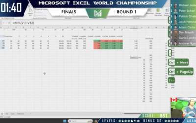
The Microsoft Excel World Championship 2023 wrapped a couple weeks ago, and the…
Software
Programs and online applications to help you make use of data.
-
Excel World Championship
-
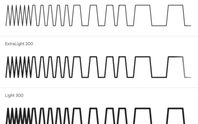
Fonts for rendering lines and bars from data
Google Fonts now provides two open source fonts by Dmitry Ivanov that let…
-
Turn a static SVG into an interactive one, with Flourish
It’s straightforward to share a static SVG online, but maybe you want tooltips…
-
Python is coming to Excel
Excel is getting a bump in capabilities with Python integration. From Microsoft:
Excel… -
Barbie and Oppenheimer themes for charts in R
Matthew Jané made a small R package called Theme Park, which is meant…
-

Understanding the SVG path element, a visual guide
The SVG path element can be useful for drawing regular and irregular shapes.…
-
Mosaic, a framework for scalable and linked visualization
From the University of Washington Interactive Data Lab, Mosaic is a research project…
-
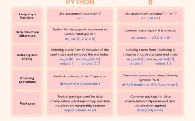
Switching from Python to R
If you’re looking to switch or just want to expand your skills, this…
-
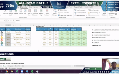
Spreadsheet esports
You’ve probably heard of esports, where people compete against each other in multiplayer…
-
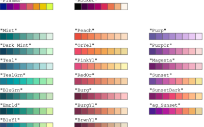
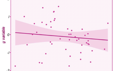
Improved color palettes in R
Achim Zeileis and Paul Murrell provide a rundown of the more user-friendly color…
-
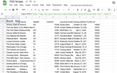
Scraping data without programming
Maybe you’ve wished you could quickly grab the data on a webpage and…
-

Scrolly video JavaScript library
ScrollyVideo.js is a JavaScript library that makes it easier to incorporate videos in…
-
Deleting your tweets with R
Twitter isn’t in a great place right now, so maybe you want to…
-
Wide range of data exploration tools
Simon Willison asked a straightforward question about the tools people use:
If someone… -
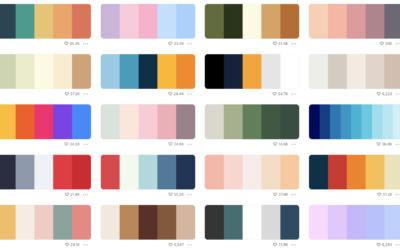
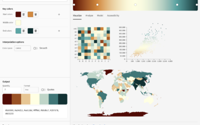
Color palette generator
In the never-ending quest to find the perfect color scheme for any given…
-
RStudio changes name to Posit
RStudio, the company behind the IDE of the same name, are changing their…
-
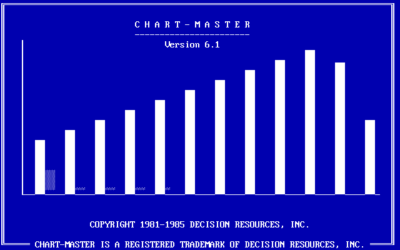
Charting software that pre-dates Excel
RJ Andrews digs up the PC archives of charting software. Scrolling through the…
-
R packages useful for sports analytics
If you’re into R and analyzing sports data, you’ll want to save this…
-
A color tool for accessible schemes
Leonardo is an open source project from Adobe that helps you pick accessible…
-

Procedural dungeons in R
Matt Dray is developing a package in R that runs a text-based game.…
Recently for Members
Second Edition
 Visualize This: The FlowingData Guide to Design, Visualization, and Statistics (2nd Edition)
 Visualize This: The FlowingData Guide to Design, Visualization, and Statistics (2nd Edition)
New tools, refined process.
Browse by Chart Type See All →


