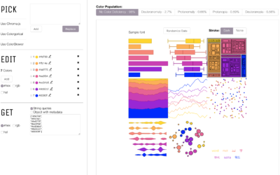
RAWGraphs, a tool conceived by DensityDesign in 2013, got a 2.0 update in…
Apps
Software that makes a part of your data job easier.
-
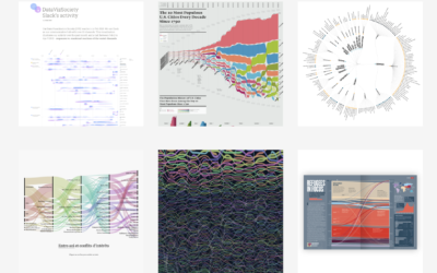
RAWGraphs 2.0, an open-source tool to visualize data
-
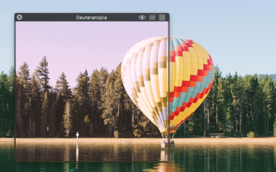
Sim Daltonism, an intuitive app that simulates color blindness
When we visualize data to communicate to others, we must consider what others…
-
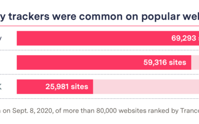
Blacklight, a tool to see how the websites you visit are tracking you
Companies are tracking what you do online. You know this. But it can…
-
Protecting your mobile data and privacy while at a protest
Maddy Varner reporting for The Markup:
“All protesting and all marches are a… -
Remix and make music with audio from the Library of Congress
Brian Foo is the current Innovator-in-Residence at the Library of Congress. His latest…
-
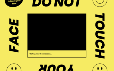
Machine learning to help you not touch your face
The CDC recommends that you do not touch your face to minimize the…
-

Botnet, a social network where it’s just you and a lot of bots
Botnet is a social media app where you’re the only human among a…
-
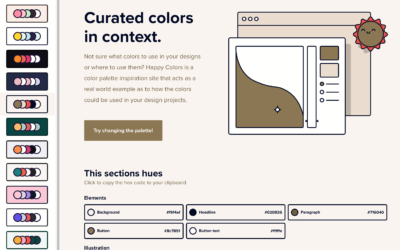
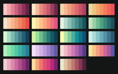
Color palettes browsable in context
Color scheme selections are nice and all, but they’re even better when viewed…
-
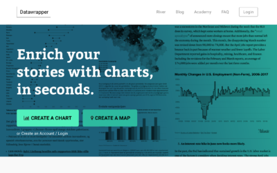
Datawrapper updates pricing structure, do more for free
Datawrapper, a focused web tool that makes online charts easier to put together…
-
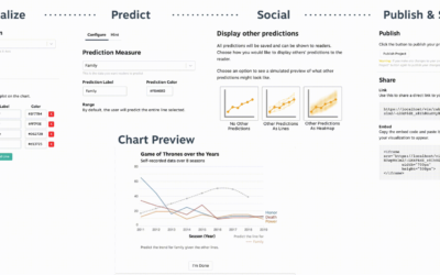
Make charts that ask readers to predict the line
A few years ago, The New York Times asked readers to guess a…
-
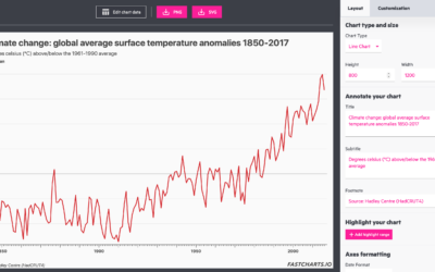
FastCharts to make charts fast
FastCharts is the public version of the Financial Times’ in-house solution for making…
-
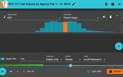
TwoTone is a tool to sonify your data
TwoTone, by Datavized and supported by the Google News Initiative, is a straightforward…
-
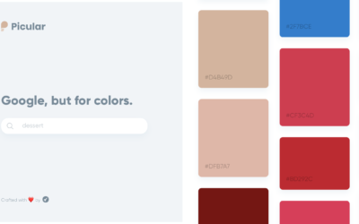
A search engine for color palettes
Picular is a simple tool that lets you search for a topic, and…
-
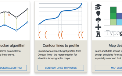
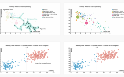
Cartography Playground
Map-making is a tricky business with many variables to consider that can directly…
-
Visualization color picker, based on perception research
The colors you choose to visualize data can completely shift what you convey…
-
CARTOColors is a quick set of color schemes to copy
Picking colors is one my favorite things to do with visualization when I’m…
-
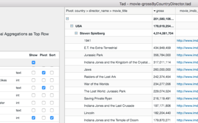
Quickly browse large CSV files on the desktop with Tad
When you first get a CSV file, sometimes it’s useful to poke at…
-
Annotate charts with a few clicks using ChartAccent
Some say annotation is the most important layer for charts meant for public…
-
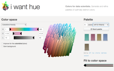
Generate color palettes automatically
Default color schemes are often horrible, but spending a lot of time putting…
-
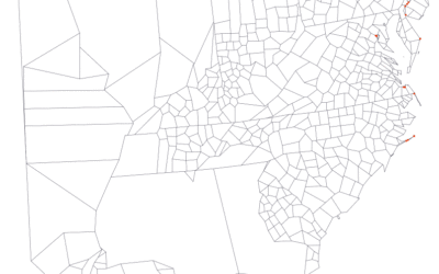
Adjusting map data with Mapshaper
Map making is a finicky challenge where oftentimes your map data — points,…
Recently for Members
Second Edition
 Visualize This: The FlowingData Guide to Design, Visualization, and Statistics (2nd Edition)
 Visualize This: The FlowingData Guide to Design, Visualization, and Statistics (2nd Edition)
New tools, refined process.
Browse by Chart Type See All →


