For those who want to share small datasets in a more straightforward way,…
Apps
Software that makes a part of your data job easier.
-
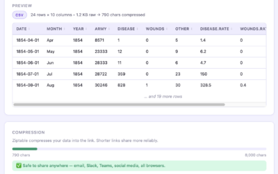
Share small datasets stored in a URL
-
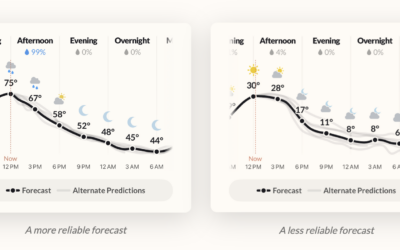
Weather forecast app, with uncertainty as a core feature
The folks who made Dark Sky, my once go-to weather app that was…
-

Making 10M government PDF documents searchable
Government organizations love to distribute documents as PDF files. They are easy to…
-
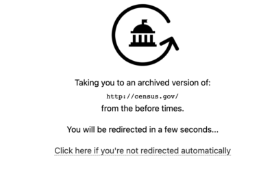
Access previous versions of government websites with GovWayback
You can use the Internet Archive to access historical versions, but GovWayback makes…
-
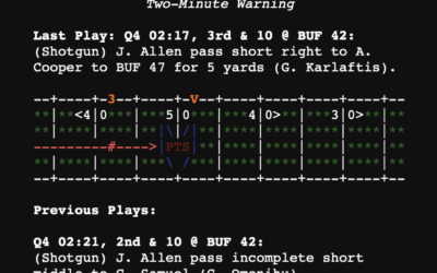
Plain text box scores
New to me, Plain Text Sports shows box scores for the major sports…
-
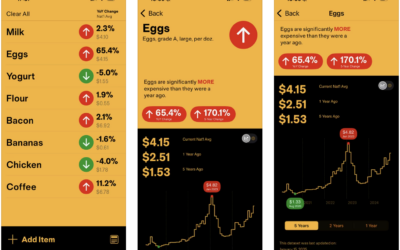
With InflataCart, your grocery list plus inflation data
If you shop at the grocery store regularly, you’ve felt prices increasing, especially…
-
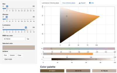
Color picker with R
As we have learned over the years, there can never be enough color-picking…
-
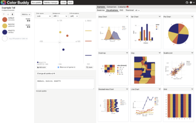
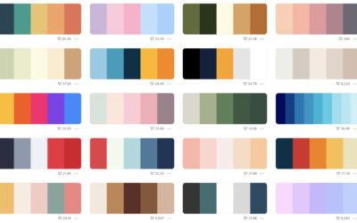
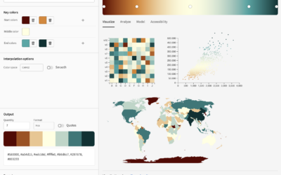
Color Buddy, a tool for building color palettes for visualization
Picking colors for visualization can be tricky, because there are infinite possibilities across…
-
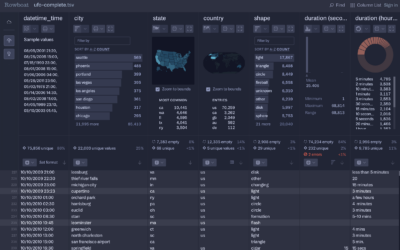
Rowboat for fast CSV exploration
Fathom Information Design, known for client visualization-centric projects, introduced Rowboat. It’s a tool…
-
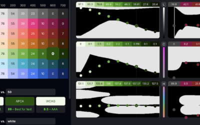
Huetone for accessible color systems
There is no shortage of color-picking tools, but it seems there can never…
-
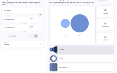
Data GIF Maker lets you make animated GIFs with data
The Data GIF Maker is a fun tool from Google that lets you…
-
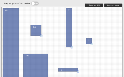
Simple tool for proportional area charts
There might be times when you want to visualize data with area, but…
-
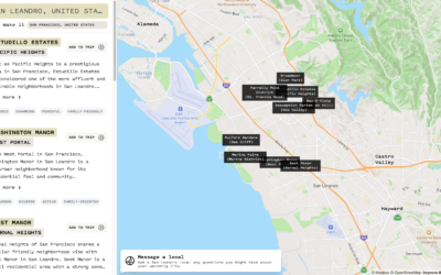
Find familiar places in new cities
If you’re traveling to a new city, it can be tricky to figure…
-

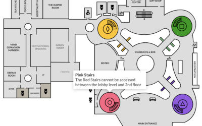
Psuedo-charts with Microsoft Image Creator
With each new AI-based tool that comes out, I begrudgingly kick the tires…
-
Turn a static SVG into an interactive one, with Flourish
It’s straightforward to share a static SVG online, but maybe you want tooltips…
-
Color palette generator
In the never-ending quest to find the perfect color scheme for any given…
-
A color tool for accessible schemes
Leonardo is an open source project from Adobe that helps you pick accessible…
-

Seeing just the questions
As a way to explore how people use questions in their writing, a…
-
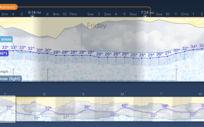
Weather Strip, an app that shows the forecast as a time series
Weather Strip is a new weather app by visualization researcher Robin Stewart. It…
-
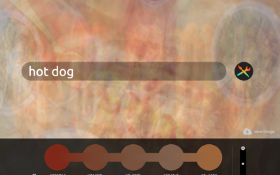
Find a color palette based on words
PhotoChrome is a straightforward tool that lets you use search terms to find…
Recently for Members
Second Edition
 Visualize This: The FlowingData Guide to Design, Visualization, and Statistics (2nd Edition)
 Visualize This: The FlowingData Guide to Design, Visualization, and Statistics (2nd Edition)
New tools, refined process.
Browse by Chart Type See All →


