Explorations of People Movements

In 2010, I surveyed visual explorations of traffic, and it was all about how cars, planes, trains, and ships moved about their respective landscapes. It was implied that the moving things had people in them, but the focus was mostly on the things themselves. Location data was a byproduct of the need of vehicles to get from point A to point B in the most efficient way possible.
Airplanes floated across the sky. Cabs left ghostly trails in the city. The visualization projects were, and still are, impressive.
However, around the same time, it was growing more common for people to carry phones with GPS capability and these days, it’s commonplace in areas where most people use smartphones. This new data source gave rise to similar but different visualization projects that were more granular.
We see people. Movements.
Aggregated estimates
Let’s not get ahead of ourselves though. Data for people movements has been around for a while. It’s just that it came as aggregated estimates — and other forms of course, as you go back further. I mean, the ever so popular Minard chart of Napoleon’s March shows people moving.
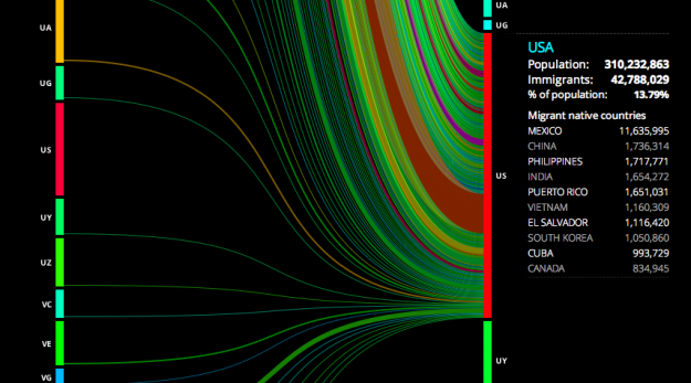
During this century though, way back in 2007 (a whole six years ago) I played with some global migration data, and that was only on the country level. It also didn’t include all the countries in their entirety if I remember correctly.
Getting more local and recent, Jon Bruner used data from the Internal Revenue Service to show migration in the United States, at the county level. Red lines represent a net migration leaving the selected county, and black lines represent arrivals.
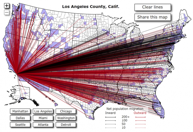
Bruner followed up the next year with a more refined version. The map seemed to re-spark interest in migration in other places, such as Carlo Zapponi’s peoplemovin project, which still used lines connecting regions but went sans map.
WNYC’s The Brian Lehrer Show asked listeners who moved to or from New York about where they came from or where they went and then posted the data so that people could play around with it. Interesting projects came out of that little experiment.
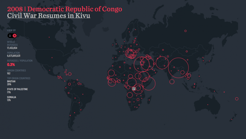
Even earlier this year, Hyperakt and Ekene Ijeoma visualized refugee data that goes back to 1975.
So there’s a lot of data that shows how people move, but until recent years, it’s been typically in aggregate and only reveals endpoints.
Single points from a lot of people
Like I said though, GPS in phones brought a different type of data. And it wasn’t just directions to a place that remained isolated in your car. People check-in to places — restaurants, stores, airports — and they share it with others. Many keep their location data public.
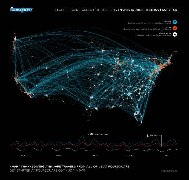
Instead of aggregated estimates, you can infer the movement of individuals, through individual check-ins. For example, Foursquare looked at transportation over a year via people who checked in at airports, railway stations, and highways.
And there are plenty of Foursquare-related maps that let readers make their own inferences. Given enough people with smartphones who use the service, you can see where those people go. The now defunct Weeplaces was a fun interactive that let you explore your check-in data.
This single point check-in data eventually found itself on other services, such as Facebook, Twitter, and Flickr, attached to status updates, tweets, and photos. Location was often implied with these objects, but it soon transitioned to latitude and longitude coordinates.
Anonymous and separate, the data points aren’t always immediately informative. See them all at once? You often see obvious patterns. This drove many of Eric Fischer’s maps. Zoom in enough and his maps just look like a bunch of dots, and zoom out there’s an activity of the masses.
For example, Fischer looked at where tourists and locals go in major cities, based on geotagged Flickr photos.
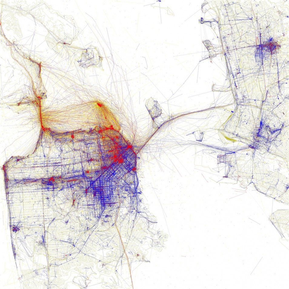
The map looks like a lot of connecting lines in the view above. They’re actually a bunch of dots that are close enough together that the streets in San Francisco grow apparent. Blue dots represent locals whereas red dots represent tourists. (It looks like there’s a dichotomy between locals and tourists, but the red dots got precedence in this map, overlaid on top of the blue. Still, it’s an interesting contrast.)
Fischer followed up the next year with a contrast between geotagged Flickr photos and tweets on Twitter. He called the series See Something or Say Something, and the idea was that people photograph areas with notable things whereas tweets are more everyday. He provided country-level views, but the zoomed in city-level views were far more interesting.
The granular data shows details that the aggregates obscure. That’s what’s so interesting. And it was just the beginning. More continuous tracking and the idea of phones as sensors were building momentum too.
Many points from a few people
Not surprisingly, continuous tracking seemed to first gain wider adoption in sports. Athletes want to improve their performance, so if there’s a more concrete way to see what makes them better and by how much, then all the better. However, the technology can be expensive. Other times it was rough around the edges, involving video cameras with manual labor to put together some form of stop motion.
The technology and demand eventually caught up to each other though, which turns out better for everyone who’s interested in their movements. Made by Humans, an artistic interpretation of athletes in motion, is one of my favorites.
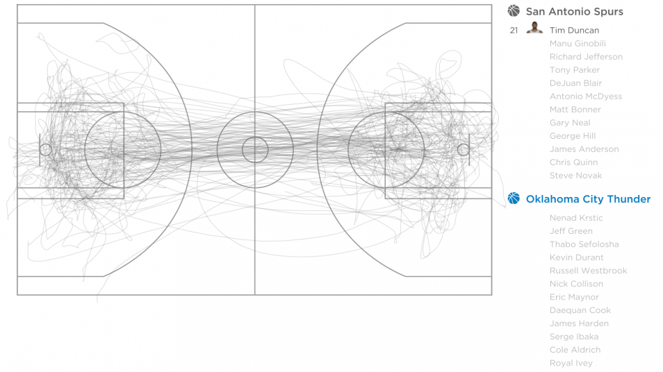
These days, it’s hard not to watch sports without sports analytics entering the picture. It used to be just random sports facts, but now there are sensors everywhere to track basketball players, log serving speed and ball placement in tennis, and survey quarterback passes at a higher accuracy than before.
Similar things exist for soccer, baseball, golf, and probably ping pong, bowling, and underwater basket weaving.
Many points from a lot of people
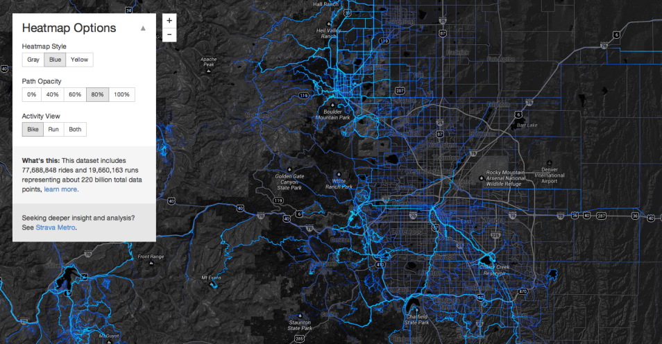
Enter the tracking for individuals today. Many apps for movement still focus on sports-like activity: Strava, RunKeeper, MapMyRun, Endomondo, and plenty more. The data is useful for people with the apps, because they can keep track of how far and how fast they walked, ran, or cycled. People can use this information to set goals and to improve their performance. Some just want to be more healthy.
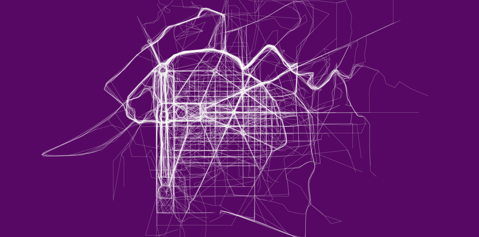
However, just like the check-in maps of single data points, the path data from running and cycling can also be useful when you look at data from many people. For example, with limited access to RunKeeper data, I was able to get a sense of where people run in major cities. Here’s a look at running in Washington, D.C.:
Like I said, I only had access to some of the RunKeeper data. Strava released a more expansive interactive map that lets you see running and cycling around the world.
These apps used to drain your battery, because it took a lot of resources to constantly grab your location for long periods of time. That’s why most people only logged their physical activity. It didn’t last all day.
A project I was a part of in graduate school, pre-iPhone, tracked location throughout the day. It tried to at least. A separate GPS device connected to the phone via bluetooth, and we carried a second battery pack to replace the drained one midday.
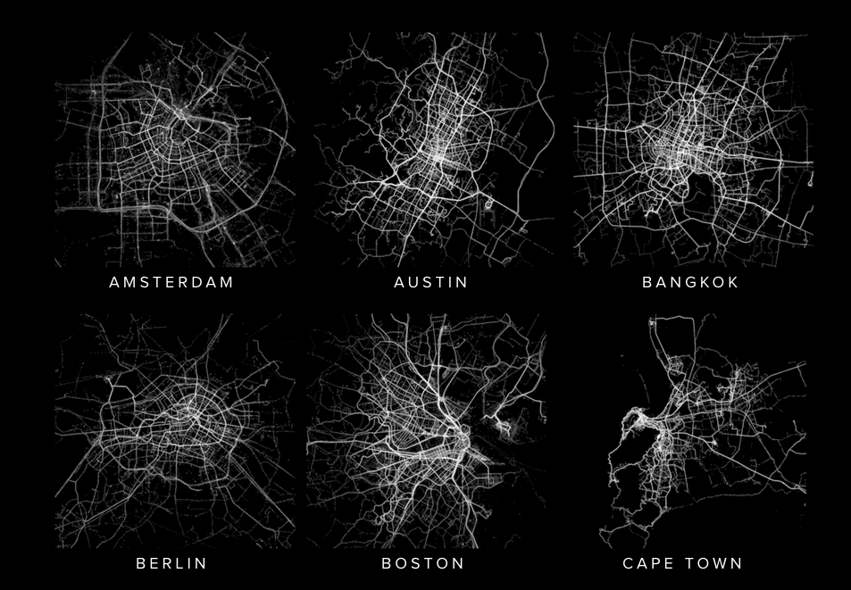
Now you can download an app that uses your phone’s built-in GPS. Leave it on all day to run in the background, and sometimes you don’t even notice. Why just track running and cycling when you can track your movements all day? The Moves app, the “activity diary for your life” (and recently acquired by Facebook), stays on all day to log your location and estimates steps, calories burned, and your activities. Human is a similar app. They just released a bunch of maps that show activity in major cities.
I use OpenPaths, because I like the data model for privacy and selective sharing. Although I have my eye on an actual GPS device that stores the data locally on one of those memory card things instead of the cloud.
Looking ahead
We can log our location all day every day, with little effort. What next? Well, the apps can even go higher granularity with increased sampling rates. Whatever the new phones allow, I guess. More sensors? Sure. Continuous data? Alright.
At some point though I hope that there are more people who care about where their data goes than there are who do not. I hope that people wonder how services use their data before they sign up for it. Why does company X provide such a neat service for free? I don’t buy into the whole “if you’re not paying, you’re the product blah blah blah” stuff, and the reason behind a service can be beneficial to a community. But, it’s important to know where such personal information — your location and movements — wanders off to in the endlessness of someone else’s servers.
For example, German politician Malte Spitz provided six months of phone data to Zeit Online a couple of years ago to demonstrate what such data revealed. It showed where he went and how and when he made phone calls.
How comfortable would you be if a company had a similar profile of you, and what if they used the data for purposes other than improving the service they provide you?
As another example, Strava started a for-fee program that gives cities a license to access anonymized cycling data. The Oregon Department of Transportation paid $20,000 for a one-year license. The hope is that cities can use the detailed data to improve cycling routes. That would be great. However, what if a city closes routes, based on what they see in the data, rather than upgrade or maintain existing paths?
I’m not saying this has happened or will happen, but if there aren’t enough people who care about where their data goes, it’s easy to see how a less savory company might aim for profit over the good of its users. Naturally this goes for other types of data too — not just location.
At the end of the day, it’s great that we can log detailed data almost effortlessly. But also, now is as good a time as any to remind ourselves the value of our personal information.
Chart Types Used


Become a member. Support an independent site. Get extra visualization goodness.
See What You Get