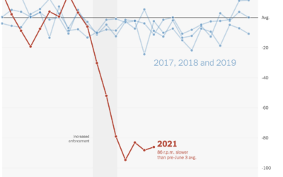
NYT’s The Upshot analyzed spin rate on pitches before and after enforcing a…
Upshot
-
Falling spin rates in baseball after rule enforcement
-
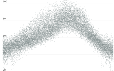
Historical context for the heat in the Pacific Northwest
It’s been hot in the Pacific Northwest the past few days. NYT’s The…
-
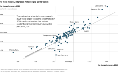
Pandemic migrations
With the restrictions of the pandemic, you might expect an unusually big wave…
-
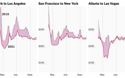
Tracking airfare as a proxy for summer travel plans
Quoctrung Bui and Sarah Kliff for NYT’s The Upshot used difference charts to…
-
Guess who the neighborhood voted for
NYT’s The Upshot has a quiz that puts you in a neighborhood via…
-
Mapping all of the voters
In what seems to have become a trend of making more and more…
-
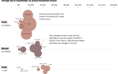
Average stimulus aid, by household size and income
Alicia Parlapiano and Josh Katz, reporting for NYT’s The Upshot, plotted the average…
-
Precinct-level map of 2020 election results
NYT’s The Upshot published their precinct-level map of 2020 election results. Zoom in…
-
All of the insults
For NYT’s The Upshot, Kevin Quealy has been cataloging all of the insults…
-
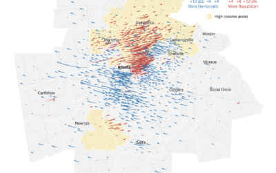
Map of the voting in Georgia, the runoff vs. the general election
For NYT’s The Upshot, Nate Cohn explains how Warnock and Ossoff won Georgia.…
-
What states are doing to make mail-in ballots clearer
Mail-in ballots can be rejected if they’re not filled out or mailed correctly.…
-
Tracking the mail
With mail-in ballots looking to be more common than ever this year, NYT’s…
-
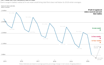
Vote-by-mail volume compared against years past
The volume of mail-in ballots will likely be higher than usual this year,…
-
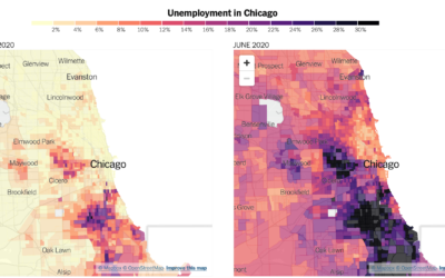
Distribution of unemployment at the tract level
We’ve been hearing a lot about national unemployment rate, but it’s not uniformly…
-
Where people are wearing masks
NYT’s The Upshot ran a survey through the data firm Dynata asking people…
-
Flow of prison population
In a collaboration between The Marshall Project and The Upshot, Anna Flagg and…
-
Hospital bed occupancy
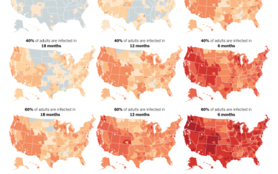
Using estimates from the Harvard Global Health Institute, The Upshot mapped what hospital…
-
Possible coronavirus deaths compared against other causes
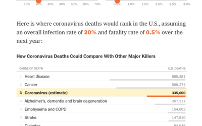
Based on estimates from public health researcher James Lawler, The Upshot shows the…
-
Federal budget scaled to per person dollars
For The Upshot, Alicia Parlapiano and Quoctrung Bui scaled down the federal budget…
-
Data problems in Iowa caucus results
It wasn’t just issues with an app. There appears to be many more…









 Visualize This: The FlowingData Guide to Design, Visualization, and Statistics (2nd Edition)


