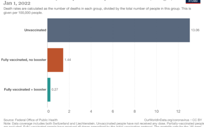
Our World in Data continues their important work on providing and showing up-to-date…
coronavirus
-
Death rates by vaccination booster status
-
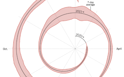
Spiral graph to show Covid-19 cases
This spiralized chart by Gus Wezerek and Sara Chodosh for NYT Opinion has…
-
What the omicron numbers tell us and do not tell us
May Louise Kelly for NPR spoke briefly with biostatistics professor Natalie Dean on…
-
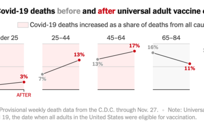
Covid-19 mortality before and after vaccine eligibility
Denise Lu and Albert Sun for The New York Times show the shifts…
-
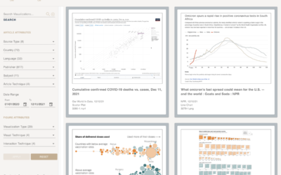
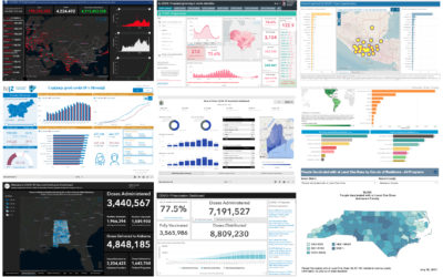
A catalog of all the Covid visualizations
The COVID-19 Online Visualization Collection is a project to catalog Covid-related graphics across…
-
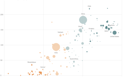
Vaccination rates compared against country wealth
Vaccine supply is only part of the equation. For The New York Times,…
-
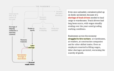
Flowchart for pandemic supply chain issues
Lazaro Gamio and Peter S. Goodman for The New York Times used a…
-
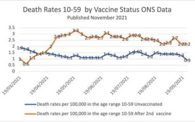
Simpson’s Paradox in vaccination data
This chart, made by someone who is against vaccinations, shows a higher mortality…
-
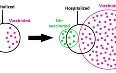
Euler diagram to illustrate base rate fallacy
Some people point out that vaccinated people are still hospitalized as a defense…
-
Communicating effectiveness of boosters
Statisticians David Spiegelhalter and Anthony Masters for The Guardian on reframing risk estimates:…
-
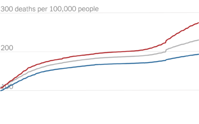
Partisan gap in Covid death counts
David Leonhardt for The New York Times looked at the partisan gap for…
-
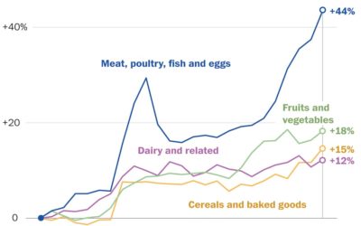
Rising prices of everything
Using Consumer Price Index, Alyssa Fowers and Rachel Siegel for The Washington Post…
-
Sonified animation of London Covid-19 rates
Valentina D’Efilippo, Arpad Ray, and Duncan Geere visualized and sonified Covid-19 rates and…
-
Assessment of the Covid-19 dashboards
Researchers evaluated 158 Covid-19 dashboards, assessing design, implementation, and usefulness. Marie Patino for…
-
A flag planted for every Covid-19 death
In fall 2020, Suzanne Brennan Firstenberg planted a flag for each American who…
-
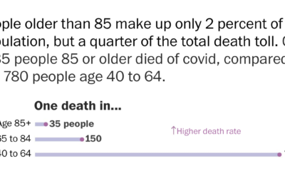
Using rates for more relatable Covid-19 numbers
With millions of Covid-19 deaths worldwide, and hundreds of thousands in the US,…
-
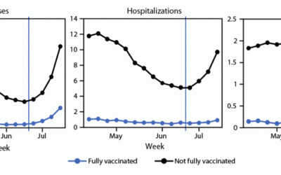
Cases, hospitalizations, and deaths for vaccinated vs. unvaccinated
The CDC released a chart that shows case, hospitalization, and death rates for…
-
Data recorded in fabric quilt
Kim Moran-Jones quilted temperature minima and maxima in the UK, along with Covid-19…
-
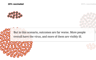
How vaccines can make a difference with the Delta variant
We see percentages for the vaccinated and unvaccinated, and people can easily misinterpret…
-
How We Spent Our Time in 2020 Versus 2019
Our everyday routines changed over the past year, and with the 2020 American Time Use Survey, we can see by how much.





 Visualize This: The FlowingData Guide to Design, Visualization, and Statistics (2nd Edition)


