Vox explains efficacy rates and why the best vaccine is the one you get now:
-
Members Only
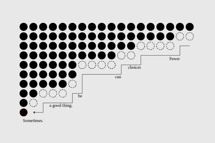
Focus on the possibilities instead of all of things you shouldn’t do.
-
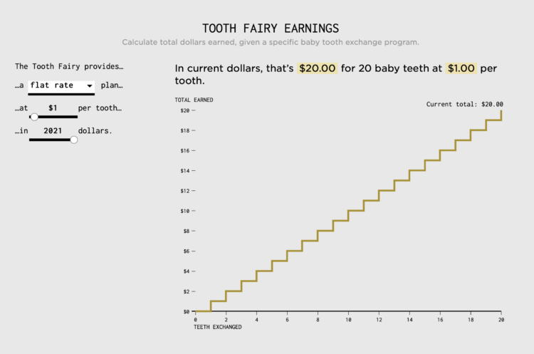
Calculating how much money a kid gets after exchanging all twenty baby teeth.
-
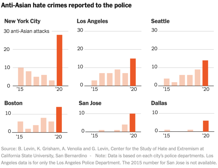
The New York Times collected, categorized, and linked to reports of anti-Asian hate crimes over the past year. The levels of ignorance, cowardice, and stupidity is off the charts.
-
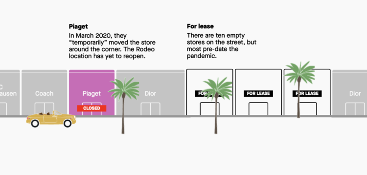
Pre-pandemic, we walked around shopping areas casually browsing, but a lot of retail didn’t make it through. For Quartz, Amanda Shendruk looks at the closures on famous shopping streets, complete with a location-appropriate vehicle to drive in and a police car that appears if you scroll too fast.
-
For The New York Times, Kashmir Hill describes the implications of facial recognition becoming a thing that everyone just has:
Retail chains that get their hands on technology like this could try to use it to more effectively blacklist shoplifters, a use Rite Aid has already piloted (but abandoned). In recent years, surveillance companies casually rolled out automated license-plate readers that track cars’ locations, which are frequently used to solve crimes; such companies could easily add face reading as a feature. The advertising industry that tracks your every movement online would be able to do so in the real world: That scene from “Minority Report” in which Tom Cruise’s character flees through a shopping mall of targeted pop-up ads — “John Anderton, you could use a Guinness right about now!” — could be our future.
No thank you.
-
An anonymous source supplied BuzzFeed News with usage data from Clearview AI, the facial recognition service that was banned by many police departments nationwide. Many agencies still used and/or tried it:
The data, provided by a source who declined to be named for fear of retribution, has limitations. When asked about it in March of this year, Clearview AI did not confirm or dispute its authenticity. Some 335 public entities in the dataset confirmed to BuzzFeed News that their employees had tested or worked with the software, while 210 organizations denied any use. Most entities — 1,161 — did not respond to questions about whether they had used it.
Still, the data indicates that Clearview has broadly distributed its facial recognition software to federal agencies and police departments nationwide, offering the app to thousands of police officers and government employees, who at times used it without training or oversight. Often, agencies that acknowledged their employees had used the software confirmed it happened without the knowledge of their superiors, let alone the public they serve.
BuzzFeed News also made a searchable table so you can see if your local agencies are on the list.
-
Dan Bouk and Danah Boyd wrote an essay on the data infrastructure and politics behind the decennial census:
Like all infrastructures, the U.S. decennial census typically lives in the obscurity afforded by technical complexity. It goes unnoticed outside of the small group of people who take pride in being called “census nerds.” It rumbles on, essentially invisible even to those who are counted. (Every 10 years, scores of people who answered the census forget they have done so and then insist that the count must have been plagued by errors since it had missed them, even though it had not.) Almost no one notices the processes that produce census data—unless something goes terribly wrong. Susan Leigh Star and Karen Ruhleder argue that this is a defining aspect of infrastructure: it “becomes visible upon breakdown.” In this paper, we unspool the stories of some technical disputes that have from time to time made visible the guts of the census infrastructure and consider some techniques that have been employed to maintain the illusion of a simple, certain count.
This process, whether we know what’s going on or not, in turn affects voices and democracy across the country. So it’s kind of important.
-
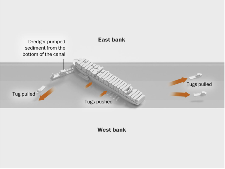
The Washington Post illustrated how the Ever Given got stuck and was freed from the Suez Canal. Pulling, digging, and a high tide.
All I could think about was the children’s book Little Blue Truck, the story of a big construction truck that gets stuck in mud and is freed by a little blue truck and its animal friends.
-
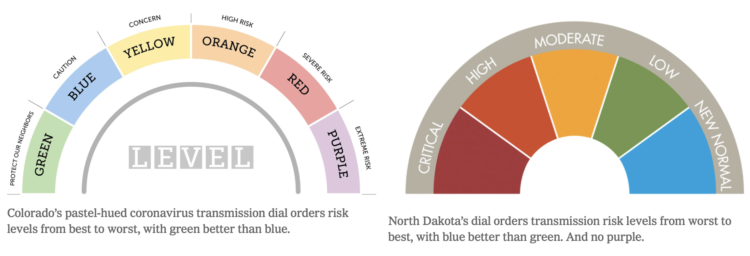
Many states use color to represent levels of Covid-19 and/or county restrictions. The color scales states use vary across the country. For The New York Times, Caity Weaver details the usage and the challenges of picking meaningful scales.
-
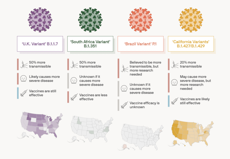
For Axios, Will Chase, with illustrations by Brendan Lynch, provides the current status of known variants of the coronavirus. The tracker shows the estimated transmission rate, severity, vaccine efficacy, and prevalence.
-
Members Only
If you only consider data format to choose your chart type, then yeah, you’re probably approaching the problem too mechanically. But it’s still part of the process.
-
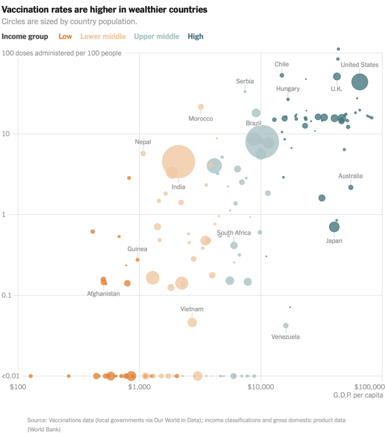
For The New York Times, Keith Collins and Josh Holder look at the relationship between country wealth and vaccination rates. Wealthier countries made deals with drug makers earlier, which means poorer countries are not able to secure as many vaccines.
-
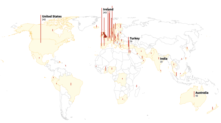
As you likely know, there are coronavirus variants around the world. Reuters mapped the spread of the Kent variant, which was detected in the English county of Kent.
-
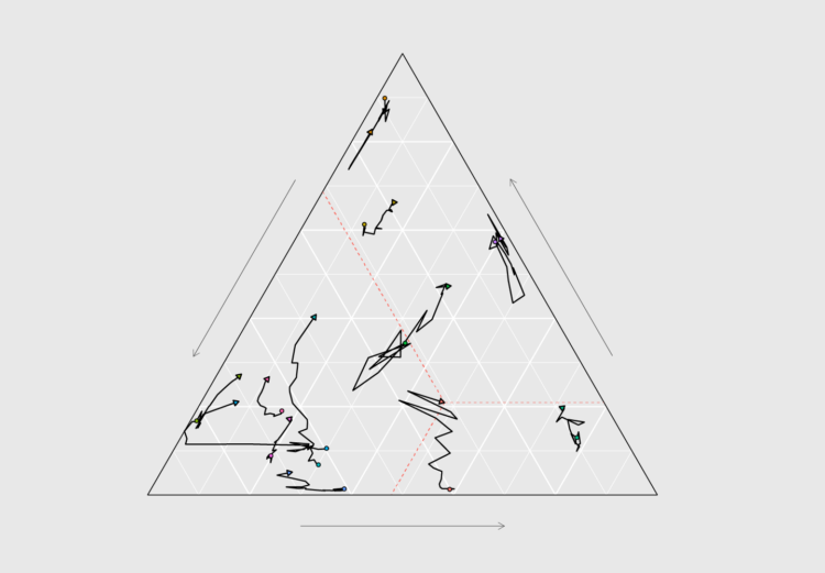
How to Make Ternary Plots in R, with ggplot2
When you want to compare between three parts of your data, ternary plots might be a good option. Here is how to make them.
-
Search history can say a lot of about a person, like where they’re going, where they want to be, what they want to learn about, or what they’re trying to make — at some point in their life. Search Record, by Jon Packles, is a way to parse through your history. Download your archive, import it into the locally-run tool, and explore.
I’m more of DuckDuckGo person, so I can speak to the specificity of the tool, but it looks insightful. At the least, I’d want to download my search archive and play around with it.
-
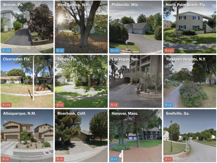
NYT’s The Upshot has a quiz that puts you in a neighborhood via Google Maps images. Who did the neighborhood vote for in the 2020 presidential election? The aggregate of reader results is the most interesting part, which shows a strong correlation between correct guesses and the magnitude of the win by a candidate.
I much prefer this quiz over the refrigerator one The Upshot put up last year.
-
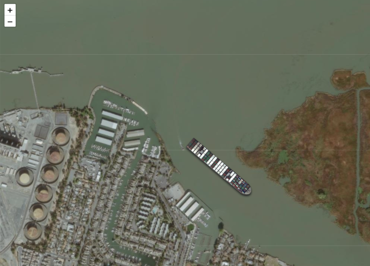
The Ever Given got stuck in the Suez Canal. It was refloated. So now you can use this “ridiculous thing” by Garrett Dash Nelson to get the Ever Given stuck anywhere in the world. Show the ship to scale and click-and-drag the satellite imagery, and you get a pretty good idea of how big the thing is.
-
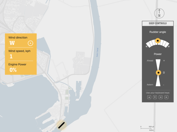
To better understand the challenge of steering a giant container ship through the Suez Canal, CNN made an interactive that lets you do just that. Control the power and point a silhouette of the Ever Given in the right direction without crashing.
It is of course a simplification that doesn’t account for things like water depth and passing boats, but it does leave you wondering how giant ships don’t get stuck more often.
-
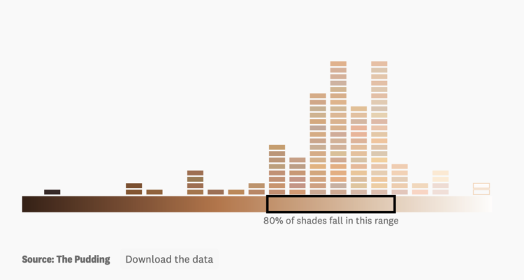
For The Pudding, Ofunne Amaka and Amber Thomas looked at shades, words, and numbers used to describe foundation makeup:
A 2020 study investigating the connotations of foundation shade names in 20 products found that dark shades were largely named after “the least valuable substances and objects” while lighter shades were labeled after “decorative, valuable, and precious objects.” Our analysis revealed similar results, and the more you study the data, the more patterns of microaggressions specifically targeting Black and Brown consumers begin to materialize.
Recently for Members
Second Edition
 Visualize This: The FlowingData Guide to Design, Visualization, and Statistics (2nd Edition)
 Visualize This: The FlowingData Guide to Design, Visualization, and Statistics (2nd Edition)
New tools, refined process.
Browse by Chart Type See All →


