Every month I collect new visualization tools and learning resources to help you make better charts. Here’s the good stuff for February 2021.
Every month I collect new visualization tools and learning resources to help you make better charts. Here’s the good stuff for February 2021.
RAWGraphs, a tool conceived by DensityDesign in 2013, got a 2.0 update in a collaborative effort between DensityDesign, Calibro and Inmagik:
RAW Graphs is an open source data visualization framework built with the goal of making the visual representation of complex data easy for everyone.
Primarily conceived as a tool for designers and vis geeks, RAW Graphs aims at providing a missing link between spreadsheet applications (e.g. Microsoft Excel, Apple Numbers, OpenRefine) and vector graphics editors (e.g. Adobe Illustrator, Inkscape, Sketch).
Load your dataset, and make a wide range of charts with the point-and-click interface. The options try to update smartly depending on your data and visualization choices.
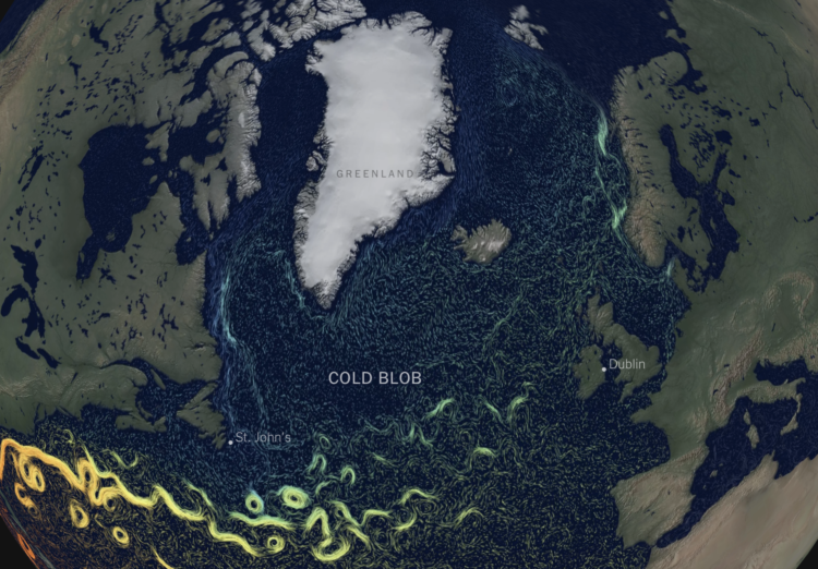
This is quite a dive by Moises Velasquez-Manoff and Jeremy White for The New York Times. They look at the potential danger of melting ice from Greenland flowing into the Gulf Stream.
An animated map of currents and temperature, reminiscent of NASA’s Perpetual Ocean from 2011, shows what’s going on underwater. The piece flies you through as you scroll with a familiar view as if you’re in space looking down.
Keep reading though, and you’re taken underwater 800 feet below the surface. It’s like seeing the currents from a fish’s point of view.
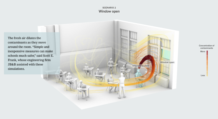
As schools begin to reopen, The New York Times illustrates why classrooms should open a window for ventilation. Lower viral concentrations swirling around means reduced exposure.
The 3-D model to show airflow was already something, but keep scrolling to see the cross-sections. Then scan the QR code on your phone to see the simulated data with augmented reality.
Minimum wage has increased over the years, but by how much depends on where you live.
Oftentimes we see “algorithms” referenced in various contexts, but the definition of an algorithm is often unclear. For MIT Technology Review, Kristian Lum describes what an “algorithm” means these days:
In statistics and machine learning, we usually think of the algorithm as the set of instructions a computer executes to learn from data. In these fields, the resulting structured information is typically called a model. The information the computer learns from the data via the algorithm may look like “weights” by which to multiply each input factor, or it may be much more complicated. The complexity of the algorithm itself may also vary. And the impacts of these algorithms ultimately depend on the data to which they are applied and the context in which the resulting model is deployed. The same algorithm could have a net positive impact when applied in one context and a very different effect when applied in another.
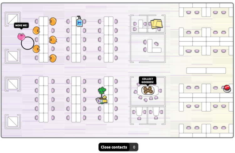
For Reuters, Sarah Slobin and Feilding Cage imagine life back at the office with an interactive game. Navigate through different office scenarios while maintaining social distance:
To understand what that might feel like, we spoke to some experts on work and workspaces who predicted that social distancing measures and hybrid work models are here to stay. Walk through our simulations below to experience what going back to the old/new office might be like. Make sure to avoid contact with others along the way!
I haven’t worked in a proper office in many years, and it never appealed to me, but it sounds pretty nice these days.
The Centers for Disease Control and Prevention released a report that said life expectancy decreased by a full year in 2020. While the calculation is correct, the interpretation and message from that number is more challenging. For STAT, Peter B. Bach provides context to the measurement:
Don’t blame the method. It’s a standard one that over time has been a highly useful way of understanding how our efforts in public health have succeeded or fallen short. Because it is a projection, it can (and should) serve as an early warning of how people in our society will do in the future if we do nothing different from today.
But in this case, the CDC should assume, as do we all, that Covid-19 will cause an increase in mortality for only a brief period relative to the span of a normal lifetime. If you assume the Covid-19 risk of 2020 carries forward unabated, you will overstate the life expectancy declines it causes. […]
Bach wonders if the CDC should have released the report at all, if most people were just going to misunderstand it. That seems like the wrong direction though. Life expectancy is a useful metric, and if you know there are a lot of chances for miscommunication, you try your best to explain the numbers with the audience in mind.
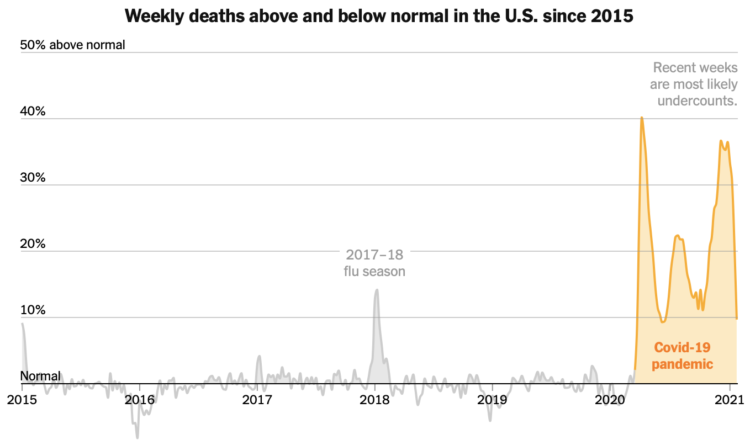
While we’re on the topic of scale, The New York Times plotted weekly deaths below and above normal since 2015. Check out that Covid-19 pandemic mountain.
NYT has been updating this chart, but I hadn’t looked at it in a while. Just, wow.
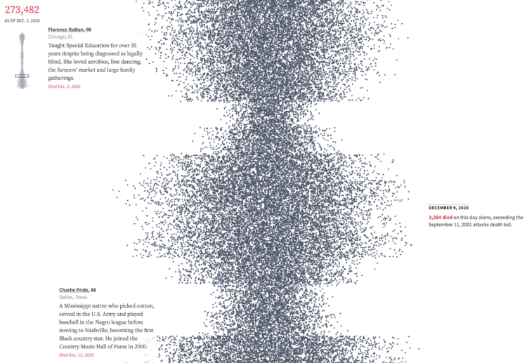
The United States passed the half million mark for confirmed Covid-19 deaths. It’s difficult to imagine 500,000 of anything, let alone deaths in a year, so Reuters used a modified beeswarm chart to show the timeline of events and the individual deaths. Each dot represents a death, and a scaled down version of the chart appears in the top left corner to show where you are in the timeline.
It’s not possible to reflect the true meaning of such a scale through a screen, but the mini-obituaries on the left-hand side help. I had to pause a few times.
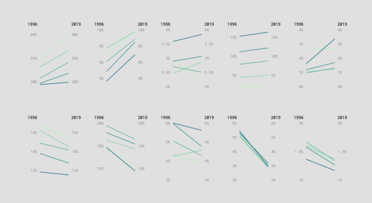
I compared spending in 1996 against the most recent spending estimates from the Bureau of Labor Statistics.
I’m happy to announce a new course on mapping geographic data in R, using the ggplot2 package. The course is by data journalist and visualization consultant Maarten Lambrechts, and it’s available immediately to FlowingData members.
If you’re not a member yet, now is a great time to join. You get instant access to this course, plus four others and over a hundred in-depth visualization tutorials.
For those who’ve read FlowingData for a while probably know that I’m not much of ggplot2 user. It’s not that I don’t like it. I just never worked it into my workflow, and what I’m using now hasn’t stalled my work yet.
But when it comes to visualizing data, I’m a firm believer in learning a wide array of tools. A flexible toolset lets you visualize data in the way that you want. The tool shouldn’t be the limiting factor.
Hence, this course.
I worked through the course myself, and I’ll tell you first-hand that it’s fun, practical, and will get you up to speed quick. There’s real data, concrete examples, and you’ll be making beautiful maps with your own data in no time.
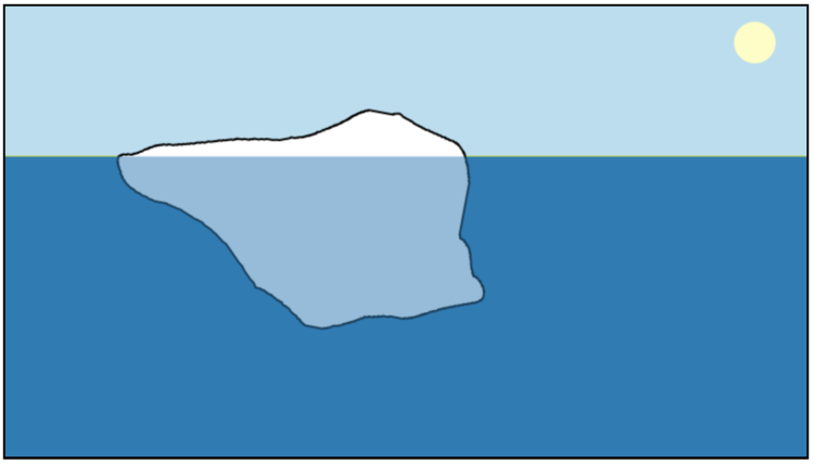
A common depiction of an iceberg is one that has a short head peeking out of the water and a deep spike underneath. However, as Megan Thompson-Munson pointed out, that’s not how icebergs actually float. Because physics.
Inspired by Thompson-Munson’s comment, Joshua Tauberer made Iceberger, which is a fun interactive that lets you draw an iceberg of your own and the shape floats accordingly.
[arve url=”https://vimeo.com/370007362″ loop=”no” muted=”no” /]
For several years, Xavi Bou has been using long-exposure photography to capture stills of bird flight patterns. The project, Ornitographies, produced gloriously abstract images. There’s also a video (above) piece under the same premise.
Jessica McKenzie, reporting for Audubon:
More recently, Bou has expanded the project to video, including one called Murmurations that shows a flock of starlings evading a hawk. “What happens is, if in this moment a hawk appears to attack them, it’s when they do this dance,” he says. “The hawk is like carving this ephemeral sculpture that’s in the air.” As with the still images, Bou knit multiple series of photographs together to create an animation. He estimates that every day of filming requires two weeks of post-production work; for Murmurations, he also enlisted the help of a film editor. The final product, which was filmed in southern Catalonia, was then set to ethereal music.
The video deserves the full-screen treatment.
See also the swallows of essex by Dennis Hlynsky.
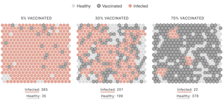
As vaccinations roll out, we work towards herd immunity, there are various challenges to consider along the way. Thomas Wilburn and Richard Harris, reporting for NPR, used simulations to imagine three scenarios: a more infectious variant of the coronavirus, high initial immunity, and low initial immunity.
Since it’s a simulation it of course doesn’t consider every real-life detail of immunity and viral spread, but the animations and the hexagon grids provide a good overhead view.
The two approaches answer two different questions.

When we visualize data to communicate to others, we must consider what others see through their eyes. Sim Daltonism by Michel Fortin is a free app for the Mac that lets you see how those with various types of color blindness perceive what’s on your computer screen.
It’s simple to use. Just drag a window over any part of your screen to see the differences.
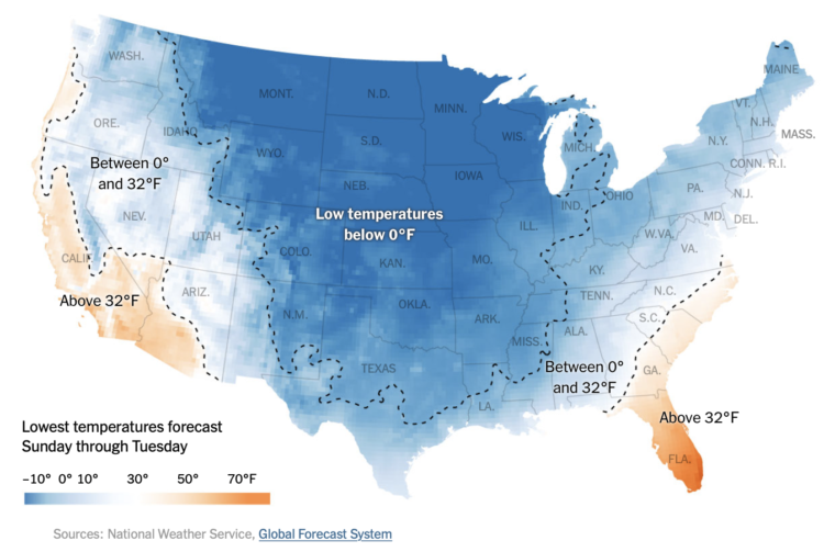
Based on data from the Global Forecast System, The New York Times mapped the lowest temperatures across the country between February 14 and 16.
The blue-orange color scale diverges at freezing, which creates a striking image of a very cold country. The dotted lines and temperature labels make the patterns especially obvious.
As someone who lives in an orange area, I was shocked by all of the blue. Stay safe.
Thomas Lin Pedersen announced the ragg package, which makes font usage in R more straightforward:
I’m extremely pleased to present the culmination of several years of work spanning the systemfonts, textshaping, and ragg packages. These releases complete our efforts to create a high-quality, performant raster graphics device that works the same way on every operating system.
This blog post presents our improvements to ragg’s font rendering so that it now “just works” regardless of what you throw at it. This includes:
- Support for non-Latin scripts including Right-to-Left (RtL) scripts
- Support for OpenType features such as ligatures, glyph substitutions, etc.
- Support for color fonts
- Support for font fallback
All of the above comes in addition to the fact that ragg is able to use all of your installed fonts.
If you’ve tried to make publication-level graphics completely in R, you’re probably familiar with the challenge of using non-default fonts. The correct steps depend on your system and the words you want to add. It’s one of the reasons I bring R output into Adobe Illustrator, so now there’s one less extra step. Nice.


 Visualize This: The FlowingData Guide to Design, Visualization, and Statistics
Available now.