• Membership
  • Newsletter
  • Projects
  • Learning
  • About
  • Member Login
  • Repulsive curves

    August 30, 2021

    Topic

    Visualization  /  curves, optimization, research

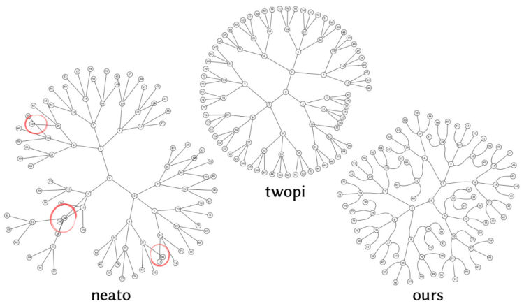
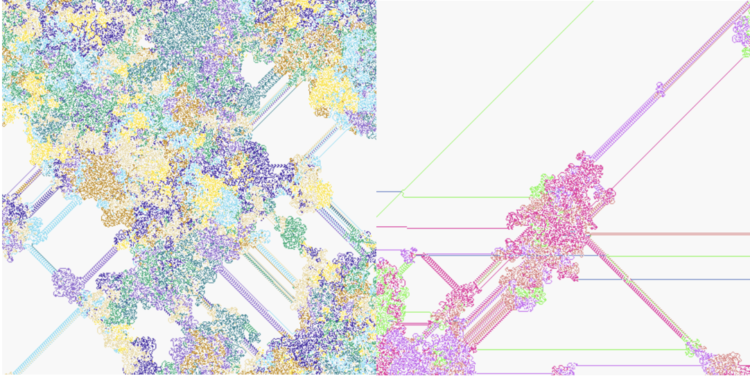
    Chris Yu, Henrik Schumacher, and Keenan Crane from Carnegie Mellon University are working on repulsive curves, which is a method to efficiently unravel curves so that they don’t overlap:

    Curves play a fundamental role across computer graphics, physical simulation, and mathematical visualization, yet most tools for curve design do nothing to prevent crossings or self-intersections. This paper develops efficient algorithms for (self-)repulsion of plane and space curves that are well-suited to problems in computational design. Our starting point is the so-called tangent-point energy, which provides an infinite barrier to self-intersection. In contrast to local collision detection strategies used in, e.g., physical simulation, this energy considers interactions between all pairs of points, and is hence useful for global shape optimization: local minima tend to be aesthetically pleasing, physically valid, and nicely distributed in space.

    Be sure to watch the video demo.

  • Lightning algorithm

    August 27, 2021

    Topic

    Statistical Visualization  /  algorithm, Matt Henderson, Numberphile

    [arve url=”https://www.youtube.com/watch?v=akZ8JJ4gGLs” loop=”no” muted=”no” /]

    Matt Henderson on Numberphile shows off a “lightning algorithm” which is actually a maze-solving algorithm that shows the solution at the end. Come for the demo at the beginning but stay for the explanation.

  • Members Only

    Visualization Tools and Learning Resources, August 2021

    August 26, 2021

    Topic

    The Process  /  roundup

    Here’s the good stuff for August.

  • Data Underload  /  time use

    Cycle of Many, a 24-hour snapshot for a day in the life of Americans

    This is a 24-hour snapshot for a day in the life of Americans.

    Read More
  • Machine learning explained at five difficulty levels

    August 25, 2021

    Topic

    Statistics  /  Hilary Mason, machine learning, Wired

    [arve url=”https://www.youtube.com/watch?v=5q87K1WaoFI” loop=”no” muted=”no” /]

    For their 5 Levels series, Wired brought in Hilary Mason to explain machine learning at five levels of difficulty. Mason’s explanations are super helpful at every level.

  • Diversity within the Asian population

    August 24, 2021

    Topic

    Maps  /  Asian, diversity, New York Times

    Robert Gebeloff, Denise Lu and Miriam Jordan for The New York Times looked at overall increases and variation within the Asian population:

    North Dakota, South Dakota, Texas, North Carolina and Indiana are among states that experienced major growth in the past decade. And people of Asian descent have been settling in ever larger numbers in states like West Virginia, where the overall population has declined.

  • Inflation isn’t that exciting

    August 23, 2021

    Topic

    Statistical Visualization  /  inflation, New York Times

    For NYT Opinion, Josh Bivens and Stuart A. Thompson argue that you don’t need to panic about inflation:

    It may surprise many Americans that even during times of strong growth and very low inflation (like the late 1990s) or weak growth and low inflation (like the years following the Great Recession), more than half of all goods and services are usually experiencing price increases. In part, this is because it is awfully hard for employers to cut nominal wages, even in a recession. And economists see some mild, steady economy-wide inflation as a sign of a healthy economy. The Fed, for instance, actively targets an average overall inflation level of 2 percent per year.

    I like the mini visual cues in the body text so that you don’t have to scroll or refer back to the full chart to see what they’re talking about.

  • NBA carry jobs

    August 20, 2021

    Topic

    Statistical Visualization  /  basketball, Pudding, Russell Goldenberg

    With professional basketball, we often hear about carry jobs. There’s one star player who carries everyone else to a championship. Russell Goldenberg for The Pudding looked for the biggest carry jobs in NBA Finals history.

  • Members Only

    Different Points of View from the Same Data – The Process 153

    August 19, 2021

    Topic

    The Process  /  purpose, questions, tradeoffs

    It still amazes me that you can give multiple people the same dataset and the results can vary depending on questions, goals, and audience.

  • Data Underload  /  routine, time use

    Daily Routine, 2020

    After looking at how much time we spent on daily activities in 2020, let’s look at when we spent our time.

    Read More
  • Generative art with R

    August 18, 2021

    Topic

    Software  /  generative art, R

    Generative art seems to be having a moment right now, so it’s only appropriate that there’s an R package to help you make some. The aRtsy package by Koen Derks makes algorithms more straightforward to use. Set parameters and you’re off.

  • How vaccines can make a difference with the Delta variant

    August 17, 2021

    Topic

    Infographics  /  coronavirus, Delta variant, Lauren Letherby, New York Times, vaccination

    We see percentages for the vaccinated and unvaccinated, and people can easily misinterpret or miscommunicate the results. It’s especially problematic when people are actively trying to confirm misconceptions. For The New York Times, Lauren Leatherby tries to make things clearer imagining two groups: one that is 20% vaccinated and one that is 95% vaccinated.

    Vaccines work.

  • Multiracial people counted in the census

    August 16, 2021

    Topic

    Statistical Visualization  /  census, multiracial, NPR

    Using unit charts, NPR shows the number of people who identify with each race or ethnicity:

    [A] different kind of breakdown can show how racial groups are becoming more heterogeneous. This graphic shows the number of people who said they identified with each race, regardless of how many races they chose. For example, if a person said they identified as Black and Asian, they would appear in both racial categories.

  • Race and ethnicity map of dots

    August 16, 2021

    Topic

    Maps  /  census, CNN, population, race

    CNN goes with the dot density map for their first pass on the 2020 decennial. Each dot represents a certain number of people depending on your zoom level. Color represents race or ethnicity.

    Does CNN have a limited color palette that they’re allowed to use? I would’ve gone for more contrast between the light blue for white and darker-but-still-light blue for American Indian/Alaskan Native.

    See also: Dustin Cable’s racial dot map from 2013 and Erica Fischer’s dot maps of the same flavor from 2010.

  • Shift in white population vs. people of color

    August 13, 2021

    Topic

    Maps  /  census, New York Times, race

    The New York Times go with the angled arrows to show the shifts in racial population. The red-orange arrows show an increase in the share of white population, and the teal arrows show an increase in the share of people of color. Longer arrows mean a greater percentage point change.

    Whereas The Washington Post focused more on the changes for each demographic individually, NYT focused more on how two broad groups compared.

  • Maps of racial population change

    August 13, 2021

    Topic

    Maps  /  census, race, Washington Post

    Using their peaks and valleys metaphor, The Washington Post shows the shift in racial population between 2010 and 2020. The open triangles, one for each county, show population with width, population growth with height, and fastest-growing race or ethnicity with color.

    You might recognize the form from the Post’s 2016 election results, but there’s a small wrinkle when you look at the breakdowns for individual groups. The triangles flip upside down for where population decreased.

  • More detailed data release from Census 2020

    August 13, 2021

    Topic

    Data Sources  /  Census Bureau, demographics

    After a lot of angst over the past few years around undercount, representation, and anonymization, the Census Bureau released detailed data from the 2020 decennial census:

    The U.S. Census Bureau today released additional 2020 Census results showing an increase in the population of U.S. metro areas compared to a decade ago. In addition, these once-a-decade results showed the nation’s diversity in how people identify their race and ethnicity.

    “We are excited to reach this milestone of delivering the first detailed statistics from the 2020 Census,” said acting Census Bureau Director Ron Jarmin. “We appreciate the public’s patience as Census Bureau staff worked diligently to process these data and ensure it meets our quality standards.”

    These statistics, which come from the 2020 Census Redistricting Data (Public Law 94-171) Summary File, provide the first look at populations for small areas and include information on Hispanic origin, race, age 18 and over, housing occupancy and group quarters. They represent where people were living as of April 1, 2020, and are available for the nation, states and communities down to the block level.

  • Procedurally generated fish drawings

    August 13, 2021

    Topic

    Data Art  /  drawing, fish, Lingdong Huang, procedural

    Lingdong Huang’s project fishdraw seems straightforward on the surface. You go to the page and there’s a drawing of a fish. But then you keep clicking the refresh arrow and realize the fish are procedurally generated, including the name on the bottom. So good.

  • Members Only

    Seeing Ranges – The Process 152

    August 12, 2021

    Topic

    The Process  /  range, variation

    You’re gonna miss out on all the good stuff if you just stare at the middle.

  • How countries ranked by Olympic medal counts

    August 12, 2021

    Topic

    Statistical Visualization  /  Josh Katz, New York Times, Olympics

    Ranking countries by medal count change depending on how much value you place on each medal. Should you just count number of medals straight up, or should you give more weight for gold than for silver or bronze? Josh Katz for The New York Times revamped his 2018 interactive for 2020 results, which lets you assign different weights to see how the overall rankings change.

    The United States took first and China second, but there are many rank combinations among the rest.

  • Page 76 of 392
  • <
  • 1
  • ...
  • 73
  • 74
  • 75
  • 76
  • 77
  • 78
  • ...
  • 392
  • >

Analyze, visualize, and communicate data usefully, beyond the defaults.

Become a member →

Recently for Members

May 15, 2025
Step Chart, Enhanced

May 8, 2025
When the data is not what it seems

May 1, 2025
Finding the Right Charts

April 24, 2025
Visualization Tools, Datasets, and Resources – April 2025 Roundup

April 17, 2025
Breaking Out of Chart Software Defaults

Browse by Chart Type See All →

Line Chart Parallel Sets Pictogram Parallel Coordinates Dot Map Cartogram Barcode Chart Dot Plot Grid Map

Browse By Topic

  • Visualization

    Seeing data

  • Maps

    Seeing geographic data

  • Infographics

    Explaining data

  • Networks

    Connecting data

  • Statistics

    Analyzing data

  • Software

    Working with data

  • Sources

    Getting data

  • Design

    Making data readable

Get the Book

Visualize This: The FlowingData Guide to Design, Visualization, and Statistics

Available now.

Order: Amazon / Bookshop

Made by FlowingData

  • The Process

  • Data Underload

  • Chart Everything

  • Guides

  • Books

  • Shop

  • About
  • Contact
  • Newsletter
  • LinkedIn
  • Instagram
  • Bluesky
  • RSS
Copyright © 2007-Present FlowingData. All rights reserved.