John Rich made pie charts of dog body proportions. This is very important.
-
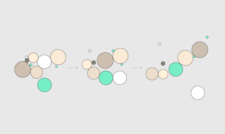
How to Make an Animated Donut Chart in R
There are “better” ways to show proportions over time, but sometimes you just want an animated donut.
-
For The New York Times, Pablo Robles, Anton Troianovski, and Agnes Chang mapped the change in destinations for Russian private jets, before and after sanctions. Before, it was more about Paris, Milan, and Geneva. After, Dubai became a top destination.
I like the charts after the map. A slope chart with a white fill provides contrast and a flight departures board gives a little something extra.
-
Thousands of smaller airplanes are still allowed to use leaded fuel, which can lead to unwanted emissions around airports. For Quartz, David Yanofsky and Michael J. Coren mapped flight activity for such planes against schools, parks, and playgrounds:
These maps illustrate where initial emissions are likely to be highest. Because lead pollution disburses with the wind, anyone within a 1.5 km radius of the runways may be exposed over the long term. But essentially three factors dictate the amount of lead exposure: the volume of air traffic (and thus lead emissions), one’s proximity to the airport, and the prevailing winds. The worst-case scenario for residents? Living alongside a busy airport, downwind of the runway. Often it’s lower-income families living in these areas. To determine individual lead risks, more detailed studies, such as the one at Reid-Hillview, would be needed.
Use the search to look activity for airports in your area.
-
Members Only
-
Tonight is game six of the NBA Finals. If the Golden State Warriors beat the Boston Celtics, the Warriors win it all and the season is done. So we almost went an entire playoffs without a cumulative multi-line chart that shows current and notable players. Luckily, NYT’s The Upshot got it done with cumulative three-pointers in career playoff games. That was close.
-
Wayne Oldford, a statistics professor at the University of Waterloo, explains risk in the context of daily life at the individual level, because “one in a million” is not especially intuitive:
A few years ago, I was the “go to guy” at the University of Waterloo, asked to speak to local media, whenever a lottery jackpot got stupendously large (and the news cycle got exceedingly slow). My purpose was to relate to their audience the size of the chance of winning in a way that was quick yet comprehensible, which I did with some success on local radio and television stations.
Inevitably, though, the next day I would hear back of listener disappointment – that some of the fun of purchasing a ticket had been removed. Joy came from anticipating winning the prize and my exposition killed that for many, by them having gained an appreciation of the chance of actually winning.
I felt a little bit bad about this. I wanted people to understand the probabilities but I didn’t want to be a kill joy.
Important reading if you’re trying to understand the odds of things these days.
My favorite explanation of risk in the day-to-day is still the one from David Spiegelhalter.
-
Hands-On Data Visualization, by Jack Dougherty and Ilya Ilyankou, is an open-access book geared for beginners. The book starts with spreadsheets, and then walks you through some of the more high-level JavaScript libraries to put things online relatively quickly. If you don’t have programming experience but want to kick the tires, it’s probably worth saving this for later.
You can also grab a physical copy.
-
The Marshall Project and Axios report that the FBI changed their reporting system last year, and 40 percent of law enforcement agencies didn’t submit any data:
In 2021, the FBI retired its nearly century-old national crime data collection program, the Summary Reporting System used by the Uniform Crime Reporting (UCR) program. The agency switched to a new system, the National Incident-Based Reporting System (NIBRS), which gathers more specific information on each incident. Even though the FBI announced the transition years ago and the federal government spent hundreds of millions of dollars to help local police make the switch, about 7,000 of the nation’s 18,000 law enforcement agencies did not successfully send crime data to the voluntary program last year.
I am sure policymakers will definitely be very responsible and cite data appropriately and not cherrypick from incomplete data to push an agenda.
-
Christophe Coupé and company analyzed speech rate (on the left) across different languages, and then compared it to information rate (on the right) in bits per second. While speech rate and information rate are still coupled, there’s less variation in information rate across languages. More syllables doesn’t necessarily mean more information.
-
This fun interactive map by William B. Davis shows you the ten closest airports, given a location in the world. The current location serves as the “hub”, and the ten “spokes” go out to the airports. The best part is when you move the globe around, the hub-and-spokes look like a creature crawling across the map.
-
James Eagle used an animated donut chart to show browser share from 1996 to present. I have fond memories of firing up Netscape to punch in a web address I saw in a magazine. It felt like I was opening something top secret. I didn’t realize Internet Explorer took over so quickly.
I was born before the world wide web. We can't imagine living without it. Although I can because I did live before it. I create this data visualisation to tell this stor#Innovation #Technology #internet #datavisualisation pic.twitter.com/HrgUjpipeI
— James Eagle (@JamesEagle17) June 3, 2022
-
Members Only
-
Matt Daniels and Russell Goldenberg for The Pudding are tracking heat records in 400 cities in the United States. Choose a city, see if yesterday was a record, and find out how it measures up against past records over time.
I wonder if this is one of those times it might’ve been better to make a series of graphics instead of adhering to a single form and transitioning between views. I got a little lost in the noise initially.
-
There are thousands of satellites that orbit Earth, with about half of them launched in the past three years. Financial Times shows why that’s a problem in a scrolling piece through space debris:
In 1978, Nasa astrophysicist Donald J Kessler outlined a theory of what would happen if space traffic continues to grow and collisions occur. The debris created by those collisions would skitter off into the paths of other satellites, creating yet more debris.
Over time, Kessler argued, a chain reaction of cascading collisions could one day make low Earth orbit hard to access and even prevent manned spaceflight from leaving Earth: a phenomenon since labelled the “Kessler syndrome”.
-
Karim Douïeb, in collaboration with Possible, mapped noise in Paris, New York, and London. The color on each map represents noise level, and if you have your sound on, you can mouse over areas to hear what noise might be like. The project, Noisy Cities, is an adaptation of Douïeb’s previous map of Brussels.
You get a good idea of what noise pollution is like geographically. All it needs now is a machine to blow varying levels of smog in your face.
Also something new I learned: the Department of Transportation has a transportation noise map that shows modeled noise levels nationally.
-
I wondered how common it is for someone to get a divorce. While I’ve touched on the topic before, I’ve never calculated it directly, so I gave it a go.
-
Eli Holder shows how he split his freelance time across various projects and categories. With visualization work, a lot of your time is spent doing non-visualization things:
As expected, at 16 percent, data wrangling and analysis takes a significant chunk of total time. This includes data prep, which I’ve categorized as fairly mindless data engineering or spreadsheet maneuvering (nine percent) or data pulls (three percent). More interesting data work was more fragmented: ~two percent of the time was exploratory analysis (e.g., for storytelling), ~one percent of the time was spent designing metrics (e.g., exploring different calculations that might best tell a given story) and another one percent was creating mock datasets (e.g., to compensate for data security constraints or clients who are slow to provide real data).
I don’t track my time with FlowingData, but if I were to guess, I spend at least half my time on analysis and wrangling. If you consider the many potential visualization projects that I scrapped because nothing panned out in analysis, that analysis/wrangling percentage goes up a lot more.
Sometimes you gotta dig a lot before you find anything worth showing.
-
[arve url=”https://www.youtube.com/watch?v=WZGQJvfGq48″ /]
Hannah Fry works with statistics and risk, but her perspective changed when she was diagnosed with cancer. Fry documented the experience and it’s available on BBC:
Hannah Fry, a professor of maths, is used to investigating the world around her through numbers. When she’s diagnosed with cervical cancer at the age of 36, she starts to interrogate the way we diagnose and treat cancer by digging into the statistics to ask whether we are making the right choices in how we treat this disease. Are we sometimes too quick to screen and treat cancer? Do doctors always speak to us honestly about the subject? It may seem like a dangerous question to ask, but are we at risk of overmedicalising cancer?
At the same time, Hannah records her own cancer journey in raw and emotional personal footage, where the realities of life after a cancer diagnosis are laid bare.
You can only watch the film in the UK for now, but she spoke about the topic on the Numberphile podcast. Worth a listen.
-
With gas prices a lot higher than usual, Júlia Ledur, Leslie Shapiro, and N. Kirkpatrick, for The Washington Post, provide a calculator to see how much more your road trip will cost in the United States. Just put in your starting point, destination, and the type of car you drive.
Going the other direction, they also show how far you could go today on a 2019 budget with a handful of popular road trips. You’d kind of get stuck in the middle of nowhere.
I don’t drive much these days, but driving down Interstate 5 in California this past weekend had me feeling thankful that I didn’t buy that SUV in 2016.