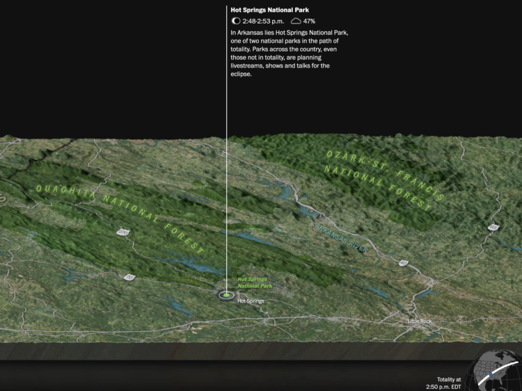
With the growth in online shopping over the years, companies required more space to store their products, which gave rise to mega warehouses (more than 100k square feet) across the country. Judith Lewis Mernit and Geoff McGhee describe and show the growth with a map.
-
Sarah Slobin and Joanna Plucinska, for Reuters, report on the challenges of counting and tracking thousands of orphans in Ukraine who were evacuated and relocated when Russia invaded:
When Russia invaded on Feb. 24, there were more than 105,000 children in Ukraine’s network of more than 700 institutions – known as orphanages or ‘internats’ – either full-time or part-time. That’s just over 1% of the child population – the highest rate of institutionalization in Europe, according to data from the European Union and UNICEF.
Around half the children in Ukraine’s orphanages were disabled, according to UNICEF. But Ukraine’s state record-keeping system, known as UIAS “Children,” was not capable of tracking or tracing children sent home from institutions, according to the Support to Ukraine’s Reforms for Governance project (SURGe), a Canadian government-funded agency contracted by the NSS to help support it.
-
Serena Wiliams’ tennis career is impressive for its success and longevity, which are easily seen here. The Athletic compiled a list of the Grand Slam champions that Williams beat between 1991 and 2019, which happens to be everyone.
Sometimes the simplest presentation is best. In this example, the angle they looked at the data makes the graphic.
-
Changing the fonts you use for labels and annotation is one of the easiest ways to make charts more readable and less messy, which makes a chart more inviting to examine. For Datawrapper, Lisa Charlotte Muth discusses font choices and what to look for.
Can’t go wrong with another one of Muth’s clear and practical guides.
-
Measuring the condition of the economy is tricky, because there are many parts to the economy. You can’t just say it’s good or bad. So Ben Casselman and Lauren Leatherby, for The New York Times, broke it down with a series of charts to view from different angles.
-
Krisztina Szűcs likes to make animated charts to show sports results, from fencing, handball, soccer, to hockey. She cataloged all of her sports charts in one place. I’m partial to the triangle timelines, which play well to sports with back and forth scores.
-
Dries Depoorter recorded video from open cameras for a week and scraped Instagram photos. Then he used AI to identify the people in the photos and their locations. Depoorter calls it The Follower.
-
Reuters reported on the fires in the Arctic and the relatively high levels of carbon emissions they release in the atmosphere. The map above shows carbon emissions from wildfire in 2021, and the chart on the right shows totals by latitude, which emphasizes the geography in the north.
The illustrations, which I appreciate and have become more of a norm in Reuters pieces, round out the maps and charts with more context:
-
Members Only
-
People have been having fun with the text-to-image generators lately. Enter a description, and the AI churns out believable and sometimes detailed images that match the input. The reason these systems work is because the models were trained on a lot of data, in the form of images. Andy Baio and Simon Willison made a tool to browse a subset of this data behind the recently released Stable Diffusion.
-
In the never-ending quest to find the perfect color scheme for any given situation at any given moment, Coolors is another set of tools to find the right shades for your application. The twist is that there’s a generator that shows you schemes based on inputs, such as a certain hue or a photograph. There is also a list of trending palettes.
-
To serve the ball in tennis, a player first tosses the ball in the air. The New York Times explained the details behind the simple action, from mechanics, positioning, to point of contact. They got fancy with it.
-
Harry Stevens, for The Washington Post, how simulations can be used to detect severely gerrymandered congressional districts. In the interactive, you play the role of concerned citizen with the task of proposing a map that more closely resembles the political leanings of the state as a whole.
-
Know Your Meme analyzed a decade of meme data to see where the memes have come from, breaking it down by year. It’s all Twitter and TikTok these days, but it used to be YouTube and 4chan.
-
The American Time Use Survey asks people to log their activities for a day, and in the most recent release, people also rated the meaningfulness of the activities. Here’s how activity categories rated, sorted by most meaningful to least meaningful.
-
By Engaging Data, this interactive map shows various splits of the United States with the condition that each division has the same population:
This visualization lets you divide the US into 1,2,3,4,5,8 and 10 different segments with equal population and across different dimensions. The divisions are made using counties as the building blocks (of which there are 3143 in the US). There are numerous different ways to make the divisions. This lets you make the divisions by different types of geographic directions and divisions by population density.
-
It appears China wants to impose a blockade around Taiwan with ships, submarines, and airplanes. The New York Times mapped the possibility and how it could disrupt life in and around the island.
-
We tend to celebrate the wins in sports and often forget about or don’t see the climb that athletes take to get to the top. Artur Galocha and Adrian Blanco, for The Washington Post, look back at Serena Williams’ winning career, focusing on who or what she had to compete against from age 15 to 40.
They start with a wideout view that shows Williams’ full career. Then they zoom in to notable career milestones where past competitors fade in and out of the picture. Years and age run along the same axis, and annotation points to key wins.
The timeline view is simple and static, but it is well-made.