You know those signs in workplaces that keep track of days since injury? Making use of NASA APIs, Neal Agarwal used that concept to keep track of natural disasters. As of this writing, it’s been 9,691,764 since the last Apocalyptic Volcanic Eruption (VEI 8). Pretty good.
-

How to Draw and Use Polygons in R
R provides functions for basic shapes, but you can also draw your own for maximum fun.
-
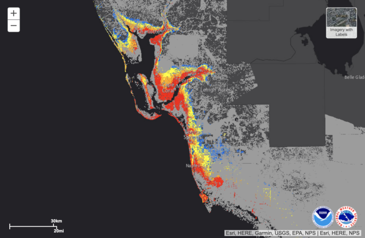
NOAA provides a map of potential flooding due to Hurricane Ian headed towards Florida. Red indicates greater than 9 feet of flooding above ground.
-
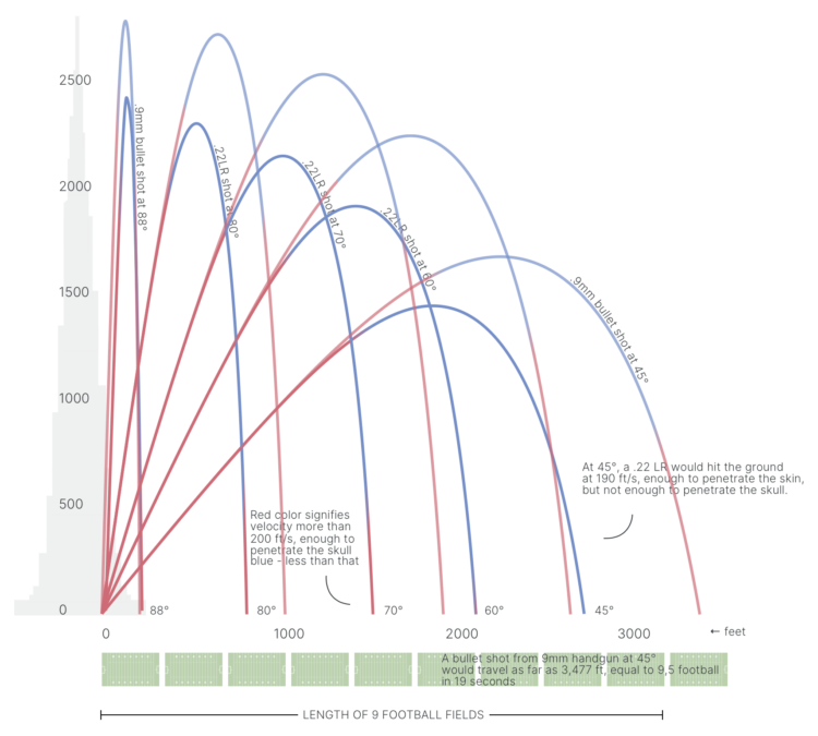
When someone fires a gun into the air, the bullet travels thousands of feet in elevation. Gravity pulls the bullet back down, and it accelerates fast enough to penetrate a human skull by the time it reaches ground-level. Acceleration and trajectory vary by type of gun and the shot angle. 1Point21 Interactive shows the variation and dangers with a visual explainer.
-
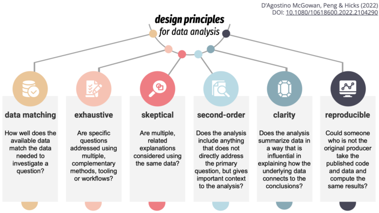
To teach, learn, and measure the process of analysis more concretely, Lucy D’Agostino McGowan, Roger D. Peng, and Stephanie C. Hicks explain their work in the Journal of Computational and Graphical Statistics:
The design principles for data analysis are qualities or characteristics that are relevant to the analysis and can be observed or measured. Driven by statistical thinking and design thinking, a data analyst can use these principles to guide the choice of which data analytic elements to use, such as code, code comments, data visualization, non-data visualization, narrative text, summary statistics, tables, and statistical models or computational algorithms (Breiman 2001), to build a data analysis. Briefly, the elements of an analysis are the individual basic components of the analysis that, when assembled together by the analyst, make up the entire analysis.
-
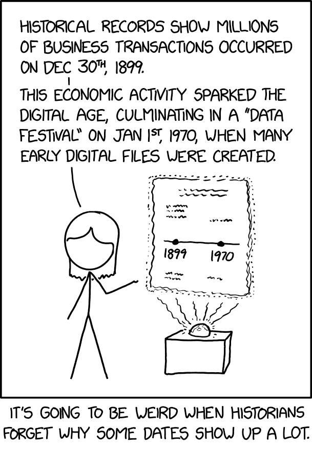
Randall Munroe provides another fine observation through xkcd.
I often wonder what our data and charts will look like a century or two from now. Will the conventions and aesthetics look silly and amateur or classic and vintage? Will what seems like a lot of detailed data now seem spotty and useless, or will we look back in disbelief that companies were allowed to track our activities? Will AI have taken over human cognition and make these questions obsolete, because we’re in a suspended dream state, our bodies used as energy to power super computers, unsure of what is real and what is simulated? Important questions.
-
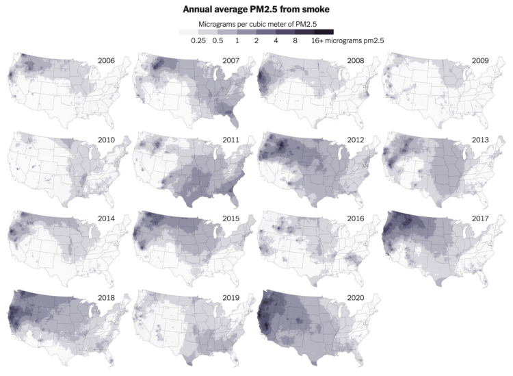
Wildfire obviously damages the areas it comes in direct contact with, but wildfire smoke can stretch much farther. Based on research by Childs et al., Mira Rojanasakul, for The New York Times, shows how pollution from smoke spread between 2006 and 2020.
My kids’ rooms still have air filters from a few years ago, when a fire many miles away made the sky orange and our indoor environment smokey.
-
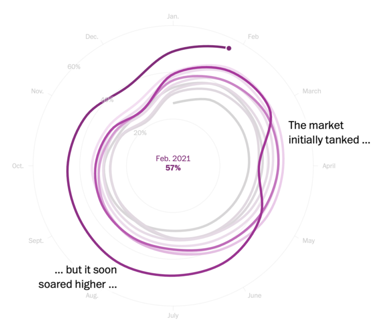
I heard you like spiral charts when the data is seasonal. I think that’s what Kevin Schaul and Hamza Shaban, for The Washington Post, had in mind when they charted housing demand through the lens of percentage of houses sold within two weeks.
-
Rafael Moral sang a very nerdy data analyst song, to the tune of “One Week” by Barenaked Ladies:
The “Data Horror Stories Song”, inspired by a tweet by @rogierK and commissioned by @LisaDeBruine
Any of these ever happened to you?#rstats #Statistics #DataScience pic.twitter.com/7A8PYGbolq
— Rafael Moral (@rafamoral) September 18, 2022
-
Members Only
If you just always assume the data is right, you’ll probably finish with garbage.
-
In a collaborative effort with UX agency Kore, Moritz Stefaner describes work with World Health Organization to develop a data design language for their evolving data collections:
Deliberately designed as a toolbox, rather than a “rule book”, the Data Design Language includes not only principles and guidelines, but also a corresponding design vocabulary and repertoire — for instance, downloadable styles for color and typography, exemplary chart designs, as well as clear specifications for achieving high levels of responsiveness, interaction, internationalization and accessibility.
A custom chart library constitutes the reference implementation for the language and its principles. A corresponding chart creation tool will make it very easy for editors to effortlessly create and publish excellent charts.
-

A reliable dense fog in San Francisco is a defining characteristic of the city, to the delight of some and less delight to others, but the pattern of fog could be on its way out as the climate changes. Scott Reinhard, for The New York Times, visualized the flow of fog and what sucks it into the bay. That intro image is something.
-
Drew Harwell, for The Washington Post, reporting on a growing database and who has access to the records:
The rapid expansion of the database and the ability of 2,700 CBP officers to access it without a warrant — two details not previously known about the database — have raised alarms in Congress about what use the government has made of the information, much of which is captured from people not suspected of any crime. CBP officials told congressional staff the data is maintained for 15 years.
Details of the database were revealed Thursday in a letter to CBP Commissioner Chris Magnus from Sen. Ron Wyden (D-Ore.), who criticized the agency for “allowing indiscriminate rifling through Americans’ private records” and called for stronger privacy protections.
-

Aaron Reiss and Oscar Molina Palestina, for The Pudding, explore the sounds of Mexico City, focusing on the street vendors and daily life. With implementation by Michelle McGhee and illustrations by Diego Parés, the piece walks you through individual sounds with what they mean and why they are relevant.
The sounds on their own probably would’ve just seemed like noise to a foreigner, but the tour through the illustrated city really helps you hear.
-
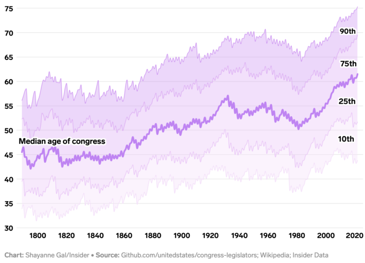
Annie Fu, Walt Hickey, and Shayanne Gal, for Insider, show the disproportionately aging government officials with a series of straightforward charts with lines moving up. You expect age across most occupations to increase with life expectancy, but this seems a bit much.
See also the aging distribution over time.
-
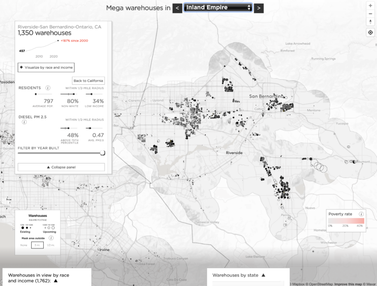
With the growth in online shopping over the years, companies required more space to store their products, which gave rise to mega warehouses (more than 100k square feet) across the country. Judith Lewis Mernit and Geoff McGhee describe and show the growth with a map.
-
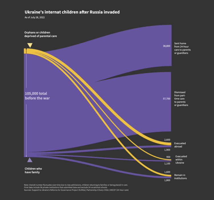
Sarah Slobin and Joanna Plucinska, for Reuters, report on the challenges of counting and tracking thousands of orphans in Ukraine who were evacuated and relocated when Russia invaded:
When Russia invaded on Feb. 24, there were more than 105,000 children in Ukraine’s network of more than 700 institutions – known as orphanages or ‘internats’ – either full-time or part-time. That’s just over 1% of the child population – the highest rate of institutionalization in Europe, according to data from the European Union and UNICEF.
Around half the children in Ukraine’s orphanages were disabled, according to UNICEF. But Ukraine’s state record-keeping system, known as UIAS “Children,” was not capable of tracking or tracing children sent home from institutions, according to the Support to Ukraine’s Reforms for Governance project (SURGe), a Canadian government-funded agency contracted by the NSS to help support it.
-
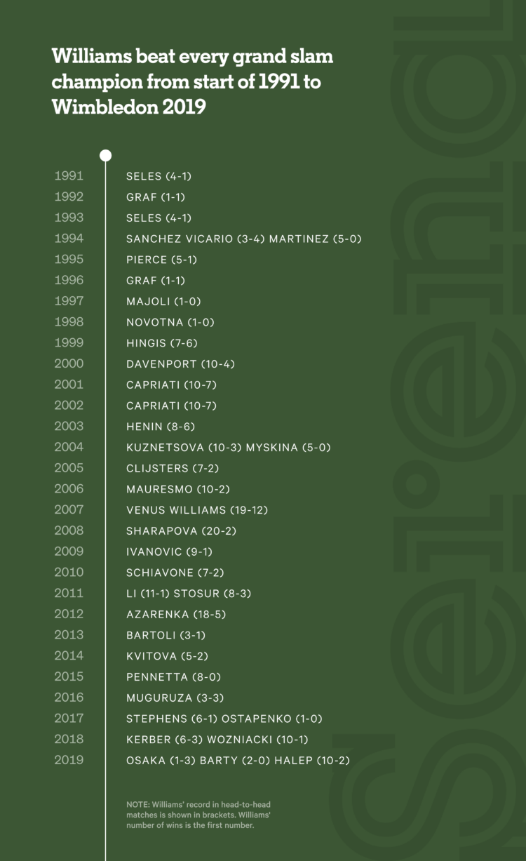
Serena Wiliams’ tennis career is impressive for its success and longevity, which are easily seen here. The Athletic compiled a list of the Grand Slam champions that Williams beat between 1991 and 2019, which happens to be everyone.
Sometimes the simplest presentation is best. In this example, the angle they looked at the data makes the graphic.
-
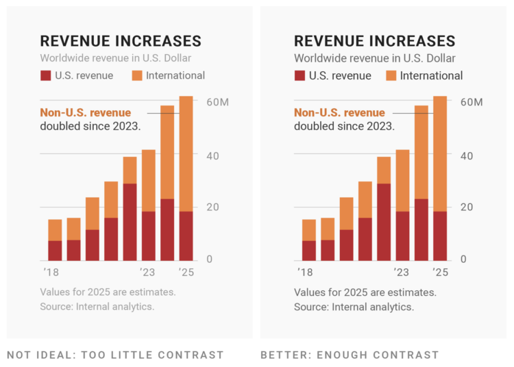
Changing the fonts you use for labels and annotation is one of the easiest ways to make charts more readable and less messy, which makes a chart more inviting to examine. For Datawrapper, Lisa Charlotte Muth discusses font choices and what to look for.
Can’t go wrong with another one of Muth’s clear and practical guides.
Recently for Members
Browse by Chart Type See All →


Browse By Topic
Get the Book
 Visualize This: The FlowingData Guide to Design, Visualization, and Statistics
 Visualize This: The FlowingData Guide to Design, Visualization, and Statistics
Available now.