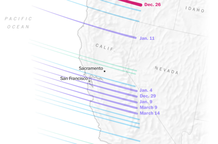
It rained a lot more than usual this winter in California. Diana Leonard and Dylan Moriarty, for The Washington Post, explain the science behind all the water falling from the sky.
It rained a lot more than usual this winter in California. Diana Leonard and Dylan Moriarty, for The Washington Post, explain the science behind all the water falling from the sky.
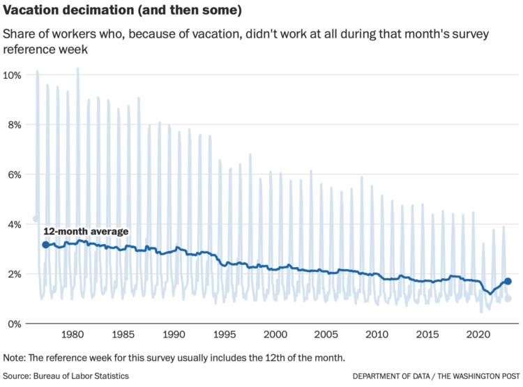
Despite available vacation days, it appears that American workers are taking less and less vacation. Andrew Van Dam, for The Washington Post’s Department of Data, has the demographic breakdowns:
It does not seem to be a matter of vacation-day supply. It is true that the United States is the only advanced economy without guaranteed paid vacation. However, BLS data on employee benefits suggests that more than 90 percent of full-time, private-industry workers have access to paid vacation time, a figure that has remained relatively steady for decades. And the number of paid vacation days offered by the typical employer has ticked up in recent years.
So we looked instead at vacation-day demand: Who uses the most? Has that changed?
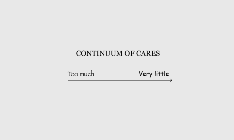
If you don’t use a colorblind-safe color palette in your maps and charts, a significant percentage of people will get nothing out of your work. For The Verge, Andy Baio, who is colorblind, discusses the experience across the web:
Because red and green are complementary colors opposite one another on the color wheel, they’ve become the default colors for every designer who wants to represent opposites: true and false, high and low, stop and go.
Inconveniently, these are also the two colors most likely to be mixed up by people with color vision deficiencies.
I wish every designer in the world understood this and would switch to, say, red and blue for opposing colors. But I know that won’t happen: the cultural meaning is too ingrained.
They used a slider mechanism to show what people with normal vision see and then what Baio sees. I’m usually not into the slider, which often shows a before-and-after view that is meant to highlight contrast. In this case, the views are so different that the contrast works.
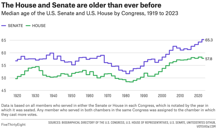
For FiveThirtyEight, Geoffrey Skelley digs into the ongoing trend:
What’s behind these increasingly older Congresses? The country’s aging population as a whole is chiefly responsible, which is most apparent in the disproportionate influence the baby boomer generation has on Capitol Hill. Coupled with longer-running trends that have made it more likely for members of Congress to win reelection and stick around, this has all helped make Congress older than ever before. And the overrepresentation of boomers doesn’t just produce moments like those of the TikTok hearings — it also has real effects on the type of policies passed by the federal legislature.
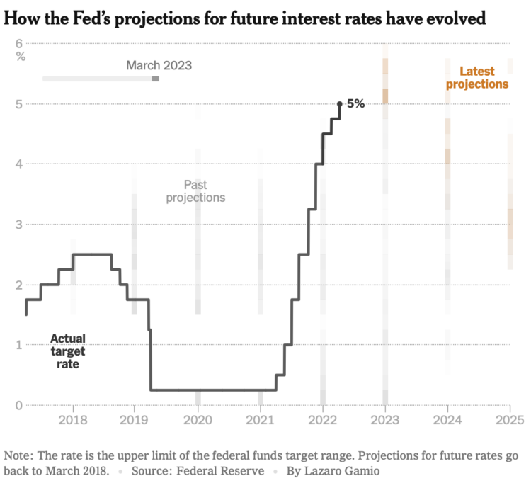
This clever chart by Lazaro Gamio shows changing interest rates set by the Fed and changing projections. The animation makes it.
Jenka Gurfinkel discusses the appearance of the American smile in AI-generated images and its implications in interpreting data:
Every American knows to say “cheese” when taking a photo, and, therefore, so does the AI when generating new images based on the pattern established by previous ones. But it wasn’t always like this. More than a century after the first photograph was captured, a reference to “cheesing” for photos first appeared in a local Texas newspaper in 1943. “Need To Put On A Smile?” the headline asked, “Here’s How: Say ‘Cheese.’” The article quoted former U.S. ambassador Joseph E. Davies who explained that this influencer photo hack would be “Guaranteed to make you look pleasant no matter what you’re thinking […] it’s an automatic smile.” Davies served as ambassador under Franklin D. Roosevelt to the U.S.S.R.
My natural face is generously non-smiley, so this resonated.
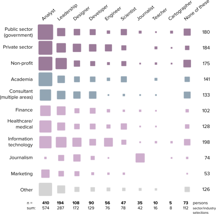
The 2022 results from the State of the Industry survey, run by the Data Visualization Society, are out. Among 1,218 respondents, see the roles, the salaries, and the responsibilities:
The overall median of the annual compensation graphs is at $60,000 to $79,999 per year, with very few respondents reporting over $159,000 per year, and a small but notable increase in the number of respondents reporting annual compensation in the $240,000 per year or more category.
I’d have to look at the actual data, which you can get for this year and previous, but my hunch that the split distribution in salary is between non-tech and tech workers.
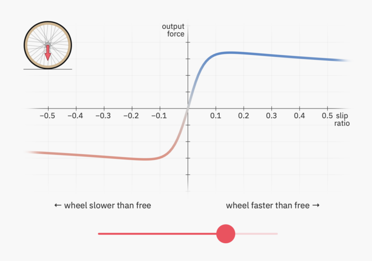
Riding a bicycle is a seemingly simple activity that we never forget how to do. However, the physics behind pedaling and movement is a balance between force and resistance. Bartosz Ciechanowski breaks it down in a visual essay filled with interactive demos.
The structure of Ciechanowski’s essays are straightforward with the interactives doing a lot of the heavy-lifting for every concept. The physics are split into many small parts for ease of understanding. It makes me wonder about a data visualization equivalent to explain a complex dataset.
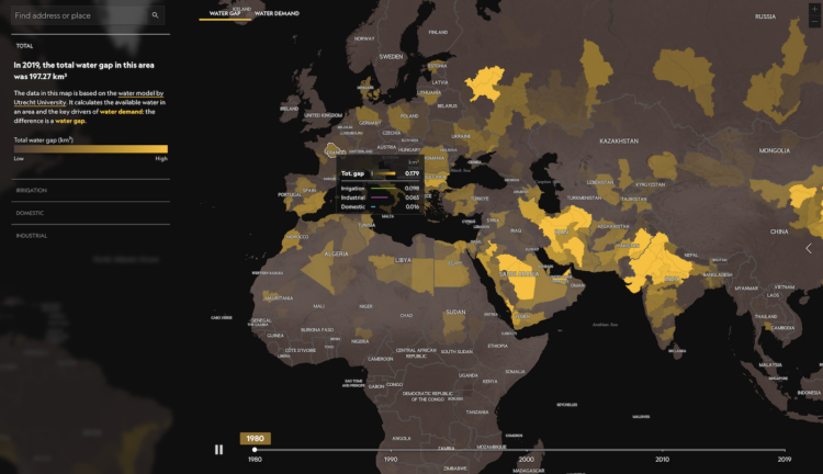
We tend to use more water than is available in the world, which as you can imagine, can be problematic. In a collaborative effort, National Geographic mapped the water gap since 1980:
The result is a water gap in an increasing number of places. Humans are using more water than the water cycle can provide, and so we deplete shallow aquifers, and may need to tap into deep ones that will not be renewed in our lifetime. In the process we threaten not only our own health, peace, and well-being, but also the health of ecosystems and wildlife.

Taylor Swift is currently on tour. During a show, she sings 44 songs split up into 10 acts as she moves across a spectacle of a stage. A fan, who goes by vinoj, mapped Swift’s path and location as she performs every song, one map for each act.

This is the good stuff for March.

Tech layoffs continue, and as companies deliver more letters, there are some repeated topics. For The Washington Post, Hamza Shaban, Luis Melgar, and Leslie Shapiro parsed out the patterns:
The Post analyzed 48 publicly available memos from tech companies ranging from start-ups that have raised at least $50 million to trillion-dollar giants that have announced layoffs since last summer. Major themes and key words for each theme were determined after reviewing the memos. The Post programmatically split each memo into sentences and identified each sentence with a key word. Sentences were manually vetted to verify correct classification. A single sentence may be assigned multiple categories. Design elements are direct quotes from layoff memos with the exception of the first, where “Dear” was not necessarily used.

This is necessarily uncomfortable to go through, but for The Washington Post, N. Kirkpatrick, Atthar Mirza, and Manuel Canales show the bodily damage caused by an AR-15 bullet versus a 9mm round.
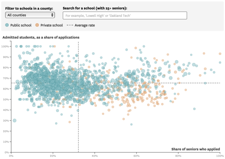
For the San Francisco Chronicle, Nami Sumida shows admission rates at University of California campuses, categorized by public and private high schools:
Admissions for UCLA and Berkeley, the most competitive of the nine undergraduate UCs, follow a similar trend. Private school seniors were 20 percentage points more likely to apply to the two campuses than their peers at public schools. But unlike systemwide admissions, UCLA and Berkeley admitted public and private school students at about equal rates.
You can download the full UC dataset, which dates back to the 1994 freshman college class. With time, and several categories, it seems like a fun dataset to poke at.
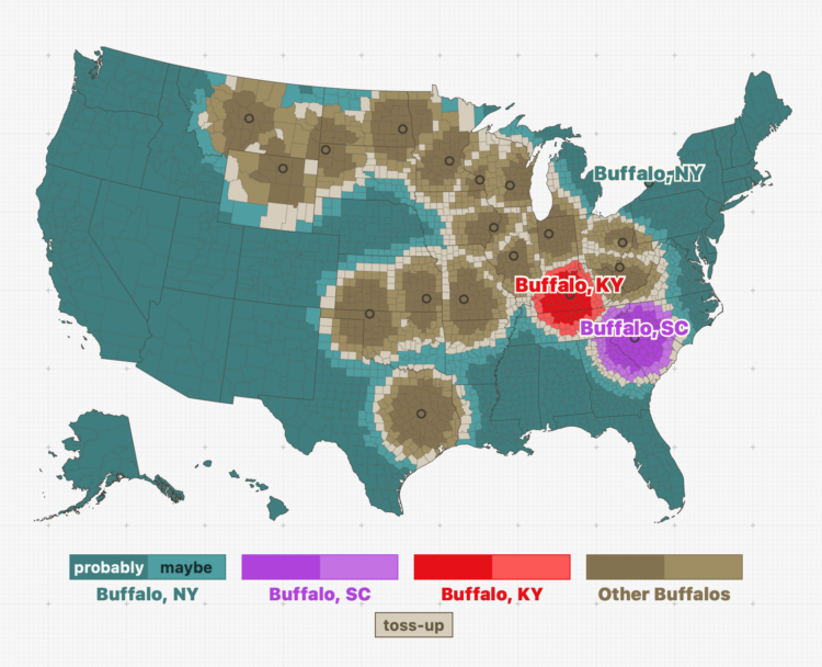
Throughout the United States, there are a surprising number of cities that have the same name. In fact, after playing with this interactive map by Russell Samora for The Pudding, it seems more likely that cities share a name with another than not. (Don’t quote me on that.)
The question is: When someone mentions a city, which one are they talking about? Samora calculated the likelihoods, given the county that person lives in. For example, when someone refers to Buffalo, most people are probably talking about Buffalo, New York. If you live in Buffalo, Kentucky, then probably not.
You can also mess around with your likelihood metric here.
See also: street names across the country.
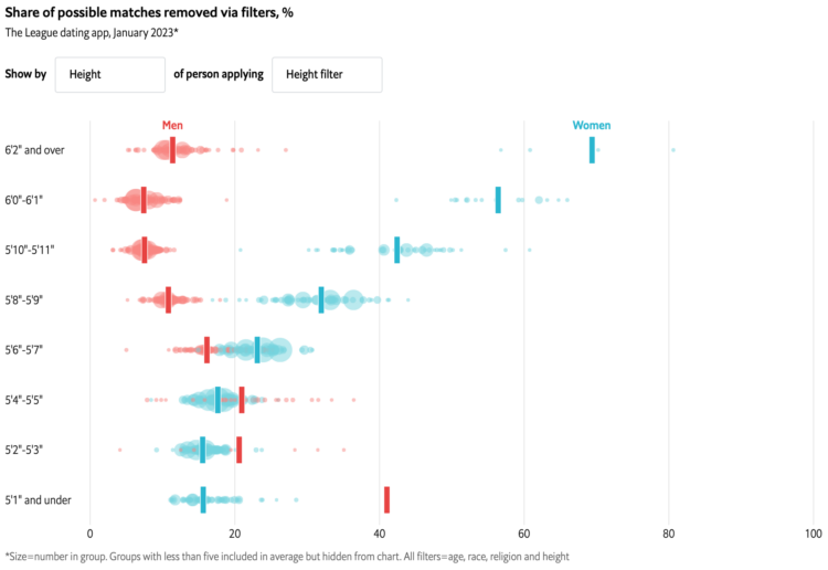
With online dating apps, you’re able to filter out potential matches based on characteristics like age and height. The Economist charted who’s filtering out what.
The chart took me a second to figure out, but I think I got it. Each bubble represents a demographic group. The x-axis represents the percentage of potential matches the group filters out, and the y-axis represents a characteristic of the searching group. For example, you can see in the above that taller women filter out more people with the height filter, whereas taller men don’t filter out as much.
After three years, The New York Times is switching away from local data collection to data from the Centers for Disease Control and Prevention:
As the virus began to spread rapidly in the United States in March 2020, it became clear that there was no single source that tracked infections at the local level. In the absence of comprehensive government data, The Times quickly built a custom system for gathering, vetting and publishing data from more than 100 state and local government sources.
By collecting the data continually, and from multiple levels of government, The Times was able to map the spread of the virus, with updated information published several times a day.
It’s sad that NYT had to collect data at all, but I’m glad they did. Those Covid pages were an invaluable resource those first two years.
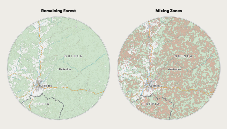
For ProPublica, Al Shaw, Irena Hwang, and Caroline Chen explain the increased risk of spreading disease when there are fewer trees and physical barriers in between people:
The implications of such a drastic increase in mixing zone area over a relatively small increase in deforestation are serious. In 2018, a team led by Christina Faust, a researcher at the University of Glasgow, Scotland, developed a peer-reviewed model that directly links changes in forest cover to the potential for spillover events. To understand how the potential for spillover had changed since the 2013 outbreak, we applied data from real-world satellite images to this theoretical model.
The dot plot and map combo at the end is a nice touch.

With fewer people in mind, you can visualize data with fewer trade-offs and greater focus.


 Visualize This: The FlowingData Guide to Design, Visualization, and Statistics
Available now.