For those watching the clock and waiting for the weekend to hurry up and start, here’s the Diagram Diaries Flickr group. The 654 diagrams should keep you occupied for a good while. Enjoy, and have a good weekend, everyone.
For those watching the clock and waiting for the weekend to hurry up and start, here’s the Diagram Diaries Flickr group. The 654 diagrams should keep you occupied for a good while. Enjoy, and have a good weekend, everyone.
Sprint, in a promotion to their mobile Internet service, created this amusing futuristic dashboard. “All aboard the now machine,” the computer says. “How about a big bowl of now?… Please keep your hands inside the moment…your hair has grown 5 millionths of centimeter in the last second.” It’s got tickers for eggs being produced, emails being sent, spam emails being received, recent news from The New York Times, CNN, newsvine, top Google searches of the day, and most importantly, seconds until doughnut day. That’d be a nice little screensaver – or something I’d have running 24/7 on a giant plasma.
Oh, and yes, that is my face in the middle.

Following up on my post last week about using Twitter to track eating…
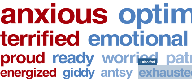
The New York Times adds another item to the list of things to watch tonight as election results start to pour in. The Times invites readers to enter one word that describes their current state of mind and who they support. You are allowed to enter a word once per hour. The result is the above self-updating word cloud as new words from readers flow from left to right. You can filter among McCain supporters, Obama supporters, or everyone. McCain supporters appear to be worried, scared, and nervous while Obama supporters are excited, hopeful, and optimistic. Both sides are anxious. What’s your current state of mind?
A quick reminder — it’s election day in the United States. If you’re registered to vote, take the few minutes out of your day and go put in some ticks at your nearest voting place. If not for the presidency, at least go vote for your local candidates and propositions.
When Google first launched their visualization API, you could only use data that was in Google spreadsheets, which was pretty limiting. Yesterday, Google opened this up, and you can now hook in data from wherever you want. What does that mean? It means that developers now have access to all the visualization API offerings like before, but it’s now a lot easier to hook visualization into data applications.
It also means we’re about to see a boom in web applications that look very Googley. Motion charts (above) are going to spread like wildfire and ugly gauges will grace us with their presence. It’ll be similar to the Google Maps craze, but not quite as rampant. In a couple months from now, I will have a long list of online places that use the Google visualization API. It’s going to be interesting where online visualization goes from here.
Going back to my original question, to what extent do you think the now-open Google Visualization API will affect visualization on the Web?
[via ReadWriteWeb]
I’ve always thought one of the best ways to make data relate-able is to humanize it. Wouter Walmink, from studio:ludens, does this quite literally in so_many_a_second. I’m sure you’ve across statistics that state something like “this many people die of this condition per second in the world,” but that number, even though it’s a rate – something that is dynamic, feels very static.
In so_many_a_second these rates are represented by objects in an attempt to show these types of numbers on a “human scale.” The above shows number of plastic cups used by airlines per second. Oh yes, it’s raining cups.
Depicting the ongoing stream of events, this application tries to get the user in touch with the emotional actuality of these objective data.
The concept itself isn’t anything new. We’ve seen stuff sort of like this before (e.g. Running the Numbers: An American Portrait, Google employee count), but the novel thing with so_many_a_second is that you can create your own flows and compare them side-by-side. It’s more than just a literal representation of numbers.
Yes, we could efficiently place all the rates in a horizontal bar graph, but somehow, so_many_a_second makes me care more.
[via infosthetics | Thanks, Tim]
FlowingData continues to grow, and FlowingData sponsors continue to help keep everything running smoothly. No doubt the site would be down a whole lot without them – especially with all the traffic bursts lately. Thank you, FlowingData sponsors:
Tableau Software — Data exploration and visual analytics software to understand your databases and spreadsheets.
Eye-Sys — Visualization tool that lets you easily link large amounts of data from many sources in real-time.
If you’re interested in becoming a FlowingData sponsor, please feel free to email me, and I’ll get back to you with the details.
Most people make the mistake of thinking design is what it looks like… People think it’s this veneer — that the designers are handed this box and told, ‘Make it look good!’ That’s not what we think design is. It’s not just what it looks like and feels like. Design is how it works.
— Steve Jobs, The New York Times, 2003
I post this not because I like Apple products, but because it’s true (and because I like Apple products). I’m no designer, but as a statistician, I have tremendous respect for those who are. Have a nice weekend all.
[via swissmiss]
October was another good month. Our FlowingData community grew from 5,100 subscribers to over 5,700 this month, and I of course have all of you to thank. Thank you for spreading the word about FlowingData – whether it’s via del.icio.us, Digg, StumbleUpon, email, or word of mouth, I appreciate it all.
October was the first time we were on the front page of Digg – with the 40 essential tools and resources post. I was mesmerized as I watched FlowingData’s blog stats increase by the thousands in a matter of a few minutes. Thankfully, WestHost was able to keep FlowingData afloat during the wave.
In case you’ve got no red bars, here are the top posts from October:
So now it’s time for a new month. What would like to see more of on FlowingData?
P.S. Happy Halloween!
In this map from the Financial Times, the state of Europe’s economy is shown like a weather map. A cloud with a lightning bolt represents a “sudden change in outlook, outlook uncertain.” There’s nothing but gray skies ahead, I’m afraid. Oh, but wait, what’s that? Cyprus has some sun peaking out over the cloud: “Clouds over growth with some sunny prospects.” There is hope.
[via The Big Picture | Thanks, Michael]
I’m sure this will come as no surprise to all of you, but personal data collection fascinates me. I love playing with data and when it’s about me, all the better. Daytum and mycrocosm are two applications that let you do this; although each have somewhat different goals. Daytum is sort of like a financial report for your life (ala Feltron) while mycrocosm is more of an experiment in communication and social media. They do both, however, have an underlying goal, whether implicit or explicit, of understanding yourself better. Do Daytum and mycrocosm help you understand yourself better? At some level, yes, but both have room for improvement. Here is my attempt #1 to improve on these existing systems.
Read More
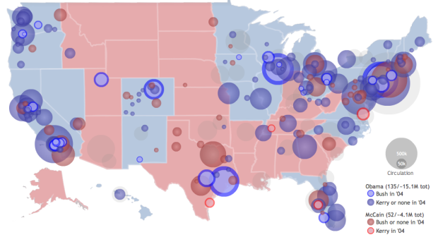
Philip, from infochimps, maps newspaper endorsements using data from the Editor & Publisher’s list. Circles with the blue radial gradient are newspapers that endorse Obama and John Kerry in 2004 while the red ones show McCain/Bush endorsements. The lighter blue circles are newspapers that endorse Obama, but actually endorsed George Bush in 2004. It’s a similar encoding for the John McCain endorsements except in red and the flip being John Kerry. Circle size is newspaper’s circulation.
The only thing I found a little weird was that the Dem to Rep or Rep to Dem endorsements were represented with all blue or all red. It certainly makes the circles stand out – which was the point – but doesn’t really indicate a flip. I had to mouse over the circle to find that out.
[via FlowingData Forums | Thanks, mrflip]
I just noticed that when you click on “show details” in Google Reader, you get a graph of how frequently posts come from that feed and how often you read those posts. It used to only show subscriber count (via Google Reader) and when the feed was last updated. It’s one of those things where it’s like “so… what” and it won’t influence any of the decisions I make in life in any way, but hopefully when all of you “show details” for FlowingData all the red and blue bars are aligned :).
P.S. Greetings from Chicago. It is much too early in the morning.
It was just a little over a week ago that The New York Times announced their Developer Network i.e. Campaign Finance API. Yesterday, they announced something more – the Visualization Lab. In collaboration with the Many Eyes group, the Times has rolled out a Many Eyes for data used by Times writers. You can visualize, explore, and comment on data posted at the Visualization Lab in the same way that you can at Many Eyes.
Today, we’re taking the next step in reader involvement with the launch of The New York Times Visualization Lab, which allows readers to create compelling interactive charts, graphs, maps and other types of graphical presentations from data made available by Times editors. NYTimes.com readers can comment on the visualizations, share them with others in the form of widgets and images, and create topic hubs where people can collect visualizations and discuss specific subjects.
I said the API was a good step forward. The Visualization Lab is more than a step. No doubt The Times heard what I said about their API and decided to roll with it since I am the head authority on everything. Yes, I’m totally kidding, in case that didn’t come across as a joke. Come on now.
I’m looking forward to seeing how well Times readers take to this new way of interacting.
[Thanks, William]
Uniqlo gathered hundreds of responses from a couple hundred Japanese women about bra size, makeup, and shopping and put it into this sort of 3-d world of short video clips. Questions appear at the top, you get a few random video responses, and then the animation zooms out to show you the rundown. I can’t say I know what exactly is going on since I don’t know Japanese, but I’m guessing… bra commercial? OK, yeah, I have no idea.
Read More
![]() I started the FlowingData forums a few months ago to give others a chance to start their own conversations or to get advice on personal projects that need some attention. I admittedly haven’t done a very good job of promoting the forums, so I thought I’d give them a little bump.
I started the FlowingData forums a few months ago to give others a chance to start their own conversations or to get advice on personal projects that need some attention. I admittedly haven’t done a very good job of promoting the forums, so I thought I’d give them a little bump.
If you’ve got something interesting to share with the FlowingData community – post it to the forums. If you’ve got a question about the best way to visualize a dataset or want some honest opinions on how to improve an existing chart or graph – post it to the forums. I’ll post the most interesting and useful discussions here on the blog once a month.
So what’re you waiting for? Sign up for a free account, and share with the rest of us. Stop being so greedy.
 Terry Pettijohn and Brian Jungeberg of Mercyhurst College took a very close look at the curves, um, measurements of past Playboy Playmates of the Year in relation to the state of the economy.
Read More
![]()
I don’t remember when I made this desktop wallpaper, but it was probably during one of those nights when there was nothing good on TV and I had nothing better to do. Anyways, it’s my current desktop wallpaper, and thought I’d make it available to all of you just in case someone wanted to flaunt their love for FlowingData.
Here it is in the metallic gray variety. Enjoy. Click on the images to get the full-sized versions:
![]()
![]() I’ve had sleep troubles for as long as I can remember. When I was in grade school, I used to stay up late (well past 10pm) listening to my Sony Walkman. I later got a 10-inch black and white television in my room from my mom’s college years. My sleep schedule only got worse in high school when I made my first big purchase with money that I had earned cutting vegetables and washing dishes in a restaurant – a beautiful 19-inch color television, with a remote! Now that I have to jump across time zones quite a bit, my sleep patterns have a hit an all-time low, so I was of course excited to receive my SleepTracker Pro in the mail a couple of weeks ago. I’ve been using it ever since.
I’ve had sleep troubles for as long as I can remember. When I was in grade school, I used to stay up late (well past 10pm) listening to my Sony Walkman. I later got a 10-inch black and white television in my room from my mom’s college years. My sleep schedule only got worse in high school when I made my first big purchase with money that I had earned cutting vegetables and washing dishes in a restaurant – a beautiful 19-inch color television, with a remote! Now that I have to jump across time zones quite a bit, my sleep patterns have a hit an all-time low, so I was of course excited to receive my SleepTracker Pro in the mail a couple of weeks ago. I’ve been using it ever since.
![]() The SleepTracker Pro is a watch that measures your movements while you sleep and wakes you up at an optimal time so that you wake up feeling refreshed instead of cranky and incapacitated. The premise is that the SleepTracker wakes you up when you’re in an almost-awake state. When you’re in deep sleep or in one of your REM cycles, your body is paralyzed, which explains why it’s so hard to get up sometimes, so SleepTracker monitors your movements to wake you up when you’re not in a state of complete floppiness. You can later transfer the data to your computer – which is of course a feature I love.
The SleepTracker Pro is a watch that measures your movements while you sleep and wakes you up at an optimal time so that you wake up feeling refreshed instead of cranky and incapacitated. The premise is that the SleepTracker wakes you up when you’re in an almost-awake state. When you’re in deep sleep or in one of your REM cycles, your body is paralyzed, which explains why it’s so hard to get up sometimes, so SleepTracker monitors your movements to wake you up when you’re not in a state of complete floppiness. You can later transfer the data to your computer – which is of course a feature I love.
Within the first few days of using my SleepTracker, I noticed an immediate difference. I was waking up feeling refreshed and ready to take on the day. It felt weird getting out of bed right when my eyes opened. I was so used to laying there for an hour not wanting to get up.
Also – and this is probably obvious – I enjoy transferring my nightly sleep data to my computer and looking at my sleep patterns. Sometimes my wife works nights, so I can see the almost-wake states when she comes in really early in the morning. I also see the times when my cat manages to open the bedroom door and jump on my face.
While advantageous, the SleepTracker could use a few improvements:
I might never wear the watch during the day, but I will gladly put it on every night when I go to bed. The manual emphasizes changing your habits to get a good night’s sleep, which is a good point – and can probably be said for all types of self-surveillance. It’s not meant as a cure all. You can’t sleep 4 hours or drink a gallon of coffee before going to bed and expect to feel refreshed the next morning. Trust me. I tried. Uh, not the gallon of coffee part. I definitely noticed a difference though when I went to sleep at a decent hour.
The SleepTracker Pro retails at $179, which might be too much for some, but I guess it just comes down to how much you value a good night’s sleep. Personally, I’m happy with it and the new source of personal data isn’t too shabby either.
Has anyone else had any experiences with the SleepTracker?
 Visualize This: The FlowingData Guide to Design, Visualization, and Statistics (2nd Edition)
New tools, refined process.


