Data visualization continues to grow online and in the real world. It exists as masterful art pieces and amazingly useful analysis tools. In both cases though it brings data — which is oftentimes cryptic — to the masses and shows that data is more than a bucket of numbers. Data is interesting. As we collect more and more data about ourselves and our surroundings, the data and the visualization will only get more interesting. On that note, I give you FlowingData’s picks for the top 5 data visualization projects of 2008. Visualizations were judged based on the use of data, aesthetics, overall effect on the visualization arena, and how well they told a story.
Read More
-
-
The great thing about being a graduate student is that you get to experiment. Anita Lillie, from the MIT Media Lab, demos MusicBox, her master’s thesis project that visualizes and maps music collections based on songs’ acoustic features. As might be expected, she uses principle components analysis to arrange songs. Each dot represents a song. If two songs sound similar, they should appear close to each other. As an example, the above dots are colored by music genre. Rap songs appear on the left in red while classical appears on the right.
As an aside, Anita’s project reminds me a lot of a GGobi demo by Di Cook. She used the tuneR library in R to quantify Beatles songs and then used GGobi to do something similar to MusicBox. R and GGobi are free to use, so if you’re interested in visualizing your own music library, you might want to check them out.
[via TechCrunch]
-
In his latest data sculptures, Andreas Nicolas Fischer places data visualization in a physical space when we’re so used to seeing it on a computer monitor. Above is a piece of two layers – the bottom is gross domestic product for 2007 (made of plywood) and the top maps “the derivatives volume, alloted to the coordinates of the countries on a map.” I don’t know what derivatives volume and I probably should, but I’m too lazy to look it up (a lil’ help please?).
Read More -
How to Make a Graph in Adobe Illustrator
You can use the vector-based software normally reserved for designers and artists to make and edit charts.
-
SiSense is running a dashboard competition, and a free iPod Touch is up for grabs. All you have to do is create the best dashboard using SiSense — which is free to try for 30 days. You’ve got until December 22 (that’s one week away) to enter, so you better jump on it.
Here’s your motivation:
-
It happened again. I told someone I study statistics. He told me that he hated statistics in college. It doesn’t annoy me like it used to – I’ve come to expect it – but why do so many people have this beef with stat? Is it really that boring? Confusing? What is it about statistics that turns people off? So I reach out to all of you:
What is it that makes statistics so uninteresting?
I’m going to assume that the icky factor is less for FlowingData readers (obviously), but still, I implore you – tell me why statistics sucks. I must know.
-
 I thought this was a joke when I first read it, but scientists from Japan’s ATR Computational Neuroscience Laboratories have developed software that can map brain activity to an image. Subjects were shown letters from the word neuron and images were reconstructed and displayed on a computer screen.
A spokesman at ATR Computational Neuroscience Laboratories said: “It was the first time in the world that it was possible to visualise what people see directly from the brain activity.
“By applying this technology, it may become possible to record and replay subjective images that people perceive like dreams.” The scientists, lead by chief researcher Yukiyaso Kamitani, focused on the image recognition procedures in the retina of the human eye.
It is while looking at an object that the eye’s retina is able to recognise an image, which is subsequently converted into electrical signals sent into the brain’s visual cortex.
The research investigated how electrical signals are captured and reconstructed into images, according to the study, which will be published in the US journal Neuron.
I’m not sure how much brain activity from the retina has to do with activity during dreams, but it’s interesting nevertheless (although I am sure – like all interesting science – it is slightly hyped by the media).
[via Telegraph & Pink Tentacle & Chunici]
-
 One of the more painful parts of analysis or visualization is that you have to get the data in a proper format. Real data almost never comes how you want it. Magic/Replace from DabbleDB lets you reformat data via their spreadsheet interface and a few sprinkles of magic. The solution is really quite elegant.
You copy and paste CSV or TSV from a spreadsheet and submit. You then see a column editor and a preview window. This is where the magic happens. In the column editor, you can edit a column so that it fits a certain format and Magic/Replace will show you a preview of what the others will look like. For example, say you have a column of phone numbers and they’re in the (555) 555-5555 format, but what you really want is 555-555-5555. Change a single row, and voila, Magic/Replace does the rest. It really is “data cleanup for everyone” – not that the data were dirty to begin with.
[Thanks, Jose]
-
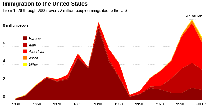
I ran a contest last week to improve a graph from Swivel that showed immigration to the United States. FlowingData readers sent in lots of different approaches (that took me forever to get organized for this post), and I still stand by my statement that there’s always more than one way to skin a dataset.
Read More -
I got an email from Harald asking, “How does the job market for DV developers work?” I find this question, or some variation of it, in my inbox every now and then, so I thought I’d give it a shot. I am after all a graduate student who will graduate eventually, so let’s take a look at some of the options. I’d like to expand on the question though, and not just focus on developers. What’s the job market like for anyone who wants to do data visualization for a living?
Read More -
The Washington Post recently put up TimeSpace: World, which is an interactive map that shows articles, video, photos, and commentary as they happen around the world (through the Washington Post’s eyes). Similar to Trulia Snapshot, by Stamen Design, news items are arranged with a force-directed graph and can be filtered by time with a timeline at the bottom. Adjust time range to find news stories from a given time of day. You get a breakdown of number of images, articles, etc. Photos seem to dominate. Here is the embedded version (which seems a little buggy):
One thing that I really liked about Trulia Snapshot, which isn’t included as a part of TimeSpace: World is a play button. It’d be like watching the news unfold over time – or even better, make TimeSpace self-updating. Maybe in the next iteration.
[Thanks, Steven]
-
FlowingData will be transferred to a bigger and better server tonight between 10pm and 2am, during which the site will be down for about 30 minutes. Hopefully everything goes as planned, but in case you don’t hear from me tomorrow, you’ll know why. Keep your fingers crossed.
-
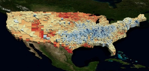
UUorld (pronounced “world”) is a 4-dimensional mapping tool that lets you explore geographic data – the fourth dimension being time. The interface will remind you a bit of Google Earth with the map, pan, zoom, etc, however, UUorld isn’t trying to replace Google Earth. In fact, it’ll probably be better if you use it with Google Earth. Think of it as another tool to add to your box of mapping toys.
UUorld’s focus is on finding trends over space and time. Load your own data or import data from UUorld’s data portal, and then play it out over time. Spatial boundaries undulate up and down as land masses look a bit like skyscrapers. Color and boundary lines are customizable. When you’re satisfied with the results, record it as video or export as KML, and then import into Google Earth or whatever else you want.
How effective is this method of visualization though? There’s the usual argument of area perception, but does color-coding and vertical dimension make up for that? Discuss amongst yourselves.
-
 It was really only a matter of time, but Amazon now hosts public data sets. Not small data sets though – more like the ones in between 1 gigabyte and 1 terabyte:
Public Data Sets on AWS provides a centralized repository of public data sets that can be seamlessly integrated into AWS cloud-based applications. AWS is hosting the public data sets at no charge for the community, and like all AWS services, users pay only for the compute and storage they use for their own applications. An initial list of data sets is already available, and more will be added soon.
Previously, large data sets such as the mapping of the Human Genome and the US Census data required hours or days to locate, download, customize, and analyze. Now, anyone can access these data sets from their Amazon Elastic Compute Cloud (Amazon EC2) instances and start computing on the data within minutes. Users can also leverage the entire AWS ecosystem and easily collaborate with other AWS users. For example, users can produce or use prebuilt server images with tools and applications to analyze the data sets. By hosting this important and useful data with cost-efficient services such as Amazon EC2, AWS hopes to provide researchers across a variety of disciplines and industries with tools to enable more innovation, more quickly.
There’s the human genome data set, US Census data from the past 3 decades, labor statistics, and some others. Still waiting on Google to follow through with their data hosting plans.
[via TechCrunch | Thanks, David]
-
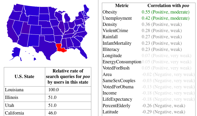
StateStats is like Google Insights but on a state level. Type in a search term and get Google search levels with correlations to certain “metrics” like obesity or support for Obama. Any Web application that uses correlation tends to make me feel a bit iffy, but it’s just for fun, so I guess it’s okay.
Being the immature man-child that I am, the first thing I type in the search field is poo. I thought it was
hilariousinteresting that Louisiana’s relative search rate was so much higher than all the other states. Apparently, obesity correlates moderately.I’m sure all of you will search for more sophisticated terms.
[Thanks, @Chimp711]
-
Just a quick reminder that the deadline to submit your entries to our graph contest is comin’ up. Get your entries in by Friday, December 5, 8:00pm EST for a chance to win two free Edward Tufte Books – The Visual Display of Quantitative Information and Visual Explanations. There have been some really good entries so far, and I’m looking forward to what else you all have in store (and to showing what FlowingData readers have come up with).
-
Evan Roth from the Graffiti Research Lab, uses typographic illustration in Jay-Z’s music video for Brooklyn Go Hard. As the song plays out, we see sketches of Jay-Z drawn using Brooklyn (sort of what we saw from Jeff at Neoformix). It’s quite the work of art:
You can download the source code for the video from Evan’s site, which is pretty cool too.
[via Animal | Thanks, Max]
-
I started tracking what I eat and my weight using Twitter in an effort to shed 10 pounds and consume less. It’s already been (a really fast) two months since I started this experiment — I’ve lost 7 pounds so far. While there are a number of factors that can contribute to weight loss (and gain), I think the simple act of tweeting raised my awareness just enough to make me feel guilty for eating that bag of chips in the middle of the afternoon.
Read More -
This is a guest post by Greg J. Smith, a Toronto-based designer and researcher. Greg writes about design, visualization and digital culture on his personal blog Serial Consign.
A few weeks ago the second edition of the Visualizar workshop wrapped up at Medialab-Prado in Madrid. In curating the event this year, organizer José Luis de Vicente selected urban informatics as the focus of research and visualization development. Partially inspired by Cascade on Wheels (a project created at the workshop last year), the Visualizar mandate was in line with contemporary thinking about the city where the street is viewed as a platform and urban space is considered a DIY enterprise. Visualizar’08 brought together a range of programmers, designers, architects, illustrators and scholars to participate in a seminar on contemporary thinking about the city and then bunker down to “rapid prototype” seven visualization projects over a two-week period.
Read More -
FlowingData has hit a critical point in its life where regular hosting isn’t enough, and the next step up is a big one — especially with what I have planned in a couple of weeks. FlowingData sponsors help me take this step and make sure everything keeps going smoothly. Thank you, FlowingData sponsors.
I hope you’ll join me in thanking them by checking them out. They all have something worthwhile to offer:
Tableau Software — Data exploration and visual analytics in an easy-to-use analysis tool.
Eye-Sys — Comprehensive real-time 3D visualization.
SiSense — Easy-to-use reporting and analysis. No code required.
If you’d like to sponsor FlowingData, please feel free to email me, and I’ll get back to you with the details.


 Visualize This: The FlowingData Guide to Design, Visualization, and Statistics (2nd Edition)


