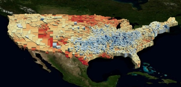
UUorld (pronounced “world”) is a 4-dimensional mapping tool that lets you explore geographic data – the fourth dimension being time. The interface will remind you a bit of Google Earth with the map, pan, zoom, etc, however, UUorld isn’t trying to replace Google Earth. In fact, it’ll probably be better if you use it with Google Earth. Think of it as another tool to add to your box of mapping toys.
UUorld’s focus is on finding trends over space and time. Load your own data or import data from UUorld’s data portal, and then play it out over time. Spatial boundaries undulate up and down as land masses look a bit like skyscrapers. Color and boundary lines are customizable. When you’re satisfied with the results, record it as video or export as KML, and then import into Google Earth or whatever else you want.
How effective is this method of visualization though? There’s the usual argument of area perception, but does color-coding and vertical dimension make up for that? Discuss amongst yourselves.
 Visualize This: The FlowingData Guide to Design, Visualization, and Statistics (2nd Edition)
Actually it looks 5-dimensional, if you count color and thickness separately.
For static views, this would not be too effective, for the areal representation Nathan alluded to, but also because color gradients are not too effective at presenting precise values, and the third dimension of height will also be difficult to judge. So if you count color and thickness as halfway effective dimensions, then maybe it’s 4-dimensional after all.
That said, I imagine if you use this tool to show trends from time A to time B, it could be very effective, on the order of the Gapminder animated bubble charts.
Pingback: Josh’s Blog » Blog Archive » Explore and Analyze Geographic Data with UUorld