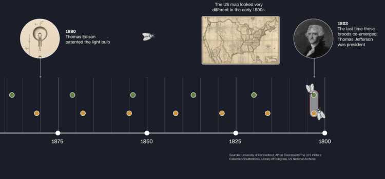
The cicadas are coming. This year is unique, because there are two broods that are arriving at the same time in the midwestern and southeastern United States. Usually it’s just one at a time. CNN has a visual guide for where the cicadas will be and why they’re here now. Basically, one brood emerges every 13 years and the other every 17, and there’s overlap.
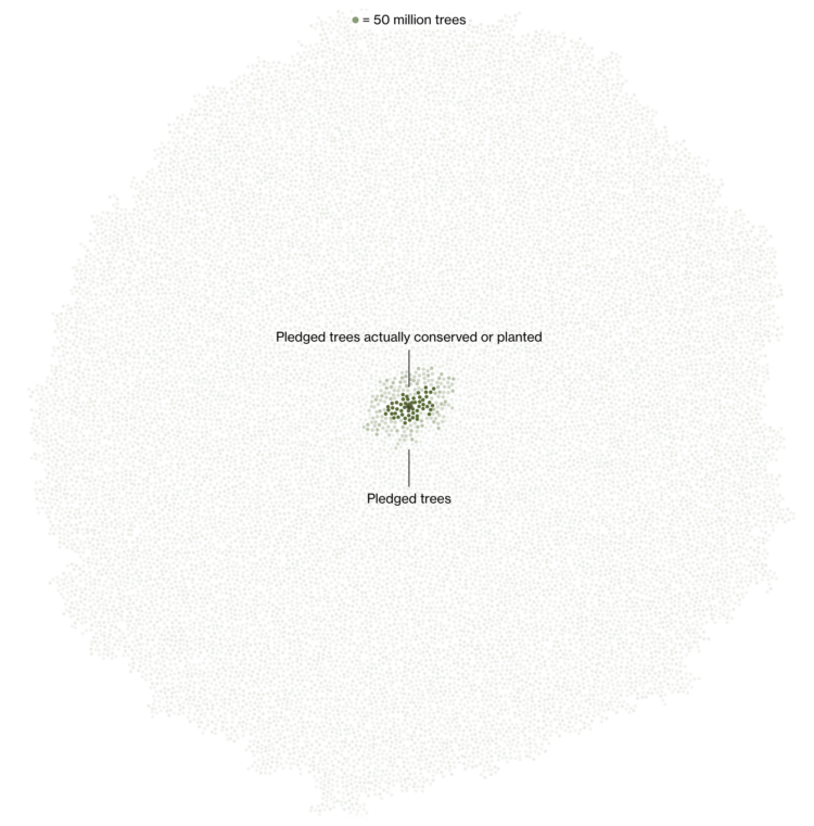
Marc Benioff, the CEO of Salesforce, set out to plant and conserve 1 trillion trees by 2030. Bloomberg uses small dots to show how much more is left to achieve the target amount. The gray dots are what still needs to be planted. It’s kind of a lot, but fingers crossed.
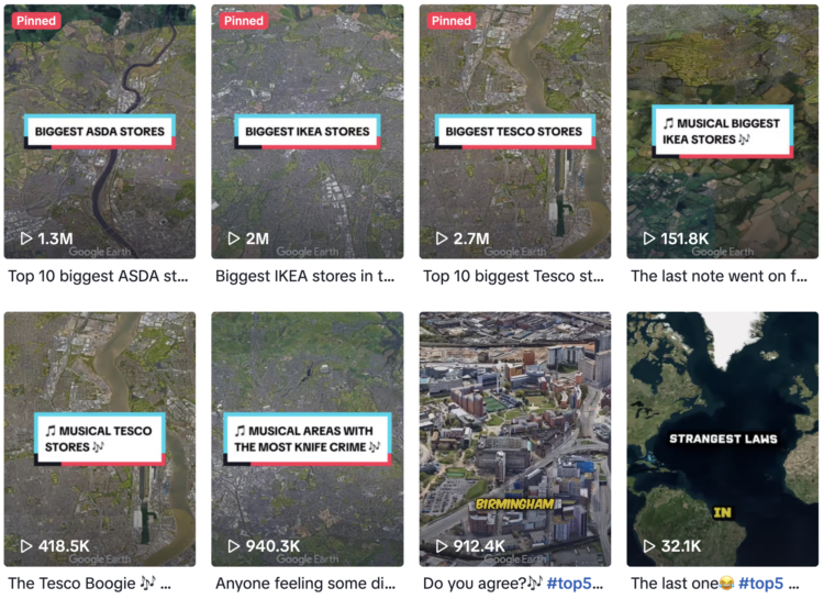
The TikTok account Globetrots combines Google Earth and text-to-speech to show top-ten lists with various statistics. For example, what cities in the United Kingdom have the most people on benefits? A Google Earth shot pans to the different cities as text-to-speech narrates.
A good number of their videos have gained popularity (or the TikTok algorithms are pushing novelty). And the account recently subbed text-to-speech for a song format, which I think uses TikTok’s AI song feature? Just watch:
It’s really corny, but we might also be seeing the beginning of something.
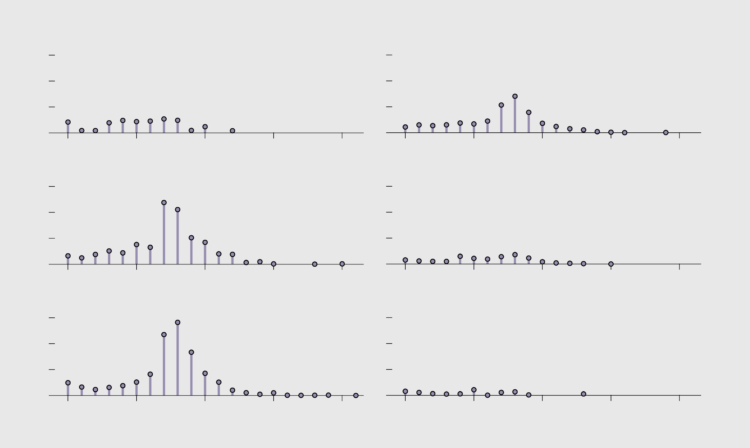
In our younger years, we have school and more important things to do, but then we get older and there are bills to pay. These charts show the shift and the sweet release of retirement.
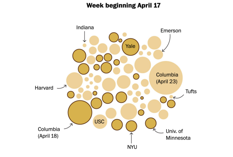
A set of maps show the locations, and a set of packed-circle charts show the increase of three weeks. Larger circles indicate larger crowd size. Darker yellow and black border indicate police presence.
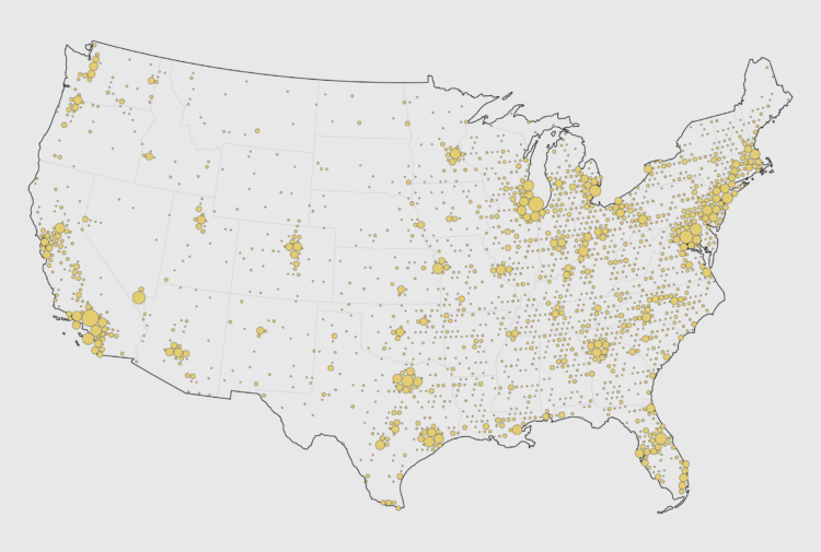
Reddit user ChangsManagement mapped where NHL hockey players were born, based on data from Hockey Reference. As someone who knows next to nothing about hockey, except the bits I picked up while living in Buffalo, I’m surprised that the distribution is so far north, but it makes sense.
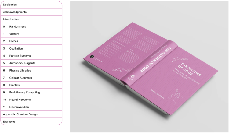
Daniel Shiffman, who you might know from his enthusiastic YouTube channel The Coding Train, updated his book The Nature of Code. The original version from 2012 focused on Processing. The new version uses p5.js, while still focusing on “understanding the mathematical principles behind our physical world.” You can find the free-to-read online version here.
The Pudding ran an experiment that asked people to trace a shape. They would string together the sketches to make a flipbook to see where a single line or a circle would end up. They published the results:
Every shape devolved into a scribble, which I feel is a metaphor for information on the internet.
They also ran a sidequest that tested anonymity and the tendency to draw inappropriate things online. While the results were underwhelming, I appreciate the effort to see how many times a phallic sketch appears. Four times out of several thousand.
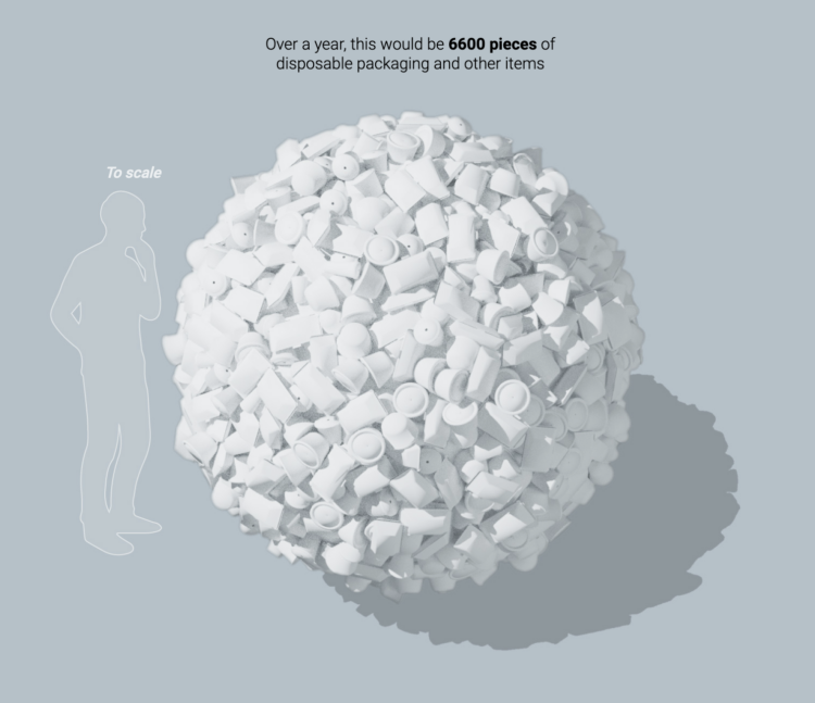
Hong Kong banned single-use plastics often used for food takeaway containers. For South China Morning Post, Kaliz Lee and Davies Christian Surya describe the ban and the scale of the waste. It’s a lot of plastic.
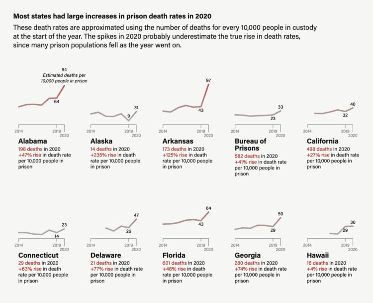
The slowdown in admissions meant that prison systems reduced the number of younger people exposed to COVID, while the older people already inside were left there. That’s because incarcerated people are generally older than those likely to be sent to prison.
By the end of 2020, Bureau of Justice Statistics data shows the number of people in state prisons under 55 fell by 17%, while the 55 and older population was down by 6%.
Prison deaths spiked almost everywhere across the country, varying in magnitude from state to state.
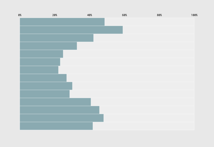
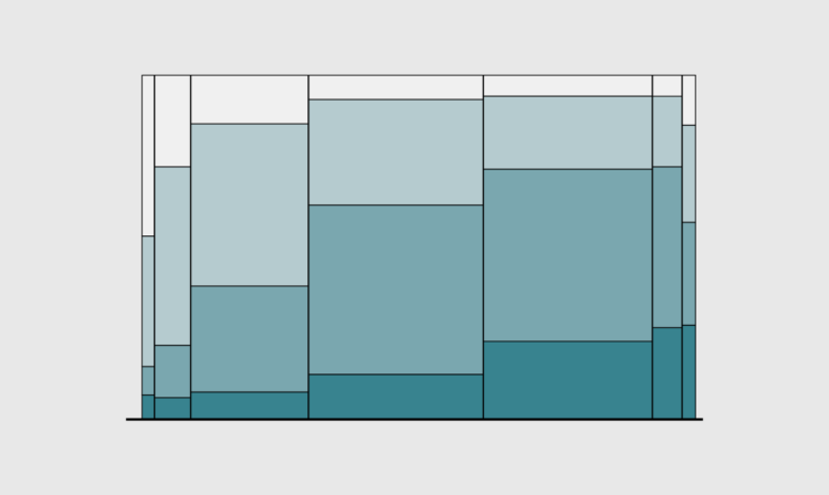
When we’re young, we tend to have fewer responsibilities, which means we can sleep and wake up later. Then work and parenting come along, and our schedules grow more structured. We can see the shift in the percentage of people who are sleeping, given their age.
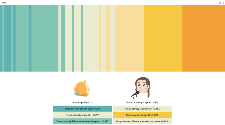
One of the challenges of understanding the weight of climate change is that it’s a slow process. You likely won’t see the full effect in your lifetime. So, for The Tardigrade, Julia Janicki and Daisy Chung placed your timeline against others to show how your future and others’ futures differ.
Projections are from the Intergovernmental Panel on Climate Change and show the timeline up until you turn 100 years old. You might recognize the visual form, which is based on Ed Hawkins’ climate stripes.
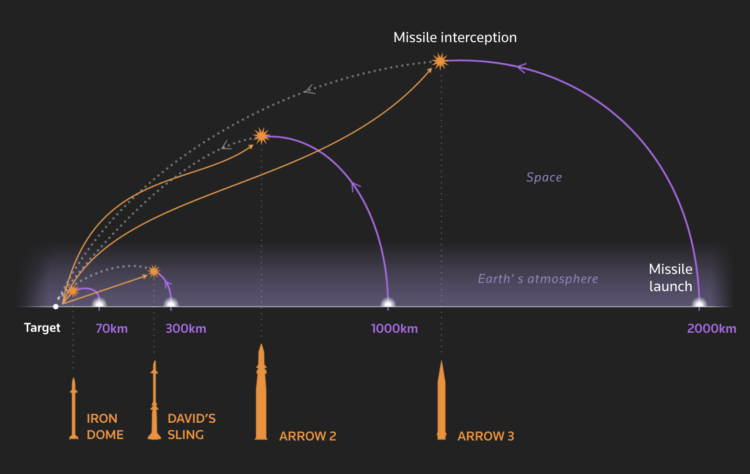
A key part of Iron Dome is its control system’s ability to discern what incoming targets pose a threat. If an adversary’s rocket will land harmlessly – in an unpopulated area or in the sea, for instance – it will not be intercepted. That makes it ideal for “saturation” scenarios in which an enemy tries to fire so many missiles that not all of them will be shot down, said Uzi Rubin, a senior researcher at the Jerusalem Institute for Strategy and Security.
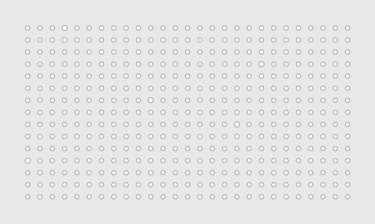
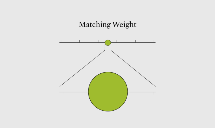
Small changes over time or small differences between categories can easily look insignificant, even if they’re worth noting in real life. Here are chart options for you.
As I peel myself out of bed in the morning after again not going to sleep at a civilized hour, blurry-eyed, I wonder what hours others sleep. Certainly, I must be in the majority. According to the National Health Interview Survey from 2022, I am not. Two-thirds of adults get at least 7 hours of sleep.
 Visualize This: The FlowingData Guide to Design, Visualization, and Statistics (2nd Edition)


