From William Couch, Kristen Novak, Michelle Price and Joshua Hatch of USA Today, this tracker tool lets you compare ratings of past current and past presidents according to Gallup polls.
Read More
-
-
The Sartorialist is a unique fashion blog that highlights people’s hot styles on the street. I’m pretty sure there’s very little overlap with its readers and FlowingData’s, but maybe I’m wrong. The above infographic shows how you can get shot by the Sartorialist. I’m all over it.
[Thanks, @MacDivaONA]
-
Similar to other visualizations showing location (e.g. Cabspotting, Britain From Above), this one from Australia-based data visualization group, Flink Labs, shows the ebb and flow of Melbourne trains over the course of a single weekday using the Melbourne train schedule as the data.
Read More -
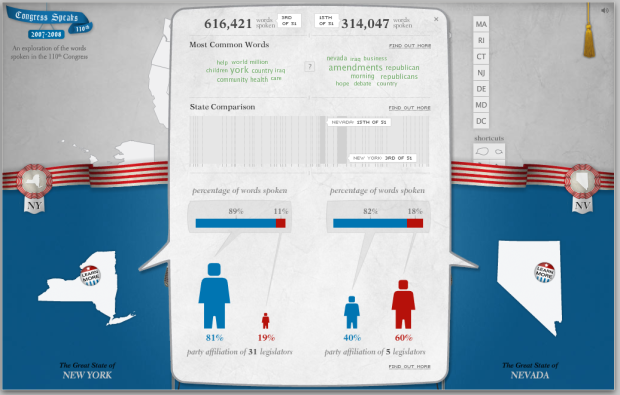
There’s a lot of talking in congressional meetings, but what are your state senators and representatives talking about? Design group Periscopic explores what congress men and women said from 2007 to 2008 in this tongue-in-cheek comparison tool with talking heads. The best part about the tool is that behind the humor is actually something useful.
Compare word distributions of senators, of states, of a senator to a state, or representatives, so on and so forth. We get breakdowns by gender, number of words spoken, and by state. All data come from public records.
[via @krees]
-
 Beautiful Data from O’Reilly is now available! The book is a collection of articles from 39 data practitioners including Michal Migurski, Aaron Koblin, Jeff Heer, and plenty others, sharing their experiences with data, their methods, their thoughts, and most importantly, how beautiful data really is.
 I was fortunate enough to write one of the chapters: Seeing Your Life in Data. I describe my experiences developing for the Personal Environmental Impact Report and the beginnings of your.flowingdata. I’m looking forward to reading all of the other contributions.
Two Free Copies to Give Away
Lucky for you I have two free e-book copies to give away. Want to win one of them? Leave a comment below by the end of today – July 31, 11:59 EST. Let’s go with your favorite food this week. One entry per person please. Good luck.
P.S. If you’re not one of the two winners, don’t fret. Use the following discount code on the O’Reilly site for a 30% discount: ABF09.
-
I love food. I love infographics. Put them together, and this is what you get. As part of the Eat Local, Eat Real campaign, this infographic video (below), produced by Sons and Daughters and Crush of Toronto, argues why we should eat local.
Read More -
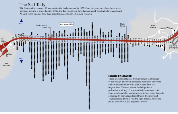
This graphic from SF Gate is a good four years old, well before I knew what an infographic was, but just because it’s old doesn’t mean it’s not interesting. Here we see San Francisco’s Golden Gate Bridge and the “sad tally” of 1,218 known suicides by location. Each black square represents a person who has taken his or her life and 128 light poles are used as reference points.
The east side of the bridge, where most of the suicides occurred, has a pedestrian walkway. The first suicide was just 10 weeks after the bridge opened in 1937.
[Thanks, Justin]
-
From Gabriel Dance, Tom Jackson, and Aaron Pilhofer of the New York Times is this game to gauge your distraction while you’re texting on the road. Yes. It’s fun AND educational. Here’s how it works.
You’re in a car with a driver’s point of view. You’re driving on a freeway or road with a ridiculous number of gates. There are six of them, and as you approach the gates, one will open, and you have select that open gate by pressing the right number. After a few seconds of practice, you’ll receive a text message on the screen that asks a question. You have to reply while still selecting the correct gates as they pass.
Read More -
 It’s Friday! I don’t know about you, but I’m ready for the weekend, and what better way to start with some free stuff? I have five free e-book copies of Beginning Python Visualization
to give away.
I reviewed this book last month, and I thought it was really useful. In fact, I still have it in arm’s reach on my desk.
How to Win a Copy
As usual, I’ll make this really easy. All you have to do is leave a comment below telling me why I should give you a copy. Make up a reason if you like. I could use a good laugh. Do this by 11:59pm EST today (Friday, July 24), and I’ll select five random winners. Good luck!
-
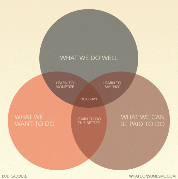
Thanks to Jessica Hagy and her Indexed project, we’ve seen lots of graphs and venn diagrams to communicate ideas outside of data. Some are bad and others are good. Here’s one of the good ones. Bud Caddell shows what it takes to make the perfect business, or more generally, just about everyone’s dream – to get paid for what you’re good at and love to do. Get the poster version of the graphic here.
[via dataviz]
-
Jess Bachman of WallStats just released his annual Death and Taxes Poster for 2010. For those unfamiliar, the poster is a graphical breakdown of the United States federal budget.
Read More -
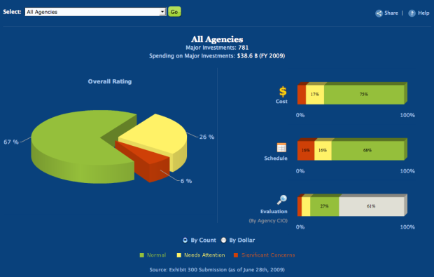
Taking another step towards data transparency, the US government provides the IT dashboard via USAspending.gov:
The IT Dashboard provides the public with an online window into the details of Federal information technology investments and provides users with the ability to track the progress of investments over time. The IT Dashboard displays data received from agency reports to the Office of Management and Budget (OMB), including general information on over 7,000 Federal IT investments and detailed data for nearly 800 of those investments that agencies classify as “major.” The performance data used to track the 800 major IT investments is based on milestone information displayed in agency reports to OMB called “Exhibit 300s.” Agency CIOs are responsible for evaluating and updating select data on a monthly basis, which is accomplished through interfaces provided on the website.
Along with a page to filter and download spending data, there’s a variety of views into the IT spending data that all provide a pretty good level of interaction.
Read More -
As part of the Explore Evolution exhibit at the University of Nebraska State Museum, Judy Diamond displays a segment of the human genome in line with that of the chimpanzee that matches very closely. The point is to show how similar two are with the few differences represented by a drawing of a man, distinguished geneticist Svante Paabo.
Read More -
Data visualization and infographics come in many forms. Some are comical and purely made for entertainment. Others are made for decisions, and important decisions at that. Let’s focus on the latter right now.
To make educated decisions based on graphics, you need accurate ones, and to make accurate graphics, you need a full understanding of the data.
If you don’t know about the data – the context of where it came from or how it was collected – your visualization or infographic is simply a data comic that could potentially misinform its readers.
Read More -
A big thank you to our FlowingData sponsors who help keep the servers running. Without them, FlowingData would be way too slow for consumption or I would be an even poorer graduate student.
Please do check out their sites to see the useful visualization tools they have to offer.
Freakalytics — Get Tableau Training- live, hands-on by author of “Rapid Graphs.” Registration is opening up across the country.
NetCharts — Build business dashboards that turn data into actionable information with dynamic charts and graphs.
Tableau Software — Data exploration and visual analytics for understanding databases and spreadsheets that makes data analysis easy and fun.
IDV Solutions — Create interactive, map-based, enterprise mashups in SharePoint.
InstantAtlas — Enables information analysts to create interactive maps to improve data visualization and enhance communication.
Want to sponsor FlowingData, your most favorite blog in the whole wide world? Email me, and I’ll get back to you with the details.
-
Visualize This: Obesity Rates by State
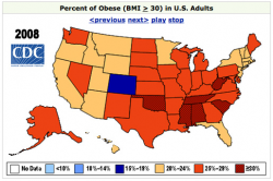 This segment of Visualize This is all about obesity rates in America. The data comes from the Centers for Disease Control and Prevention (CDC).
In 2008, every state in the US, except for one had an obesity rate greater than 20%. In 1994, there were zero. Here is the data for 2008. You can find data from 1985 to 2008 from the CDC site. Share your visualizations in this forum thread.
Thanks to all those who participated in the last Visualize This with Rambo kill counts. A little bit of Tableau, some R, and dare I say, Powerpoint. Be sure to check those out in the forums.
Interesting Threads
- Edward Tufte is Talking at the Met – I know many of of you will be interested in this one. Tufte is giving a talk at the Met in NYC on classic drawings. Your ticket comes free with admission.
- Help a Graduate Student Out – Do you collect data about yourself? Take this survey on personal informatics.
- Mapping H1N1 Virus: Pattern of Spread Over Time – Do you have any suggestions on how to improve this graphic? Some put in their two cents while others provided their own work with the data.
- Diseasome, Explore the Human Disease Network – A smooth network graph online to present scientific work.
-
In a different take on a timeline of television, Abstruse Goose, a web comic, shows us what aliens would be watching if they were able to tune into our television frequencies light years away. It doubly serves as a reminder of how old you are.
[Thanks, Patrick]
-
While we’re on the subject of flight, ever since that plane landed in the Hudson River a few months ago, the thought of bird-airplane collisions haven’t strayed too far from the media (or my mind each time I fly). In light of all the hoopla, the Federal Aviation Administration (FAA) finally gave in and opened up their bird strike database to the public.
Below is an interactive exploring this data breaking things down by bird type, location, phase of flight, and time of day. Click through to this post to view.
Read More -
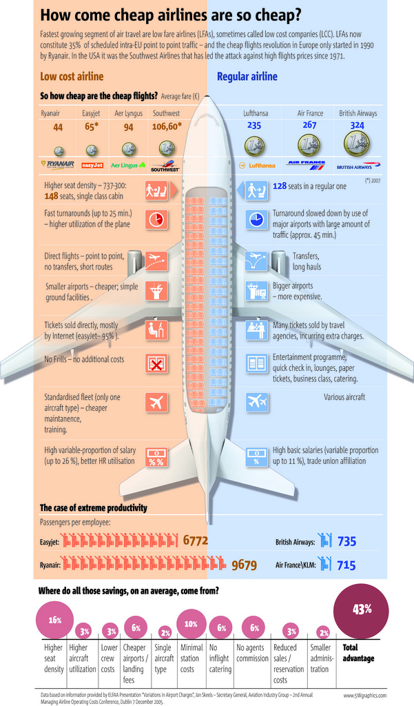
5W Graphics, whose work you’ve seen by now, compares lower-cost airlines to “regular” airlines. The infographic is from the Spain group, so the focus is on Eurpoean airlines. Apparently the concept of low fair airlines (LFAs) is fairly new in Europe, only starting in 1990 with Ryanair while Southwest Airlines was founded in 1970. I’m more of a JetBlue guy myself. I cherish my legroom and in-flight entertainment.
[via Cool Infographics]
-
your.flowingdata (YFD), a Twitter application that lets you collect data about yourself, is now LIVE!
I feel like I’ve been working on this project forever, but it’s finally at a place where I think it’s ready for human consumption. And unlike the previous version, what you track is completely up to you.
Read More






 Visualize This: The FlowingData Guide to Design, Visualization, and Statistics (2nd Edition)


