• It’s coming to the end of the academic year, which means there are lots of graduate students frantically finishing up their dissertations, defending, and earning their degrees (yay!). Here are some tasty visualization dissertations, new and old, worth thumbing through.

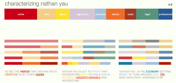
    Information Visualization for the People
    Information Visualization for the People by Mike Danziger, Massachusetts Institute of Technology, Comparative Media Studies

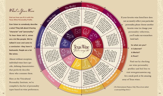
    Form of Facts and Figures
    The Form of Facts and Figures by Christian Behrens, Potsdam University of Applied Sciences, Interface Design

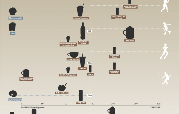
    Practical Tools for Exploring Data and Models
    Practical Tools for Exploring Data and Models by Hadley Wickham, Iowa State University, Department of Statistics

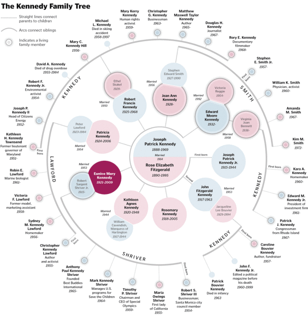
    Visual Tools for the Socio–semantic Web
    Visual Tools for the Socio–semantic Web by Moritz Stefaner, Potsdam University of Applied Sciences, Interface Design

    Computational Information Design
    Computational Information Design by Ben Fry, Massachusetts Institute of Technology, Media Arts and Sciences

  • Bestiario, the group behind 6pli, recently put up their piece that maps informational distance between cities. At the base is a freely rotating globe. Arcs, whose strength and height represent strength of relationship, connect cities. The metric to determine strength of relationship takes several contexts into account – Google searches for individual cities, cities together, and geographical proximity. Bestiario implemented the piece in actionscript and used their own 3d framework (in Spanish).

    [Thanks, Santiago]

  • The U.S. Census Bureau released their 2008 Statistical Abstract, the National Data Book, not too long ago (um, like in January). There are state rankings and data in 30 categories and many more sub-categories. All this data is in the form of PDFs and Excel spreadsheets, which doesn’t lend much to readability, but still, it’s nice to have access to all the information.

    Maybe FlowingData readers can put together a giant statistical abstract all conveyed through graphics. That would be cool. Above are six data sets that I picked from the billion or so available.

  • Popular Mechanics did a study on where it was safest to sit on an airplane based on all commercial jet crashes since 1971. Contrary to expert statements that “one seat is safe as the other,” the study found that it is safer to sit in the back.

    The funny thing about all those expert opinions: They’re not really based on hard data about actual airline accidents. A look at real-world crash stats, however, suggests that the farther back you sit, the better your odds of survival. Passengers near the tail of a plane are about 40 percent more likely to survive a crash than those in the first few rows up front.

    The percentages in the above graphic are survival rates.

    [Thanks, Tim]

  • In elementary school through high school, I always used Microsoft Excel for my charts and graphs (and use it to clean data every now and then). In undergrad, I learned all of my programming in C++ and Java and did a little bit of engineering stuff in MATLAB. When statistics rolled along, I always analyzed data using R.

    Then I got into data visualization, and for a while it was all about Processing. When I interned for The New York Times, I used a lot of Adobe Illustrator (and still really enjoy playing with it). Lately, I’ve been immersed in Actionscript.

    So what do you use to make sense of data?

    If your weapon of choice isn’t listed, I’d be interested to know what your “other” tool is in the comments, because, well, there’s always more fun stuff to learn.

    {democracy:3}
  • Beach Vacation

    My wife and I are celebrating our one-year anniversary this week with an all-inclusive trip to some tropical island. If all has gone according to plan, I should be sitting on a warm, sunny beach right now enjoying unlimited food and drink to my heart’s content :).

    I do of course have posts scheduled for all this week, so you won’t even notice I am gone, but just in case you email me, sit tight, and I’ll send a reply when I get back. Have a nice week everyone and I’ll see you all next week.

    I’m looking forward to the results of the poll on what you use to play with data (coming up tomorrow).

  • The Boston Globe lets readers explore home run data for the Boston Red Sox left fielder Manny Ramirez. The data is quite detailed and the graphic lets your split the data in several directions. Look at homers by ballpark, who was pitching, the pitch count, when Ramirez homered, and where the ball landed. Baseball fans will really appreciate this interactive graphic and non-baseball fans will probably find it interesting too.

  • This guest post is by Rahul Bhargava, a Senior Software Engineer at nTAG Interactive, makers of interactive name badges for conferences and meetings. Email him : rahul [ @ ] ntag . com

    A common thread in many of the great visualizations Nathan shares on Flowing Data is that they are created for external consumption – someone designs a neat way to represent a dataset to a larger, naive audience. I want to talk about the under appreciated utility of writing quick visualizations for yourself, to help you debug your own complicated or data-dense problems. This is not a new discussion, but I want to remind all the programmers out there that a speedily-created visual representation of your debugging log data might be the quickest way to find your problem! Below are some examples of what we’ve done at nTAG, and some techniques we’ve found particularly useful. Please post a comment about what you do.
    Read More

  • Todd provides 5 reasons why data visualization isn’t more prevalent:

    1. People don’t know what data visualization is.
    2. Bad visualization has skewed perception of what data visualization is and what it can be used for.
    3. People can’t interpret charts or new data representations.
    4. Visualization is difficult to create, but easy to copy.
    5. People won’t pay for visualization.

    While all the reasons do have some truth, there are a couple things worth adding.

    People Do Know What Data Visualization Is

    People have some kind of idea of what data is and know that you can get information out of it somehow. Maybe it’s with a graph or it could be with something more elaborate, but most people will get it. They know what data visualization is. They just don’t know what it’s called. In other words, they know. They just don’t know they know.

    People Will Pay (A Lot) for Visualization

    With all the data out there and the constantly increasing volumes of it, more people want to understand without having to learn formal statistical methods. How can they understand it? Visualization of course. The growing number of examples I’ve covered here on FlowingData show that there is a growing demand. After all, a lot of stuff I’ve covered here was commissioned.

    Not Too Worried

    Anyways, even though not everyone knows about data visualization (yet), I’m not too worried about it. There’s just too much data for people not to care… or am I wasting my time? No. If they don’t care, we’ll show them why they should.

  • At the bottom of each article on National Nine News (Australian MSN), there’s a button to “Flock It!” which is like favorit-ing a news story.

    Flock Button

    Flock ItThe more people who flock a story, the higher up the flock list the story goes. In the sidebar of each story is an interactive graphic that shows readers flocking around the news and stories getting highlighted. The larger the bubble, the more people who have flocked it; story bubbles light up orange when someone flocks it. The site isn’t showing any larger sizes, but a full screen version could be fun. Maybe a screensaver.

    MSN seems to have have this whole news exploration thing going on lately. I like it.

    [Thanks, Andrew]

  • blist logoToday, Kevin Merritt, founder and CEO of blist, provides some background on putting data in the hands of mainstream users.

    blist is not a company of modest ambitions. We want to democratize working with data much as PowerPoint and Visio have empowered mainstream users to create their own presentations and diagrams. Before these breakthroughs in innovation, mainstream users sketched free hand and asked professionals in central resource pools (art departments and engineering departments) to turn drawings into foil transparencies and blueprints.
    Read More

  • Matthew Block and Jonathan Corum from The New York Times use a network graph to map diseases and the genes they have in common. Color indicates the type of disease, circles represent diseases, and gray squares are genes that the diseases have in common. The graphic has a nice magnifying glass zooming feature, so that you too can be a biologist.

  • A quick announcement: I’m headed back to California for a few days and may or may not be online. While I’m gone, I have a couple of interesting guest posts scheduled, so I’m looking forward to reading what you all think when I get back :).

    Also, I have two guest post spots left for when I leave on vacation, so anyone is welcome to email me their ideas.

  • If I were to skip straight to the part in The Shawshank Redemption when Andy Durfesne climbs out of the pipe of poo (and put it on mute), someone who never saw the movie might see an escaped convict who steals money from a warden and fleas to some random place in Mexico called Zihuatanejo. Out of grief, the warden kills himself and Ellis Boyd “Red” Redding eventually teams up with Andy to commit more crimes.

    Those of us who have seen the movie though know this isn’t the case. Why? Because we saw the whole movie and have context.

    Context Matters

    As Andrew, a FlowingData reader, put it, “For statistics to be useful, it needs to be explained in a context.” When I get my hands on some data, whether I’m analyzing or visualizing, I want to know the context of data first. I want to know who collected the data, how it was collected, when it was collected, and what was done to it before it arrived in my hands. Without that meta-information, I could easily make an incorrect assumption about the data or misrepresent it somehow in a visualization – which is very bad.

    Simply put, we use visualization and statistics to tell stories with data. If we don’t have all the information, then we can’t tell a complete story.

  • Thank you to everyone who responded to last week’s poll: What Field of Expertise Do You Study or Work In? At the time I’m writing this, there were 326 responses. While I knew all of you came from lots of different fields, I was surprised by how diverse this group really is, which made me really happy.

    Here are the results. I tried to extract some of the “Other” responses from the comments and placed them into new categories.
    Read More

  • NewsWare was launched yesterday on msnbc.com. It’s a set of apps, games, and widgets to interact with the news. The three main points of interest are the Spectra (pictured above) and two games that resemble a couple of popular arcade games infused with news.
    Read More

  • In a deviation from the usual pie chart and standard tree map, this graphic from The New York Times resembles something of a stained glass window – a really pretty piece of work. Amanda Cox, with Matthew Bloch and Shan Carter, designed the interactive graphic that lets you explore how American consumers spend their money.
    Read More

  • Visualization Criticism – A criticism on the criticism on visualization. Robert Kosara, Fritz Drury, Lars Erik Holmquist, and David Laidlaw argue that we need to critique to further develop viz theory.

    Data Visualization Talks Online – Talks for your viewing pleasure from the likes of Ben Fry, Eric Rodenbeck, Jonathan Harris, and others. A couple hours of weekend learning.

    Why Things Cost $19.95 – An interesting article from Scientific American on the “psychological rules of bartering.” Any guesses on this somewhat arbitrary pricing?

  • People from lots of different fields have emailed me during the course of FlowingData, and I continue to be surprised by the wide reader diversity. So naturally, I’m interested to know what fields all of you study or work in. If you select the Other option, please do leave your “other field” in the comments, or if you are some mix of everything, I’d be interested to hear about that too.

    {democracy:2}