The opening page of We Feel Fine: An Almanac of Human Emotion reads a quote from “a woman in Maine.” It sets the stage for the rest of the book.
I have a problem I’m sure many other bloggers face: I am perfectly comfortable sharing intimate details about my emotions with complete strangers I meet online but shy away from expressing my true feelings to anyone I know in real life.
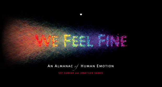
For those unfamiliar, We Feel Fine is a project from Jonathan Harris and Sep Kamvar that’s been online since 2006. At its core, the goal is to show the emotions of the authors behind millions of blog posts on the Web by looking for sentences that start with “I feel” or “I am feeling.” It’s an interactive artwork “authored by everyone.”
Read More


 Visualize This: The FlowingData Guide to Design, Visualization, and Statistics (2nd Edition)


