I’m admittedly not very good with historical precedent, but I think we can all agree it’s important to know about the work those have done before us. It makes your own work better and lets you appreciate what others do more (or less).
Read More
-
-
Thank you, sponsors. I wouldn’t be able to do what I do on this blog without you. It seems like FlowingData is growing faster every month, and you guys make that possible.
Check out what these fine groups have to offer. They help you understand your data:
Tableau Software – Data exploration and visual analytics in an easy-to-use analysis tool.
InstantAtlas – Create and present compelling data reports on geographic maps.
NetCharts – Agile Performance Dashboarding™ for business users.
Xcelsius Engage – Create insightful and engaging dashboards from any data source with point-and-click ease.
Business Intelligence – Visual data analysis made easy. Try 30 days for free.
FusionCharts – Convert all your boring data to stunning charts. Download your free trial now.
Xcelsius Present – Transform spreadsheets into professional, interactive presentations.
Email me at nathan [at] flowingdata [dot] com if you’d like to sponsor FlowingData, and I’ll send you the details.
-
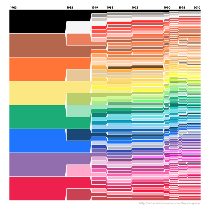
In 1903, Crayola had eight colors in its standard package. Today, there are 120, along with special packs like Gem Tones and Silver Swhirls. What happened? Above, from Weather Sealed, shows the growing color selection (and a few color retirements) in the standard package from 1903 to now.
In 2101, Crayola will hit a color peak and revert to a simpler time. The standard pack will have just two colors: black and Tickle Me Pink (#FC89AC).
[via Waxy Links]
-
Lazy Bob called himself an information designer, but everyone else knew the truth.
-
It’s funny how data is finding it’s way into everyday objects. There was jewelry a few months ago and coins last month. Now we’ve got this experiment with Christmas ornaments from Really Interesting Group (RIG). The snowman’s head is sized by the number of followers on Twitter; the (rain) bars represent miles traveled per month on Dopplr; the red shows listening habits on last.fm; and finally, the blue one shows apertures you’ve used over the year for photos uploaded to Flickr. Read More
-
How do you compare music visually? You can break it down into data by quantifying the notes, volume, etc and then visualize it with timescapes (above). The horizontal axis represents musical time, from the beginning to end of a piece. Large blocks show similarities to other pieces and smaller noisy chunks show more “fleeting” similarities.
Read More -
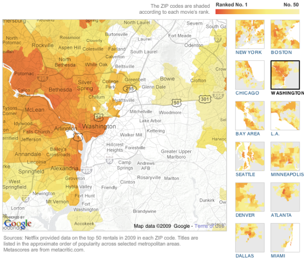
Some movies are popular everywhere. Others are popular only in certain regions. The New York Times, in a nice team effort, maps rental popularity by zip code for large regions in the US.
Read More -
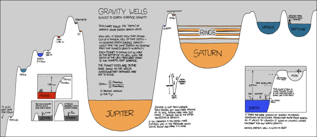
Randall of xkcd has been having fun with data visualization lately. In his latest data-ish comic, Randall explores gravity wells. The height of each well is sized relative to the amount of energy (on Earth) it would take to escape that planet’s gravity. The width of wells are scaled by planet size.
So you’d need one big arse rocket to escape Jupiter.
I know it’s a comic, hand-drawn, and all stick-figurey and stuff, but Randall actually explains the concepts really well. There’s good annotation, clear examples, and he’s made an obscure topic easy to understand.
It’s also entertaining in the Bill Nye the Science Guy (i.e. best Saturday morning show ever) sort of way.
[Thanks, Ricki and Thomas]
-
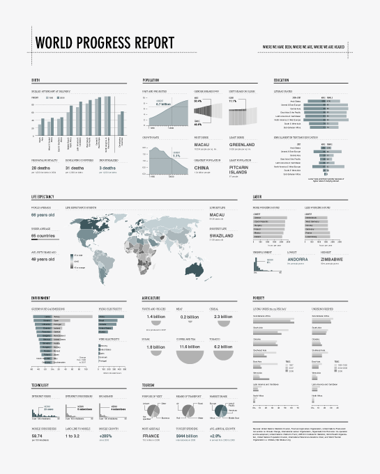
FYI: A new edition on the current state of the world is coming soon from FlowingPrints. Join the mailing list to be first to know when it’s available. I’m only going to take orders for one week this time around, so please please make sure you sign up. More info coming next week.
Read More -
Deal with data? No doubt you’ve come across the time-based variety. This is a guide to help you figure out what type of visualization to use to see that stuff.
-
Old graphics are awesome. We saw some from the 1930s already. These are even older.
Other than the maps, I don’t exactly know what I’m looking at (knowing French would help too), but who cares? Mmm, hand-drawn goodness.
Read More -
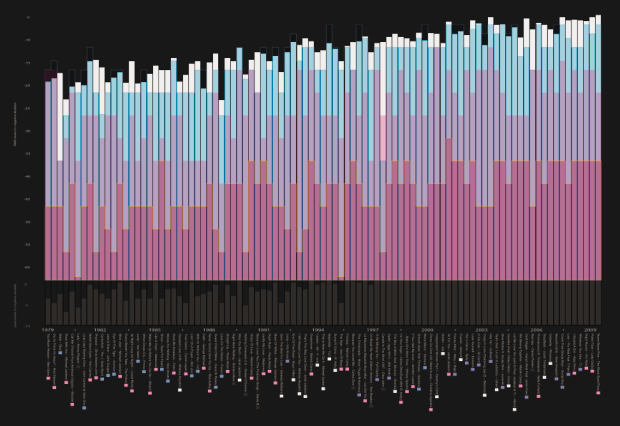
All Things Considered discusses why music sounds worse than it did a few decades ago. Through a practice using compressors, the quiet parts of a song are made louder and the louder parts quieter so that the song as a whole sounds louder to your ear. The purpose: to make the song stand out when you hear it on the radio.
As a result, tracks have gotten louder over the years.
Read More -

Late at night, the new year’s resolution longed for a straight line.
-
The Known Universe from the American Museum of Natural History shows a view of the universe, starting from the Himalayas and quickly moving out to the edge where all is black and scary – made possible by the records in the Digital Universe Atlas.
Read More -
Did we all see this? Phillip Niemeyer of Double Triple pictures the past ten years in this Op-Chart for The New York Times. Each row is a theme, and each column represents a year. For example, the champion rep for 2007 is Tiger Woods or collagen as the fad of 2002. Oh how times change.
Have a happy new year everyone. Be safe.
[via WeLoveDataVis]
-
Merry Christmas, everyone! I hope you’re having a great holiday season so far. Good food, good company, and more good food.
This will be my last post for the year, but don’t fret. FlowingData will return to its regularly scheduled programming January 1. Take a look through the archives if you start to go through withdrawl. Don’t worry – it’s all going to be okay.
See you all next year.
-
This experiment (below) by graduate student Pedro Miguel Cruz shows the decline of Maritime empires during the 19th and 20th centuries .
Pedro explains:
I don’t wanna call this small experiment of information visualization neither information art. Either way sounds too pretentious – as the visuals are not very sophisticated or elegant, and the way that the information is treated doesn’t enable the extraction of advanced knowledge. Although, it works very well as a ludic narrative. I ultimately found it very joyful.
So sit back and enjoy. It’s fun to watch.
Let’s for a second consider an alternative to view this data more analytically for some more insight and what not. I’m thinking an area graph ala Fernanda Viegas and Martin Wattenberg’s History Flow for Wikipedia dynamics could be interesting. What do you think?
-
In celebration of Information Aesthetics’ birthday, Moritz Stefaner of Well-formed Data adapted his elastic lists concept to all five years of infosthetics posts. Each white-bordered rectangle represents a post, and colors within rectangles indicate post categories.
Select categories on the right, and the list updates to show related categories. Similarly, filter posts by year, author, and/or number of categories. Select a rectangle to draw up the actual post.
Go on, give it a try for yourself. Excellent work.
And then head over to infosthetics and wish it a happy birthday.
-
Statisticians are generally behind the times when it comes to online applications. There are a lot out-dated Java applets and really rough attempts at getting R, a statistical computing environment, in some useful form through a browser. So imagine my surprise when I tried this tool by Jeroen Ooms, a visiting scholar at UCLA Statistics.
It actually works pretty well, and for a prototype, it isn’t half bad.
Read More
Recently for Members
Second Edition
 Visualize This: The FlowingData Guide to Design, Visualization, and Statistics (2nd Edition)
 Visualize This: The FlowingData Guide to Design, Visualization, and Statistics (2nd Edition)
New tools, refined process.
Browse by Chart Type See All →


