• Membership
  • Books
  • Projects
  • Learning
  • Newsletters
  • Member Login
  • DOGE goes for farmers’ financial and personal data

    July 10, 2025

    Topic

    Data Sharing  /  DOGE, farmer, government, NPR, privacy

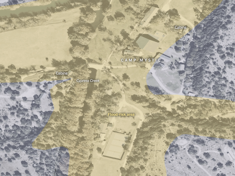
    For NPR, Jenna McLaughlin breaks down DOGE access to sensitive USDA data and potential usage to stop loans and payments.

    “USDA has a lot of data that people should be very concerned about protecting for a lot of different reasons,” said one current USDA employee who requested anonymity due to ongoing fear of retaliation. “Farmers’ financial and production data should be protected at all costs, for privacy reasons and because of competition. If you got access to disaster payments, you would be able to layer a lot of data and arrive at a lot of valuable conclusions about productivity and U.S. farmland, futures markets, and commodity prices. You can hedge a lot of bets and make a lot of money if you know what’s happening with U.S. agriculture.”

    If DOGE were to combine that sensitive data with other sources of government information that it has sought access to, such as Internal Revenue Service and Social Security records, it could create an incredibly detailed dossier of farmers’ and ranchers’ lives, along with their networks and the people they employ, sell to and contract with.

    It should not be this easy.

  • Map of flood-risk area and Camp Mystic

    July 10, 2025

    Topic

    Maps  /  Camp Mystic, flood, New York Times

    The New York Times mapped an overhead view of Camp Mystic with flood-risk area near the Guadalupe River. Cabins, including those just built in 2020, fall within the yellow area.

    “The river is beautiful, but you have to respect it,” Mr. Eastland told the Austin American-Statesman in 1990.

    More disasters followed. In October 1998, flooding in Central Texas, including much of the Guadalupe River basin, killed 12 people and injured 4,290. In the years since, floods in the area have killed 35 more individuals, according to a New York Times analysis of data from the National Oceanic and Atmospheric Administration.

  • Members Only

    Switching axis positions

    July 10, 2025

    Topic

    The Process  /  axes

    Paying attention to the visualization minutiae adds up. This week: axis positions.

  • Second brain deleted

    July 10, 2025

    Topic

    Self-surveillance  /  Joan Westenberg, Jorge Luis Borges, memory

    Joan Westenberg had been writing notes and storing bits for seven years in an effort towards personal knowledge management, to remember everything. She deleted it.

    PKM systems promise coherence, but they often deliver a kind of abstracted confusion. The more I wrote into my vault, the less I felt. A quote would spark an insight, I’d clip it, tag it, link it – and move on. But the insight was never lived. It was stored. Like food vacuum-sealed and never eaten, while any nutritional value slips away.

    Worse, the architecture began to shape my attention. I started reading to extract. Listening to summarize. Thinking in formats I could file. Every experience became fodder. I stopped wondering and started processing.

    I immediately thought of Funes, the Memorious by Jorge Luis Borges. The short story is about a boy who remembers everything, which makes it difficult to function in everyday life. Westenberg references The Library of Babel, another short story by Borges, which imagines an infinite library that seems like it would be useful to access infinite knowledge, but most of the books turn out to be non-sensical.

    Borges wrote those stories in the 1940s, but I think there might be a metaphor in there for the present day.

  • Quarter of the world’s ocean floor has been mapped, so far

    July 10, 2025

    Topic

    Maps  /  collection, ocean, Seabed 2030

    The Seabed 2030 Project aims to create a complete map of the world’s ocean floor. They recently announced that they are a quarter of the way there:

    On World Hydrography Day, The Nippon Foundation-GEBCO Seabed 2030 Project has announced that 27.3% of the world’s ocean floor has now been mapped to modern standards. The increase in data represents more than four million square kilometres of newly mapped seafloor – an area roughly equivalent to the entire Indian subcontinent.

    […]

    From improving tsunami early-warning systems to guiding the installation of undersea cables and identifying biodiversity hotspots, seafloor data enables informed, real-world action.

  • Data Underload  /  marriage

    Marital Status Shifts in the United States

    In 1930, the median age at first marriage for males and females was 24 and 21, respectively. By 2023, the median age increased to 30 and 28. Life expectancy and priorities change.

    Read More
  • Studying the why behind the everyday, like coffee stains

    July 8, 2025

    Topic

    Statistical Visualization  /  everyday, physics, Quanta, Sidney Nagel

    Quanta Magazine interviewed physicist Sidney Nagel, who is known for his research in everyday occurrences and capturing the processes in images.

    Some pushback came because a few people did not consider certain subjects I studied to be “serious.” Others were upset because I was emphasizing what seemed to them unscientific aspects. We could have captured the same physics without working nearly as hard as we did to perfect the photography, and this made people upset. They said, “You’re a scientist, you’re not supposed to care about things like that.” But it matters to me that you appeal to as many aspects of the human endeavor as you can.

    That’s why, for me, the idea of having tenure is such a meaningful thing. Most places wouldn’t have encouraged this stuff, but Chicago has been very good to me. I mean, would you give tenure to someone who’s studying coffee stains?

  • Map of alerts from the National Weather Service

    July 7, 2025

    Topic

    Maps  /  alert, flood, government, National Weather Service

    We are seeing in real-time why the National Weather Service, a part of NOAA, grows in importance as extreme weather grows more common. Currently, shown in the map of alerts above:

    A Moderate Risk of flash flooding has been issued for central Texas for ongoing impactful flash flooding, which may hamper recovery efforts. An enhanced risk of severe thunderstorms in effect for portions of the Plains today. Severe wind gusts and damaging hail are the main threats. T.D. Chantal continues across the Mid-Atlantic with local flash flooding possible. Extreme heat in the West.

    Stay safe.

  • Backyard bird sounds

    July 7, 2025

    Topic

    Infographics  /  Alex Tomlinson, birds, sound

    Alex Tomlinson illustrated backyard sounds of a cardinal, goldfinch, blue jay, mourning dove, and red-bellied woodpecker. “Various, very subjective interpretations of bird calls.”

    For more bird-related art, Tomlinson has an online shop, which includes a magnet with the above.

  • Data Underload  /  emergency room, fireworks, July 4

    Fireworks-related emergency department visits

    The fourth of July, or Independence Day in the United States, is the biggest day for beer and fireworks. The combination doesn’t always work out.

    Read More
  • FlowingData enters adulthood at 18

    July 3, 2025

    Topic

    Site News  /  birthday

    Last week marked 18 years of FlowingData.

    That seems like a long time, especially on the internet. I didn’t know what I was getting myself into.

    There have been books. There have been many analyses and charts. There have been many shared projects.

    Still, my notebooks overflow and I’m excited about projects in the works. I grow more curious about data, analysis, and visualization with every new project, big and small.

    I feel lucky. I feel grateful.

    Thank you for reading. Thank you for sharing. Thank you for supporting.

    Let’s run it back.

  • Members Only

    Questions to visual answers

    July 3, 2025

    Topic

    The Process  /  questions

    One of the best and most direct ways to visualize data with clarity is to ask questions and answer with data.

  • Types of deadlines illustrated from beginning to end

    July 3, 2025

    Topic

    Infographics  /  deadline, Harriet Hand, illustration, Keri Facer

    Some deadlines come unexpected, some come staggered, and some come on a fixed schedule. They all shift the flow of work. Harriet Hand and Keri Facer, as part of their workshop on how we use time, illustrated the different types of deadlines.

    You can also get the above in print.

  • Rating all the U.S. airports

    July 2, 2025

    Topic

    Maps  /  airports, ranking, Washington Post

    There are great airports and there are really bad ones. Which one you get depends on your origin and destination. The Washington Post ranked over 450 U.S. airports to find the best, based on reader survey responses and Yelp reviews. Instead of just landing on the most popular airports, the focus is on what travelers value most, such as how easy it is to get to the terminal.

    Portland International topped the list. I was just at Long Beach Airport, which was number two, and it’s definitely a different feel from all other airports I’ve been to. It’s an oddly relaxing experience.

    WaPo also provides a map tool so that you can search for airports in your area. I actually saw the tool before the article and was so confused why they kept referencing ranks without showing an ordered list.

  • Table for science-backed vaccine recommendations

    July 2, 2025

    Topic

    Infographics  /  CDC, science, Scientific American, vaccination

    Jen Christiansen and Meghan Bartels provide a quick reference for Scientific American:

    Kennedy’s decision to replace ACIP wholesale and the comments he has made about deviating from standard vaccine policymaking practice suggest that new recommendations won’t be backed by established vaccine science—hence our reproduction of the vaccine recommendations as of the end of 2024.

    There are tables for young children, older children, and adults. Green represents a recommendation for everyone. Yellow represents a recommendation for a subset.

    It’s annoying that this is necessary, but it is necessary. It seems wise to keep watch on how these reproduced tables compare against shifting CDC recommendations.

  • AI slop on Last Week Tonight

    July 1, 2025

    Topic

    Artificial Intelligence  /  Last Week Tonight, slop

    Last Week Tonight with John Oliver digs into AI slop. It’s the fake generated stuff filling our feeds with content, inevitably leading us to question our existence and whether this internet thing was really all worth it.
    Read More

  • When a woman’s cycle stops

    June 30, 2025

    Topic

    Infographics  /  period, Reuters

    Many women lose their period while still of reproductive age. For Reuters, Daisy Chung, Minami Funakoshi, and Julia Wolfe explain why it happens and how some people can recover.

    In this situation — known as functional hypothalamic amenorrhea (HA) — the body shuts down the reproductive system to preserve energy for essential functions, such as keeping the heart beating. It’s an evolutionary strategy to prevent pregnancy when the body can’t support it — but the consequences can extend to all aspects of health.

    Careful illustrations and a soft water color aesthetic is used to approach the sensitive topic.

  • Overview of the GOP bill, a bar chart

    June 30, 2025

    Topic

    Statistical Visualization  /  bill, taxes, Washington Post

    The Washington Post starts with a bar chart to show the major changes from the bill. This provides a wide view, and a sidebar navigation takes you to short explanations of each category.

  • Cost and savings for each item in the GOP bill

    June 30, 2025

    Topic

    Infographics  /  bill, Medicaid, taxes, Upshot

    NYT’s the Upshot has a running list of the items in the bill with how much each will cost or save. The bill would add $3 trillion of debt. Reduced taxes accounts for most of that amount, and Medicaid takes the biggest hit. Items highlighted yellow indicate ongoing discussions.

  • Effects of the Republican bill on your taxes

    June 30, 2025

    Topic

    Infographics  /  bill, profiles, taxes, Washington Post

    The tax bill, that seems to be on its way to passing, will affect people differently, based on income and household. The Washington Post shows concrete examples of the changes to an individual’s taxes.

    I like the use of “profiles” to illustrate quick examples first. Then you can enter information for your own profile with income, state, filing status, and dependents to see how it affects you. The structure gives a point of reference to compare against.

  • Page 1 of 396
  • 1
  • 2
  • 3
  • 4
  • 5
  • 6
  • ...
  • 396
  • >

Analyze, visualize, and communicate data usefully, beyond the defaults.

Become a member →

Recently for Members

July 10, 2025
Switching axis positions

July 3, 2025
Questions to visual answers

June 26, 2025
Visualization Tools and Learning Resources, June 2025 Roundup

June 19, 2025
Making Data Relatable

June 12, 2025
Comparing multiples

Second Edition

Visualize This: The FlowingData Guide to Design, Visualization, and Statistics (2nd Edition)

New tools, refined process.

Order: Amazon / Bookshop

Browse by Chart Type See All →

Connected Scatter Plot Chord Diagram Timeline Barcode Chart Table Ternary Plot Strip Plot Pie Chart Streamgraph Histogram

Browse By Topic

  • Visualization

    Seeing data

  • Maps

    Seeing geographic data

  • Infographics

    Explaining data

  • Networks

    Connecting data

  • Statistics

    Analyzing data

  • Software

    Working with data

  • Sources

    Getting data

  • Design

    Making data readable

Made by FlowingData

  • The Process

  • Data Underload

  • Chart Everything

  • Guides

  • Books

  • Shop

  • About
  • Contact
  • LinkedIn
  • Instagram
  • Bluesky
  • RSS
Copyright © 2007-Present FlowingData. All rights reserved.