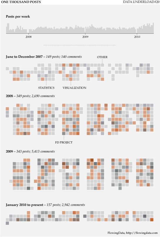
• I finally got around to putting all the FlowingData projects together. As many of you know, I like to post my own experiments once in a while (a few that I forgot that I had even done), but I never had them all together; now you can find them all in one place. I also moved some stuff around so that everything is more unified. Lastly, there’s a new growth map up, alongside Target and Walmart, for your viewing pleasure. Enjoy.

  • While we’re on the topic of beer (it is Friday after all), let’s take a look at legal drinking age around the world. Greenland – no age limit. Probably gotta drink to stay warm, eh? Have a nice weekend, everyone. Be kind to your liver.

    [Thanks, Jason]

  • Mike Wirth maps medal winners from the Great American Beer Festival from 1987 to 2007. I’m not surprised that California has won so many medals, because, well it’s a big state, but check out Colorado and Wisconsin. There must be some good beer there. Although, it’s hard to make any real judgment based just on medals. Coors and Budweiser have each won seven medals. Really? To each his own, I guess.

    [Thanks, Mike]

  • This interesting chart from Russel Investments shows the current state of the economy and what it typically is according to seven key indicators such as credit risk, corporate debt, and market volatility. The blue bars provide a “typical” range, and the orange pointers show the current values. Above each orange pointer is an arrow that indicates whether we’re trending towards or away from the typical.

    So for example, corporate debt is much higher than usual and it’s trending towards typical. Mortgage delinquencies, however, are trending away from the typical. Scary. The chart is updated once a month. Hopefully all those arrows are pointing towards blue soon.

    [Thanks, Max]

  • Roland Lößlein, a media student at University of Applied Sciences in Augsburg, presents meteorological time series data in 3-D in a class project called Synoptic. Rotate and zoom in and out on the different time lines, select different metrics, and compare against the corresponding time series on the bottom. After a few minutes of playing with it, I’m still trying to decide whether or not it’s useful, but I think it’s more of an experience than it is an analytical tool. It’s almost like exploring a map, but instead of rolling hills, you get dips and peaks in a chart. Interaction is smooth and the visualization scores well in aesthetics.

    [Thanks, Roland]

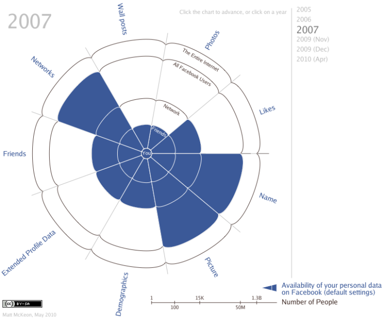
  • Facebook started as a spinoff of Hot or Not in 2003. Now Facebook is the world’s biggest online social network. It’s certainly come a long way with millions of users around the world, the opening of the Facebook Platform, and quite possibly a personal data gold mine. All Facebook, the unofficial Facebook resource, provides news, and more importantly, data on growth, demographics, pages, and applications. A lot of it is locked behind a not so pretty widget, but interesting nevertheless. The above graphic is a look at some of that data.

    [Thanks, @mobiletek]

  • Tomas Nilsson, a graphic design student from Linköping University, tells the story of Little Red Riding Hood with animated infographics. The video (below) was inspired by Röyksopp’s Remind Me and has that ever so familiar European electronica music moving things along. Covering topics from grandma’s nutritional value to the aerodynamics of the traveling bus, the video is very tongue in cheek and totally worth the three minutes of your life.
    Read More

  • Nicolas Rapp and Damiko Morris of Associated Press delve into the AIG bailout. Six months ago, AIG received $173 billion from the government. They have about $50 billion left while the rest has gone to bonds, securities, credit default swap, and some other stuff. I wonder where the other $50 billion will go.

    [Thanks, Nicolas]

  • How can we now cope with a large amount of data and still do a thorough job of analysis so that we don’t miss the Nobel Prize?

    — Bill Cleveland, Getting Past the Pie Chart, SEED Magazine, 2.18.2009

    For the past year, I’ve been slowly drifting off my statistical roots – more interested in design and aesthetics than in whether or not a particular graphic works or the more numeric tools at my disposal. I’ve always had more fun experimenting on a bunch different things rather than really knuckling down on a particular problem. This works for a lot of things – like online musings – but you miss a lot of the important technical points in the process, so I’ve been (slowly) working my way back to the analytical side of the river.
    Read More

  • In the promotion of its speedy javascript, Google announces the Chrome Experiment. As part of the Experiment, design group Use All Five give us Small Talk, which is a social weather map that uses tweets that contain terms like rainy and sunny. Circles are sized by number of tweets, and tweets are colored by dominant weather tweet, so what you get right now is very blue on the east and sort of orange in the west. Oh how I long for the sun.

    The cool thing about this (and the other projects from Chrome Experiment) is that it’s implemented in javascript.

    Pan and zoom…

    Click on the bubbles…

    Yes, javascript just keeps getting faster and more impressive. It’s no longer just a way to show dynamic status messages and popups. It’s much more than that. Javascript is becoming a viable visualization solution.

    [Thanks, Levi]

  • I’ve given a few talks on my work with self-surveillance, and there is almost always someone who asks, “What if someone doesn’t want to know about _____?” Fill in the blank with weight, health, pollution, or whatever. I usually respond with something like, “Then self-surveillance is probably not for them, and they can continue living in denial.” Maybe instead we should just force everyone to bite the bullet and face the facts. That’s what the above bus stop ad for FitnessFirst seems to be going for. When someone sits on the bus bench, the ad shows the the person’s weight on a big LED. Not only is it looking straight at that person, but it’s also up there for everyone else to see. I wish I could get a tape that showed people’s reactions.

    [via directdaily via kottke]

  • I just started the FlowingData NCAA tournament bracket. Join now. Try and beat me if you can.

    The great thing about the tournament is that that you’re gonna hear tons and tons of statistics on what players have done, who’s favored to win, and who is without a doubt going to lose. Throw a huge dose of raw, human emotion and competitive spirit, and without a doubt, a lot of the data will mean absolutely nothing. I love it.

    To make things interesting, to the winner goes a $20 Amazon gift certificate. If I win, nobody gets anything. Muauahahaha. Go on. I dare you. Join now and make your picks. Hurry though, because there’s only a couple of days left.

  • Aaron Koblin and Daniel Massey team up to give us Bicycle Built for Two Thousand, an Amazon Mechanical Turk rendition of Bicycle Built for Two. They used custom software written in Processing to record 2,088 voices. Put together all those random voices, and you get this:

    For 6 cents, turkers were asked to imitate a sound bite and were not told why they were doing so. What they were actually singing was a note from “Daisy Bell,” originally written by Harry Dacre in 1892, or otherwise known as the first song sung by a computer in 1962. The full song is interesting, but it’s even more amusing listening to the individual (dorky) voices singing the separate notes. Ehhhhh… wahhhh… eeeeeee… haha.

    [via infosthetics]

  • Data Flow: Visualizing Information in Graphic Design isn’t an Edward Tufte book. It’s not an instruction manual nor is it a guide to analytical and statistical graphics. Rather, Data Flow is a showcase of visualization and infographics with a hard focus on aesthetics and form.
    Read More

  • If you’re interested in learning how to use R for statistical graphics or tools like GGobi for exploratory data analysis, check out this workshop in Washington, DC during the end of July right before the annual Joint Statistical Meetings. The workshop’s called Looking at Data.

    Graphics are a fundamental part of data analysis, used in initial data inspection and exploration, model building and checking and also communicating information. In this course we will teach the basics of static graphics and move on to the new developments in direct manipulation and dynamic graphics that facilitate exploratory data analysis. The methods taught are readily available in open source software, enabling all participants to reproduce, extend and use them with their own data after the workshop.

    This workshop will be focused on the analytical side of things (after all, three statisticians are running it) with static graphics on day 1 and dynamic graphics on day 2, so if you’re interested in learning graphics for analysis, this should be fun.

  • I’ve said it before, and I’ll say it again. If there’s anything good that has come out of the financial crisis it’s the slew of high-quality graphics to help us understand what’s going on. Some visualizations attempt to explain it all while others focus on affected business. Others concentrate on how we, as citizens are affected. Some show those who are responsible. After you examine these 27 visualizations and infographics, no doubt you’ll have a pretty good idea about what’s going on.
    Read More

  • It’s been an interesting month on FlowingData. We celebrated 10,000 readers not too long ago and we’re already about to reach 12,000. I also handed out more invites to your.flowingdata, and it’s been really fun getting all the good feedback from all of you. It’s kind of overwhelming at times, but I enjoy every minute of it.

    None of this would be possible without the help of FlowingData sponsors. I hope you’ll join me in thanking them by checking out the cool visualization stuff they have to offer:

    Eye-Sys — Comprehensive real-time 3D visualization. Their gallery section in particular is quite impressive.

    Tableau Software — Data exploration and visual analytics for understanding databases and spreadsheets that makes data analysis easy and fun.

    NetCharts — Build business dashboards that turn data into actionable information with dynamic charts and graphs.

    InstantAtlas — Enables information analysts to create interactive maps to improve data visualization and enhance communication.

    SiSense — Easy-to-use reporting and analysis. No code required and directly connects to Excel, CSV files, SQL, MySQL, Oracle and SQL Analysis Services

    If you’d like to sponsor FlowingData, please feel free to email me, and I’ll get back to you with the details.

  • Remember our short contest a while back with immigration rates to the United States? The New York Times digs deeper with their Immigration Explorer. It’s an interactive map that lets you browse immigration rates since 1880. Counties are colored by the largest foreign-born group according to percent of population. You can also explore by number of residents.

    Scroll the top bar left and right for decade; zoom and pan the map to focus on a state; mouse over counties for foreign-born population vs total population; change bubble size as you look at immigration counts; or select a specific country for a different view. It really does let you explore the data, which by the way you can find most of at Social Explorer.

    You’ll notice a large portion of immigrants are from Europe and Russia in the earlier decades, but as you come closer to the present the country appears to diversify as well as an increase in counties with large Asian and Latin American populations. Of course, this is exactly what we should expect. It’s what we saw in all the stacked plots, bar graphs, time series plots, and maps from our contest.

    [Thanks, Scott]

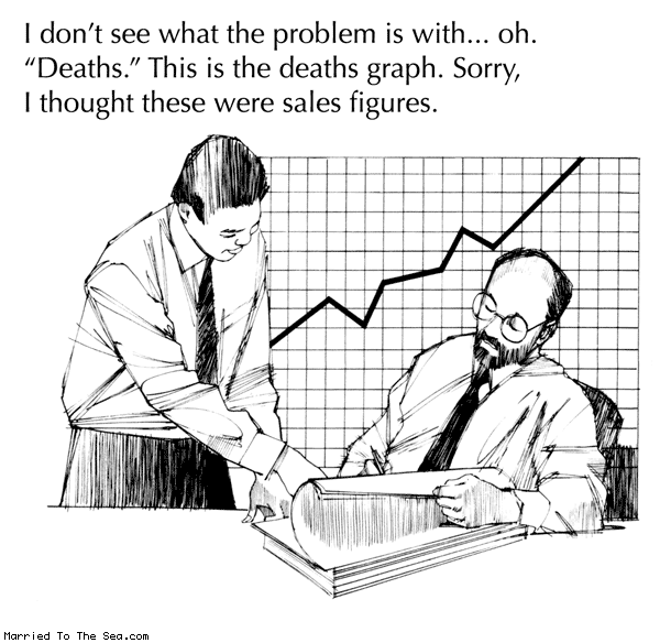
  • What do you think about the above graphic? Good, bad? Effective, or not? Sexy, not sexy? Discuss amongst yourselves.

    [via Pharyngula | Thanks, Pat]

  • As many of you know, I’ve been working on a project that lets you collect data about yourself via direct messages on Twitter. It’s called your.flowingdata (YFD). It started with just weight and sleep, but it’s slowly growing. I recently added entertainment, potty time, smoking, mood, and something I call YFD pulse. You can now also download your data in CSV format.
    Read More