• Membership
  • Newsletter
  • Projects
  • Learning
  • About
  • Member Login
  • Data Underload  /  income, work, young

    Young Money

    Income tends to increase with age, because more work experience and education tends to lead to higher paying jobs. However, young people can also earn higher incomes. Using data from the most recent 2022 American Community Survey, let’s see what those people studied and what they do for a living.

    Read More
  • Members Only

    Figuring Out How a Visualization Was Made

    December 7, 2023

    Topic

    The Process  /  components, steps

    One of the best ways to learn how to visualize data is to recreate a chart, but sometimes it’s unclear how that chart got made. What tool was used? What are the steps to make the chart with your own tools?

  • Life in the Gaza Strip

    December 7, 2023

    Topic

    Maps  /  Gaza, life, New York Times

    The New York Times put together an image of what life is like in Gaza right now: bombing, death, food and water shortage, and limited medical supplies. A 3-D basemap of the Gaza Strip sets the foundation of the story and layers of individual stories and overall destruction display on top.

  • Steps for getting started with data visualization

    December 6, 2023

    Topic

    Visualization  /  Datawrapper, getting started, learning, Lisa Charlotte Muth

    Getting started with data visualization can be tricky because of all the resources and tools available these days. Approaches also change with what you want to visualize data for. For Datawrapper, Lisa Chartlotte Muth outlines how to take your first steps.

    The main theme is to make more charts.

    See also: getting started with visualization after getting started with visualization.

  • A wide view of visualization with ‘The Art of Insight’

    December 5, 2023

    Topic

    Design  /  Alberto Cairo, book

    The Art of Insight, by Alberto Cairo, highlights how designers approach visualization with a wide view.

    In the narrowest view of data visualization, you use charts to pull quick, quantitative information from dashboards and reports. Take a few steps back and you get exploratory data analysis and then storytelling. Keep going and you get a fluid-like approach to visualization that gives more attention to beauty, emotion, and qualitative insights that are difficult to measure. The Art of Insight, the final book in Cairo’s three-book series, focuses on the more fluid approach.

    As a slow reader, I read this surprisingly quick. I enjoyed reading and thinking about the less mechanical side of visualizing data.

  • ER visits for Christmas decoration injuries

    December 4, 2023

    Topic

    Statistical Visualization  /  Christmas, emergency room, USAFacts

    A lot of Christmas lights went up this past week. I hope you weren’t one of the thousands who ended up in the emergency room. USAFacts shows the ramp up after Thanksgiving and the mini-spikes after. [Thanks, Amber]

  • Inflation high, cost of living no good

    December 1, 2023

    Topic

    Infographics  /  Bloomberg, cost, inflation

    Usually inflation is more of a slow thing that you don’t notice so much until you think back to the time when a burger was only a dollar. Prices increased much faster over the past few years though. For Bloomberg, Reade Pickert and Jennah Haque zoom in on the everyday items that are noticeably more expensive. Basically everything.

    I just wrapped up travel in a high cost of living area. The sticker shock on a simple grocery bill was brutal.

  • Members Only

    Visualization Tools, Resources, and Datasets – November 2023 Roundup

    November 30, 2023

    Topic

    The Process  /  roundup

    Here’s the good stuff for the month.

  • How much more income people need to be happy

    November 30, 2023

    Topic

    Statistical Visualization  /  happiness, income, Wall Street Journal

    For the Wall Street Journal, Joe Pinsker reports on income and happiness, or more specifically, on the raises people said they needed to be happy. The more people have the more they need.

  • Failed community notes to stop misinformation on Twitter

    November 29, 2023

    Topic

    Infographics  /  Bloomberg, misinformation, Twitter

    Twitter has a Community Notes feature that attempts to flag posts that contain misinformation. This might work well in theory, and the notes are often informative, but it works slowly and is often not enough to stop the spread of misinformation in a viral tweet. Bloomberg shows the spread through the lens of a single tweet.

  • Running out of space to grow food

    November 28, 2023

    Topic

    Maps  /  agriculture, Associated Press, population

    For Associated Press, Christina Larson and Nicky Forster examined the growing population and the land required to feed all the people. A map shows spreading farmland over the centuries and at some point there won’t be enough land to grow food if we continue what we’ve been doing.

  • Change in commute times in major cities

    November 27, 2023

    Topic

    Statistical Visualization  /  commute, New York Times

    Using GPS data processed by Replica, Lydia DePillis, Emma Goldberg, and Ella Koeze, for The New York Times, show how commutes have changed post-pandemic. The roads in major cities are a little bit less congested and the traffic moves a bit faster.

    The line chart above shows average speeds in 2022 relative to 2019. So you can see in most places people driving faster and more so during rush hour.

  • Toddlers and stochastic parrots

    November 24, 2023

    Topic

    Infographics  /  AI, children, illustration, New Yorker

    For The New Yorker, Angie Wang draws parallels between toddler learning behavior and training large language models, but more importantly, where they diverge.

    They are the least useful, the least creative, and the least likely to pass a bar exam. They fall far below the median human standard
    that machines are meant to achieve.

    They are so much less than a machine, and yet it’s clear to any of us that they’re so much more than a machine.

  • Parallel lines of old

    November 22, 2023

    Topic

    Infographics  /  humor, parallel

    This doesn’t have labeled axes, so I assume it only shows a zoomed in portion of the earlier years. The slope of the top line starts to level out at older ages, because my lines are about to cross.

    See also: Closeness lines over time.

  • Attitudes towards tipping in the U.S.

    November 21, 2023

    Topic

    Statistical Visualization  /  Pew Research, tipping

    Tipping seems to be in a confusing spot right now. On the one hand, customers want to support workers, but on the other, tip suggestions seem to be rising towards uncomfortable rates and in places where people don’t usually tip. Pew Research surveyed 12,000 U.S. adults to see how we’re all feeling about the current state of tipping.

  • Data Underload  /  income, occupation, work

    Jobs with Higher Income and Fewer Hours

    About 15% of working Americans make at least $100,000 of income per year as of the 2021 American Community Survey. As you’d expect, many who fall in that 15% spent more years in school and spend more hours at work.

    But you can also earn a six-figure income without working all the time. What about those people? What do they do?

    Read More
  • Building fair algorithms

    November 17, 2023

    Topic

    Statistics  /  algorithm, bias, Coursera, Fred Hutchinson Cancer Center

    Emma Pierson and Kowe Kadoma, for Fred Hutchinson Cancer Center, have a short and free course on Coursera on practical steps for building fair algorithms:

    Algorithms increasingly help make high-stakes decisions in healthcare, criminal justice, hiring, and other important areas. This makes it essential that these algorithms be fair, but recent years have shown the many ways algorithms can have biases by age, gender, nationality, race, and other attributes. This course will teach you ten practical principles for designing fair algorithms. It will emphasize real-world relevance via concrete takeaways from case studies of modern algorithms, including those in criminal justice, healthcare, and large language models like ChatGPT. You will come away with an understanding of the basic rules to follow when trying to design fair algorithms, and assess algorithms for fairness.

    It’s geared for beginners and no coding is required.

  • Members Only

    Chart Options When You Have Little Space

    November 16, 2023

    Topic

    The Process  /  mobile, options, responsive design

    As more charts shift to smaller screens, we have to find ways to save space but keep the data readable. There are options.

  • Carrier pigeon vs. internet upload speeds

    November 16, 2023

    Topic

    Infographics  /  Internet, pigeon, speed, Washington Post

    In some rural areas, upload speeds are crawlingly slow, which can make it difficult to send things on the internet. In some cases, a carrier pigeon might even be faster. For The Washington Post, Janice Kai Chen did the math so you know which one to use:

    Racing pigeons clock an average of 40 miles per hour and typically race up to 400 miles, roughly from D.C. to Boston, according to the American Racing Pigeon Union. With the boost of a tailwind, pigeons have been recorded going as fast as 110 mph and as far as 1,000 miles.

    At certain data volumes and distances, the pigeon is a quicker option for large swaths of rural America, where internet speeds can lag far behind the national average.

  • Premiums on electricity during Covid lockdowns in Italy

    November 15, 2023

    Topic

    Statistical Visualization  /  Bloomberg, Covid, electricity, Italy

    During Covid lockdowns, power companies in Italy charged premiums to cover increased prices for electricity, but it appears that isn’t the full story. For Bloomberg, Vernon Silver, Eric Fan, and Sam Dodge analyzed costs and premiums over time:

    Even so, it’s clear – from executives’ celebratory comments during earnings calls as well as simple mathematics – that the dispatch market’s higher prices helped companies do far better than merely avoiding losses. In 2020 alone, dispatch premiums totaled €1.2 billion – or 238% more than companies would have received at the day-ahead price.

    It looks like the power costs might partially be an excuse to charge more premiums. Maybe. Either way, I’m into the glowing aesthetic on the calendar heatmaps.

  • Page 33 of 392
  • <
  • 1
  • ...
  • 30
  • 31
  • 32
  • 33
  • 34
  • 35
  • ...
  • 392
  • >

Analyze, visualize, and communicate data usefully, beyond the defaults.

Become a member →

Recently for Members

May 8, 2025
When the data is not what it seems

May 1, 2025
Finding the Right Charts

April 24, 2025
Visualization Tools, Datasets, and Resources – April 2025 Roundup

April 17, 2025
Breaking Out of Chart Software Defaults

April 15, 2025
Line Chart with Decorative Neon Accents

Browse by Chart Type See All →

Small Multiples Packed Bubble Chart Area Chart Stacked Bar Chart Ternary Plot Donut Chart Choropleth Map Radar Chart Connected Scatter Plot Dot Density Map

Browse By Topic

  • Visualization

    Seeing data

  • Maps

    Seeing geographic data

  • Infographics

    Explaining data

  • Networks

    Connecting data

  • Statistics

    Analyzing data

  • Software

    Working with data

  • Sources

    Getting data

  • Design

    Making data readable

Get the Book

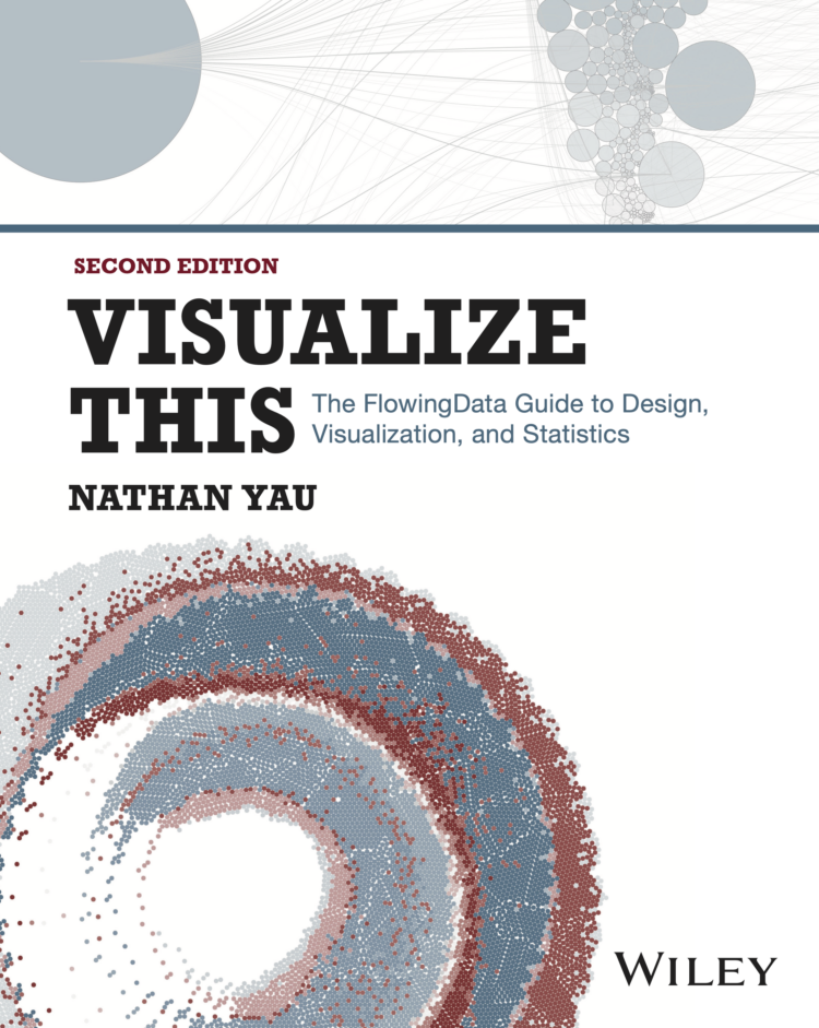
Visualize This: The FlowingData Guide to Design, Visualization, and Statistics

Available now.

Order: Amazon / Bookshop

Made by FlowingData

  • The Process

  • Data Underload

  • Chart Everything

  • Guides

  • Books

  • Shop

  • About
  • Contact
  • Newsletter
  • LinkedIn
  • Instagram
  • Bluesky
  • RSS
Copyright © 2007-Present FlowingData. All rights reserved.