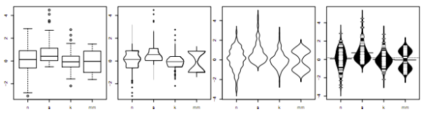
• Membership
  • Newsletter
  • Projects
  • Learning
  • About
  • Member Login
  • Best of FlowingData – October 2010

    November 5, 2010

    Topic

    Best of FlowingData

    Here are the most popular posts of October, according to combination of views and comments. Thanks again for sharing, linking, and liking. Every little bit helps FlowingData reach a wider audience.

    1. Privacy and the Internet
    2. True size of Africa
    3. Animated graphic on why you should shut off your work computer
    4. Mad Men office floor plan
    5. Evolution of Batman logos
    6. Mobile patent lawsuits
    7. Eating guide for dim sum virgins
    8. Visualize This: Sexual health data from national survey
    9. Where refugees come from
    10. Famous logos and brands simplified
  • Simple analysis makes Expedia extra $12m

    November 5, 2010

    Topic

    Statistics

    There was a problem on Expedia where a lot of people were choosing their itinerary, entering their information and then dropping off after they clicked on the Buy Now button. It’s like getting to the cash register at a store, and the cashier says they can’t take your money.

    So analysts took a look and found that the field to enter your company was confusing people, leading to the input of an incorrect address. “After we realised that we just went onto the site and deleted that field — overnight there was a step function [change], resulting in $12m of profit a year, simply by deleting a field.”

    Not bad for a little bit of data digging. I hope the analysts got a bonus.

    That said, not every decision has to be driven by data. Balance is good.

    [Silicon via @jpmarcum]

  • Open thread: How do you start working on a data graphic?

    November 4, 2010

    Topic

    Discussion

    People approach data in different ways, especially across different fields. When you’re presented with a dataset that you have to convert to a graphic, what’s the first thing that you do?

  • When people break up, according to Facebook updates

    November 4, 2010

    Topic

    Statistical Visualization  /  facebook, relationships

    For his book The Visual Miscellaneum, David McCandless, along with Lee Byron, had a look at breakups on Facebook, according to status updates. They looked for the phrase “we broke up because” in status updates, and then graphed the frequencies over time. Why they couldn’t just look at updates to relationship status, I’m not sure.

    Notice the peak leading up to the holiday season and spring cleaning. Then there’s the people who think it’s a funny April Fool’s joke to say the broke up with their significant other.

    Finally, there’s the highlight of Mondays, which you might lead you to believe that people like to call it quits during the beginning of the week. My hunch though is that it happens towards the end of the week, people use the weekend to be sad, and then talk about it on Facebook.

    [Information is Beautiful | Thanks, Elise]

  • Review: Atlas of Science, Visualizing What We Know

    November 3, 2010

    Topic

    Reviews, Visualization  /  book, science

    Katy Börner, professor of information science, catalogs visualization and science in Atlas of Science: Visualizing What We Know.

    Cartographic maps have guided our explorations for centuries, allowing us to navigate the world. Science maps have the potential to guide our search for knowledge in the same way, helping us navigate, understand, and communicate the dynamic and changing structure of science and technology. Allowing us to visualize scientific results, science maps help us make sense of the avalanche of data generated by scientific research today.

    At first glance, without reading anything, it looked a lot like a general scientific visualization book. Sort of like the opposite of Data Flow. Where the visuals lack in aesthetics, they make up for with richness in data and detailed explanations of what you’re looking at. There are a lot of network diagrams, some geographic maps, and a handful of traditional statistical graphics.
    Read More

  • FlowingData is brought to you by…

    November 3, 2010

    Topic

    Sponsors

    My many thanks to the FlowingData sponsors. They help me keep the servers running and the posts coming. Check ’em out. They help you understand your data.

    InstantAtlas – Enables information analysts and researchers to create highly-interactive online reporting solutions that combine statistics and map data to improve data visualization, enhance communication, and engage people in more informed decision making.

    Tableau Software — Combines data exploration and visual analytics in an easy-to-use data analysis tool you can quickly master. It makes data analysis easy and fun. Customers are working 5 to 20 times faster using Tableau.

    Bime — Start small, connect all your data and answer deep business questions in minutes. Then enlight your partners and everyone in your organisation. Bime is a perfect balance of power and simplicity to help your organisation make better decisions.

    Want to sponsor FlowingData? I’d love to hear from you. Contact me at [email protected] for more details.

  • Keeping an eye on election results

    November 2, 2010

    Topic

    Maps  /  election, interactive

    All eyes here in the states will be on election results tonight, and all the major graphics desks have been hard at work to provide you up-to-date results as the numbers start to roll in. While you’ll be able to see results just about anywhere you look, here are some of the online spots to keep an eye on. They’ve all got the red, blue, and yellow map, but each provides different functionality.
    Read More

  • Past century of government and economy

    November 2, 2010

    Topic

    Statistical Visualization  /  economy, government

    John Palmer has a look at the past 100 years of government and economic indicators:

    This historical perspective visualizes economic trends and spending patterns, during good times and bad. Present-day assumptions regarding core party values have had major shifts over time, and the ridiculous extremes in voter alignment, lobbying, and legislative action are due for revision. As a basis for future shift, this data can educate a presumptive public, empowering citizens to make an informed decision on each and every election day.

    I’m not so sure this would help you make a better informed decision as you vote, since the relationship between political party and economy is more complex than true and false. It’s a good historical reference though.

    What do you think of the graph overlays on top for GDP, debt, collections and CPI, with different vertical scales?

    [Thanks, John]

  • Issues Americans care about

    November 1, 2010

    Topic

    Statistical Visualization  /  interactive, pew

    Every year the Pew Research Center asks Americans what their top political priority is for the year. It should come as no surprise that the economy, jobs, and terrorism top the list.
    Read More

  • Billionaires’ favorite politicians

    November 1, 2010

    Topic

    Network Visualization  /  contributions, election, forbes

    Jon Bruner for Forbes reports on billionaire contributions to politicians over the past four years:

    The billionaires on the Forbes 400 list have given more than $30 million to politicians and political action committees since 2006, along with millions more in soft money to politically active groups. Although Forbes 400 members give about 15% more money to Republicans than Democrats, they fund groups across the political spectrum.

    On the top are the billionaires, sized by the amount of donations, and on the bottom are the politicians, sized by amount of contributions received. Click on either or use the drop down menus to see the connections.

    It lacks some polish, and I’m not totally sure what measurements are used for vertical and horizontal placement, but worth clicking around.

    [Thanks, @JonBruner]

  • The Election on Twitter

    November 1, 2010

    Topic

    Infographics  /  election, interactive, nytimes

    In what seems to have become an expectation during all major events, a Twitter tracker from the New York Times shows you what candidates are getting the most and least buzz. Each circle represents tweets from a candidate, retweets, and tweets direct at, colored appropriately by party. Press play and they grow and shrink over time. Select a specific candidate(s) to see the specific breakdowns.

  • Data Underload

    Data Underload #24 – My Candy

    One pound for them. Nine pounds for you. Happy Halloween. Watch out for…

    Read More
  • Stat concepts to the tune of Gershwin

    October 29, 2010

    Topic

    Statistics

    Stat people will probably find this amusing. For the rest, this might make your head explode. Gurdeep Stephens and Michael Greenacre perform classic songs but use statistical concepts for lyrics. Here’s Summertime, originally by George Gershwin, turned into a song about statistical modeling (video below).

    It’s summertime,
    Statistical modelling is easy,
    Data are fitting,
    Explained variance is high.
    Your data are rich,
    And your model’s good-looking,
    So hush, statisticians, don’t you cry…

    Read More

  • Famous logos and brands simplified

    October 29, 2010

    Topic

    Miscellaneous

    How well do you know your logos and brands? Or more importantly, how memorable are company logos that you don’t even need to see the whole thing to recognize where it’s from? Graham of ImJustCreative simplifies logos into basic shapes. The above is Google. That one’s easy. It’s got the shape. It’s got the color. Can you guess the rest?
    Read More

  • Why everyone should learn programming

    October 28, 2010

    Topic

    Coding  /  Daniel Shiffman, Processing

    Daniel Shiffman, assistant professor at the NYU Interactive Telecommunications Program, talks programming, computation, data, and why everyone should learn programming in this interview by Mark Webster.

    It’s not just about saving time. There are certain things you can discover and be creative with with computation that you can’t by hand. They both go together.

    Watch the four-minute interview below. The excitement in Shiffman’s voice alone might want to make you learn some Processing (which he wrote a useful book for).
    Read More

  • How people in your area spend money

    October 28, 2010

    Topic

    Apps

    The personal finance site Mint aggregates spending data from four million users. At the individual level, Mint is useful in that it brings all of your finances into one place. Zoom out and aggregate, and you have spending for a city or a state. This is what Mint Data does.
    Read More

  • Opportunities in Government 2.0

    October 27, 2010

    Topic

    Data Sources

    Vivek Wadhwa talks government data and the (financial) opportunities ripe for the picking:

    What is happening with the opening up of government data is nothing less than a silent revolution. There are literally thousands of new opportunities to improve government and to improve society—and to make a fortune while doing it. Unlike the Web 2.0 space, which is overcrowded, Gov 2.0 is uncharted territory: a new frontier to explore, grow things on, and settle on. It’s fresh soil for unlikely seedling ideas that, if they take root, could lead to very successful ventures. So I encourage entrepreneurs to stake their claims as soon as they can.

    Wait a minute. Hold up. You can do more with government data than awkward dashboards? Bring it.

    [TechCrunch via @ucdatalab]

  • Visualizing NFL statistics

    October 26, 2010

    Topic

    Statistical Visualization

    Sports statistics. Always so many tables. Juice Analytics takes a more visual approach with their interactive:

    Our NFL stats “spike chart” is an easy way to see who’s leading the league in passing, rushing, receiving, tackles, team offense, and team defense. By showing key metrics side by side, you get the full picture of a player or team performance—not just the highlights.

    It’s pretty straightforward. Select a category on the top, such as passing or rushing, and then see how your favorite players rank in four subcategories. Each player is represented by his team logo. Roll over a logo to see a player’s numbers as well as how they rank in all the subcategories, highlighted by a white square.

    Finally, use the search box to find the player of interest. Matching boxes highlight as you type.

    Such a simple idea. Well executed.

    [Juice Analytics]

  • Unemployment rates over this past year

    October 26, 2010

    Topic

    Projects  /  labor, project, unemployment

    I took a look at unemployment rates about a year ago, and I got to wondering if it’s changed at all over the past year. Not really. It’s still stuck in the 9 to 10 percent range, according to the Bureau of Labor Statistics. It looks like it could be a while until things get better.
    Read More

  • Page 329 of 392
  • <
  • 1
  • ...
  • 326
  • 327
  • 328
  • 329
  • 330
  • 331
  • ...
  • 392
  • >

Analyze, visualize, and communicate data usefully, beyond the defaults.

Become a member →

Recently for Members

May 15, 2025
Step Chart, Enhanced

May 8, 2025
When the data is not what it seems

May 1, 2025
Finding the Right Charts

April 24, 2025
Visualization Tools, Datasets, and Resources – April 2025 Roundup

April 17, 2025
Breaking Out of Chart Software Defaults

Get the Book

Visualize This: The FlowingData Guide to Design, Visualization, and Statistics

Available now.

Order: Amazon / Bookshop

Browse by Chart Type See All →

Alluvial Diagram Pie Chart Connected Scatter Plot Slope Chart Baseline Chart Dot Density Map Calendar Box Plot Bubble Chart Stacked Area Chart

Browse By Topic

  • Visualization

    Seeing data

  • Maps

    Seeing geographic data

  • Infographics

    Explaining data

  • Networks

    Connecting data

  • Statistics

    Analyzing data

  • Software

    Working with data

  • Sources

    Getting data

  • Design

    Making data readable

Made by FlowingData

  • The Process

  • Data Underload

  • Chart Everything

  • Guides

  • Books

  • Shop

  • About
  • Contact
  • Newsletter
  • LinkedIn
  • Instagram
  • Bluesky
  • RSS
Copyright © 2007-Present FlowingData. All rights reserved.