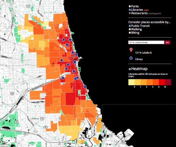
• Membership
  • Newsletter
  • Projects
  • Learning
  • About
  • Member Login
  • Visualization as a mass medium in the 21st century

    April 19, 2011

    Topic

    Visualization  /  CNN, sexy, Viegas, Wattenberg

    In an op-ed for CNN and perhaps adding fuel to the fire, Martin Wattenberg and Fernanda Viegas, leaders of Google’s Big Picture project, talk visualization and its future.

    In reference to rules of simplicity and the data-to-ink ratio derived from works such as that of William Cleveland and Robert McGill:

    The single-minded pursuit of clarity and precision led to designs that were, sure enough, clear and precise. Grid lines receded discreetly into the background; Tufte’s beloved beiges and tans became standard recommendations.

    However, is there something more? Using Hans Rosling’s widely-viewed TED talk as an example:

    Was animation really the most precise way to show the data? Probably not, but the motion, color, and energy helped capture the imagination of millions of viewers across the world.

    Finally, Viegas and Wattenberg end with:

    Emotions and a strong voice aren’t necessarily sins in other media, and they shouldn’t be in visualization, either. By recognizing that being expressive and engaging doesn’t mean giving up clarity, we will have fulfilled the promise of visualization.

    It’s common to look at data through a factual lens, where all meaning and insight is quantitative. This fits well in many settings, but there are other stories to tell that are personal and even moving.

    [CNN via @infosthetics]

  • Dropping movie ratings from the past six decades

    April 19, 2011

    Topic

    Statistical Visualization  /  movies, ratings, rotten

    Dorothy Gambrell of very small array charts median Tomatometer ratings of the top 10 grossing films, since 1950. From the graph it looks like movies are getting worse, but are they really? This goes back to a similar argument from a couple of months ago. The decline is probably more of an indicator of reviewers, viewers, movie types, and ease of watching than it is of a drop in quality.

    [very small array]

  • DisplayCabinet augments keys and wallet with data

    April 18, 2011

    Topic

    Visualization  /  DisplayCabinet, hack, installation, physical

    DisplayCabinet is a clever use of a projected display and RFID tags to take data away from the computer screen an into the physical world.
    Read More

  • Business intelligence vs. infotainment

    April 17, 2011

    Topic

    Infographics  /  criticism, rant

    Business intelligence expert Stephen Few goes on another rant about information graphics — mainly about the work of David McCandless, designer of The Visual Miscellaneum. Few’s post is in response to another from Teradata marketing director Mario Bonardo, praising innovation and new ideas, etc for business intelligence.
    Read More

  • When charts attack

    April 15, 2011

    Topic

    Miscellaneous  /  advertisement, Invesco

    Don’t you just hate it when you’re pleasantly driving around in the city and you’re suddenly enveloped by a giant pie chart in the road? Such a downer.
    Read More

  • Mental disorder graphics

    April 15, 2011

    Topic

    Infographics  /  health, mental, minimalism

    Designer Patrick Smith has a minimalist look at mental disorders:

    I was doing some research about mental health and I came across a list of mental disorders. I chose a few, starting with OCD, and set myself the challenge of defining each in a minimal style.

    The OCD graphic is definitely the best one of the bunch. Others include agoraphobia, anorexia nervosa, and depression.

    [Adapt & Graphic Patrick]

  • Sorting algorithms demonstrated with Hungarian folk dance

    April 14, 2011

    Topic

    Coding  /  dance, nerd, sorting

    We’ve seen sorting algorithms visualized and auralized, but now it’s time to see them through the spirit of Hungarian folk dance. In a series of four videos (so far), folks at Sapientia University in Romania demonstrate how different sorting algorithms work with numbered people dancing around and arranging themselves from least to greatest.

    See them in action in the video below. This one is for Bubble-sort. They move with such zest.
    Read More

  • Sugar consumption buckets

    April 13, 2011

    Topic

    Infographics  /  nytimes, photo, sugar

    Lovely imagery showing sugar consumption for day through lifetime. The average American consumes 45.3 pounds of sugar in a year. It’s a part of a read-later NYT article on the toxicity of sugar. Check out the similar pic for high fructose corn syrup. [via]

  • Challenge: Spot the mistakes in the figures

    April 13, 2011

    Topic

    Discussion  /  garbage, government, mistakes

    During production of the 2011 USAID annual letter from Rajiv Shah, someone said to someone else, “We need to make this more visually appealing. Let’s add some charts.” The problem was that there wasn’t much data to look at or report, and no one knew how to dig deeper. Plus — they had to sexify the letter in a hurry, so they settled for what’s there now.

    Your mission, if you choose to accept it, is to find the mistakes and to make suggestions on how to improve on what’s there. Some figures clearly have a few oddities while others simply could’ve been improved with better design choices. Here’s the letter and the same as a PDF. Can you figure out what’s going on? Leave your findings in the comments. Godspeed.

  • Rings of population change by block

    April 12, 2011

    Topic

    Maps  /  census, population

    You’ve seen population changes at the state and county level, but with Census data, you can zoom in all the way to the block level. Stephen Von Worley breaks it down.
    Read More

  • Recession and rise in antidepressant prescriptions

    April 11, 2011

    Topic

    Statistics  /  antidepressants, journalism, recession

    Over the past four years there was a 43 percent increase in prescriptions for antidepressants. Some news outlets attribute this rise to the recession. People more depressed equals more drugs. Ben Goldacre of Bad Science explains why said outlets need to be more careful with their analyses.

    From what I can tell, all the reports took an aggregate (the 43 percent) and then made a big assumption to explain it. I’m all for data journalism, but statistics is rarely that straightforward.

  • The city in real-time

    April 11, 2011

    Topic

    Maps  /  MIT, sensors, Singapore

    The MIT SENSEable City Lab presents five different perspectives of the ebb and flow in Singapore at the Singapore Art Museum.
    Read More

  • Statistical significance on xkcd

    April 8, 2011

    Topic

    Miscellaneous  /  humor, xkcd

    It’s xkcd on statistical significance. I need to stop eating all those green jelly beans.

    I hear there’s also a link between sunshine and lollipops.

  • Star Trek characters in pixel form

    April 8, 2011

    Topic

    Miscellaneous  /  humor, pixels, Trekkies

    John Martz, in collaboration with Koyama Press, pixelates 235 Star Trek characters in this limited edition print. This amuses me even though I’ve never been a Star Trek fan. Must be those episodes of Next Generation I watched after school because there was nothing else on. Always had a soft spot for that Data fellow.

    [Trexels via Boing Boing]

  • Statistics is the sexiest subject around. And information design.

    April 7, 2011

    Topic

    News  /  design, information, nytimes

    Natasha Singer for The New York Times starts the article on visualization and design with: “In an uncharted world of boundless data, information designers are our new navigators.” Uh oh, I thought, another aesthetic-heavy piece on hot numbers. But then Singer continues:

    They are computer scientists, statisticians, graphic designers, producers and cartographers who map entire oceans of data and turn them into innovative visual displays, like rich graphs and charts, that help both companies and consumers cut through the clutter. These gurus of visual analytics are making interactive data synonymous with attractive data.

    I can get on board with that. Includes soundbites from Rosling, Shneiderman, and Rodenbeck.

    [The New York Times]

  • Data Underload  /  life expectancy, OECD, retirement, world

    Who spends the most years in retirement?

    Early retirement. That’s what most people want, unless you’re lucky enough to love…

    Read More
  • Beauty of Maps available in its entirety

    April 6, 2011

    Topic

    Maps  /  BBC, documentary

    Almost a year ago, the BBC aired the Beauty of Maps, but we Americans couldn’t watch it online. Well, now you can. The full documentary is available for your viewing pleasure on YouTube. The hour and a half film is broken up into 12 parts. They’ve actually been online since August of last year, but for some reason I’m just now hearing about it. Enjoy part one below.
    Read More

  • Movies with multiple Harry Potter wizards

    April 5, 2011

    Topic

    Network Visualization  /  movies, Potter

    I feel like whenever I watch a British film, I see a Harry Potter wizard or witch in it. I guess I’m not imagining things. The Ragbag had a similar curiosity and graphed all the films with four or more wizards in it — all 24 of them.
    Read More

  • Thoughts on end of Data.gov

    April 5, 2011

    Topic

    Statistics  /  Data.gov, government, quicklink

    In a guest post for the guardian.co.uk Datablog, I thought out loud about the possible end of Data.gov and what it means for open government data. Let me know what you think.

    Update: Funding might not be cut completely (for now).

  • Physically climb over budget data with Kinect

    April 5, 2011

    Topic

    Visualization  /  budget, challenge, Kinect

    As an entry to the Eyebeam DataVizChallenge to visualize your taxes, Budget Climb by Frankie Cheung, Zach Schwartz, and Fred Truman places you in a virtual environment where you can climb and stand on top of tax data.

    Created using openframeworks, the Microsoft Kinect and OpenNI Budget Climb is a physically interactive data environment where we can explore 26 years of federal spending – giving us a unique perspective on how our government spends our money. In order to explore the data we must exert physical effort, revealing how the budget is distributed in a novel and tangible way.

    Maybe not the best way to learn about the data, but I like the idea of data exploration as a game. See it in action below. It reminds me of Irad Lee’s Spamology.
    Read More

  • Page 317 of 392
  • <
  • 1
  • ...
  • 314
  • 315
  • 316
  • 317
  • 318
  • 319
  • ...
  • 392
  • >

Analyze, visualize, and communicate data usefully, beyond the defaults.

Become a member →

Recently for Members

May 15, 2025
Step Chart, Enhanced

May 8, 2025
When the data is not what it seems

May 1, 2025
Finding the Right Charts

April 24, 2025
Visualization Tools, Datasets, and Resources – April 2025 Roundup

April 17, 2025
Breaking Out of Chart Software Defaults

Browse by Chart Type See All →

Grid Map Slope Chart Donut Chart Sankey Diagram Stacked Bar Chart Bump Chart Ternary Plot Baseline Chart Pictogram Bar Chart

Browse By Topic

  • Visualization

    Seeing data

  • Maps

    Seeing geographic data

  • Infographics

    Explaining data

  • Networks

    Connecting data

  • Statistics

    Analyzing data

  • Software

    Working with data

  • Sources

    Getting data

  • Design

    Making data readable

Get the Book

Visualize This: The FlowingData Guide to Design, Visualization, and Statistics

Available now.

Order: Amazon / Bookshop

Made by FlowingData

  • The Process

  • Data Underload

  • Chart Everything

  • Guides

  • Books

  • Shop

  • About
  • Contact
  • Newsletter
  • LinkedIn
  • Instagram
  • Bluesky
  • RSS
Copyright © 2007-Present FlowingData. All rights reserved.