With the new year, many of you (myself included) and your employers resolved to be more productive this year. You are going to finish that side project. Learn that new language. Run that long distance. You are going to be all that you can be. Then you spent all day in front of the television yesterday while playing Angry Birds. Little did you know, productivity and Angry Birds go hand-in-hand.
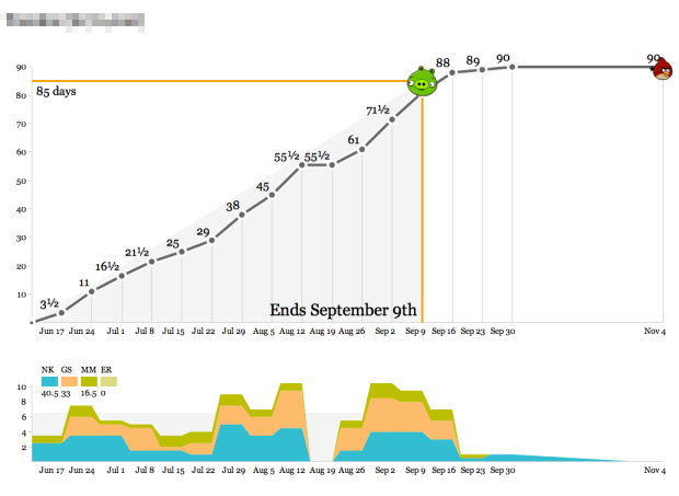
Enter Productivity Birds, created and used internally by Stamen.
We’ve used these graphs as the simplest-possible visualization of how we spend our time so we know how we’re doing relative to the budget for a project. Operationally, the data output of these graphs feeds directly into an accrued revenue model that lets us predict our income earlier. The day/week granularity makes it possible to collect the data as a team without making everyone unhappy with management overhead, and the bias toward whole- or half-day increments helps stabilize fractured schedules (not for me, though—my time is probably the most shattered of anyone in the studio).
Calendar time is represented on the horizontal axis and time spent on a project is the vertical. The object of the game is to hit the bird, where a bird over the pig means a risk of losing money, and a bird past the big means a risk of finishing late. The stacked area chart on the bottom shows who has been or is working on the project.
The small app, built with Protovis, is available on GitHub.



 Visualize This: The FlowingData Guide to Design, Visualization, and Statistics (2nd Edition)


