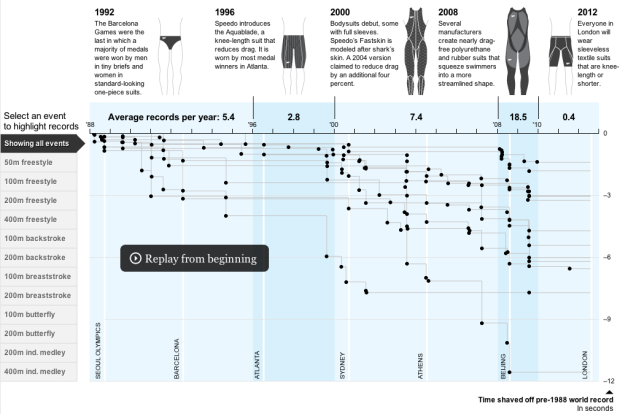
• fingerprintThere’s a lot of crime data. For almost every reported crime, there’s a paper or digital record of it somewhere, which means hundreds of thousands of data points – number of thefts, break-ins, assaults, and homicides as well as where and when the incidents occurred.

    With all this data it’s no surprise that the NYPD (and more recently, the LAPD) took a liking to COMPSTAT, an accountability management system driven by data.

    While a lot of this crime data is kept confidential to respect people’s privacy, there’s still plenty of publicly available records. Here we take a look at twenty visualization examples that explore this data. Read More

  • digits
    Photo by Leo Reynolds

    Undoubtedly you’ve been seeing a lot of headlines about the stuff going on in Iran. If you haven’t, you must be living under a rock.

    One of the huge issues right now is whether or not fraud was involved in the election of Mahmoud Ahmadinejad.

    Wait a minute. Voting? Results? Numbers?

    Oh, we have to look at the data for this one. Bernd Beber and Alexandra Scacco, Ph.D. candidates in political science at Columbia University, discuss in their Op-ed for the Washington Post:

    The numbers look suspicious. We find too many 7s and not enough 5s in the last digit. We expect each digit (0, 1, 2, and so on) to appear at the end of 10 percent of the vote counts. But in Iran’s provincial results, the digit 7 appears 17 percent of the time, and only 4 percent of the results end in the number 5. Two such departures from the average — a spike of 17 percent or more in one digit and a drop to 4 percent or less in another — are extremely unlikely. Fewer than four in a hundred non-fraudulent elections would produce such numbers.

    Why does this matter? Well humans are bad at making up sequences of numbers. Made-up number sequences look different from real random sequences (e.g. numbers from McCain/Obama). Beber and Scacco go on to describe the details of why the data look fishy. For those of us who’ve read Freakonomics will recognize the discussion.

    The result?

    The probability that a fair election would produce both too few non-adjacent digits and the suspicious deviations in last-digit frequencies described earlier is less than .005. In other words, a bet that the numbers are clean is a one in two-hundred long shot.

    Now what?

    [via Statistical Modeling]

  • Oh why not, it’s Friday. Have a good weekend, everyone. Go have yourself a slice of beautiful chocolate Belgian tart… or some other beautiful treat. You deserve it.

    [Thanks, Ian]

  • Python is a powerful programming language that’s good for a lot of things. I mainly use it for data scraping, parsing, munging, etc, and more recently, for the Web, and I’ve left visualization up to other languages.

    But why not use Python for visualization too? That way you can have everything in one language and all the gears can fit together a little easier. Beginning Python Visualization (BPV) by Shai Vaingast is a guide to help you do this.

    While you might need a little bit of programming experience to fully make use of this book, Vaingast provides plenty of examples and explanations for you to easily learn how to use Python’s visualization options.
    Read More

  • Inc.com just released their annual valuation guide for 2009, which allows business owners to gauge the value of their, uh, business. At the center of this guide is an interactive “business valuation calculator” by Tommy McCall. I guess the best way to describe the graphic is Trendalyzer with some style and added functionality.

    Each dot represents an industry and the position on the chart indicates whether the companies in that industry are priced high or low. Press the play button and watch how prices change between 2002 and now.

    Finally, if you’ve got a business of your own, enter your own values to for a custom value estimate.

    [Thanks, Sarah]

  • Visualize This (and win)

    This round of Visualize This is a fun one. We’ve got the Rambo kill chart, which shows well, a breakdown of kills in each of the four Rambo movies. It’s surprisingly detailed with several cuts of the dataset like number of bad guys killed by Rambo with his shirt on and off, number of good guys killed by bad guys, number of people killed per minute, and several others.

    The problem is that the data is just in a table. Surely we can do better than that. Can you visualize this?

    Person with the best viz gets a copy of Darrell Huff’s classic How to Lie with Statistics. Get your entry in by July 1. One entry per person.

    Cool Threads

    • Visual Ideological History of the US Supreme Court: Alex Lundry visualizes the last seven decades of ideologies of US Supreme Court judges. Interact through the years and split the data in several ways.
    • Visualizing Biological Data: VisualMOA is an information browser for the Microbial Online Analysis database. Is it useful without subject knowledge?
    • Processing vs. Flash: Both are heavily used for visualization on the Web, but both have their pros and cons. Processing is good for coding beginners. Flash loads quicker using vectors. Which one should you use?
    • Mapping SPAM and Sensornet Attackers: Using some heat mapping and Circos, Ben, a visualization beginner, is looking for some input.
  • A big thank you to our FlowingData sponsors who help keep the servers running. This blog would be running at a snail’s pace otherwise. Check out their sites to see the useful visualization tools they have to offer.

    Tableau Software — Data exploration and visual analytics for understanding databases and spreadsheets that makes data analysis easy and fun.

    NetCharts — Build business dashboards that turn data into actionable information with dynamic charts and graphs.

    IDV Solutions — Create interactive, map-based, enterprise mashups in SharePoint.

    InstantAtlas — Enables information analysts to create interactive maps to improve data visualization and enhance communication.

    East-West Center — The non-profit is looking for an information designer to put together a series of graphics for their online and print publication.

    Want to be a FlowingData sponsor? Email me, and I’ll get back to you with the details.

  • Check out my guest post on The Guardian’s Data Blog on the current state of social data applications. There are what seems like a ton of them but none of them have really taken off (yet).

    While the post is more of an overview of what’s available, I’d like to start a little discussion here on why these data apps haven’t gained more popularlity. There always seems be a lot of buzz around launch time, but then it fizzles.

    Are people just not interested in interacting with data or do we need to approach the whole social data puzzle from a different angle?

  • We spend so much time trying to make our graphs accurate, simple, understandable, etc that we forget the lost art of making graphs that are inaccurate, unreadable, make absolutely no sense, and make your eyes want to vomit. I’m so tired of understanding data. I want to experience it, and I know you want to also.

    So this one’s for you, crappy graph.
    Read More

  • I’ve been working on my mapping skills lately in preparation for the first FlowingPrints poster, so when I came across this dataset for abortion rates in America, I had to map it.

    The darker the shade of green, the higher the number of reported abortions per 1,000 live births.

    New York has the highest rate with a whopping 507, which is a little over a third. That I’m not so sure about though. I’m thinking that there might be some high numbers in the ’70s driving that rate up, but I’d have to look deeper into that. Wyoming, on the other hand, only had a reported 14 abortions between 1970 and 2005.

    In retrospect, the choice of green probably wasn’t the best color choice, but seeing as this is just practice, I don’t think it’s a big deal.

    How I Made It

    In case you’re wondering, I made the basemap in R using the maps and maptools packages. It was actually only 5 or 6 lines of code after I got the data how I wanted it. Then as I always do, I brought the PDF into Adobe Illustrator for some touch-ups and annotation.

    Check out the full version here.

    UPDATE: I revised the map using the Albers projection, so it doesn’t look so funky. Of course, it was more difficult than originally thought. Tutorial to come.

  • eastwest-logoAre you an information designer looking for a project?

    The East-West Center in Washington is currently looking for a designer to create a series of information graphics for an online and print publication. They want a series of graphics that will cover a broad range of topics from economics, politics, demographics, history and culture. They provide the data, and you provide the creativity.

    The job description is a little wordy, but basically, they just want to see your portfolio and a sense of what kind of work you do. You can find more details here. It sounds like a fun opportunity.

  • As the newest release from Google Labs, Fusion Tables is a tool that aims to make your data more accessible.

    Today we’re introducing Google Fusion Tables on Labs, an experimental system for data management in the cloud. It draws on the expertise of folks within Google Research who have been studying collaboration, data integration, and user requirements from a variety of domains. Fusion Tables is not a traditional database system focusing on complicated SQL queries and transaction processing. Instead, the focus is on fusing data management and collaboration: merging multiple data sources, discussion of the data, querying, visualization, and Web publishing.

    Google Spreadsheets + phpMyAdmin

    Fusion Tables will feel familiar to those of you who use Google Spreadsheets, but the use is somewhat different.

    Where Spreadsheets is meant to mimic much of the feel of MIcrosoft Excel, Fusion Tables is somewhere in the middle between Excel and database (or at least it hopes to be eventually). You can filter data as well as merge your datasets with others, for example, by country.

    Maybe the best way to describe Fusion Tables is a cross between Google Docs and phpMyAdmin, which is a user interface into a MySQL database.

    Visualization Options

    Probably of most interest are the visualization options. They’re what you’re used to seeing with line, pie, and bars, all looking very Google-y. The new ones to check out: motion chart and intensity map (above). There’s also a regular point mapping option. Again, we’ve seen these visualizations before, but Fusion Tables is trying to make it easier to use them.

    What do you think of Google’s new offering? GIve it a whirl with their sample tables, and come back here and let us know what you think in the comments below.

    [Thanks Andrew, NoodleGei, Oleks, and everyone else…]

  • geek
    Photo by penmachine

    I threw out a random thought a couple of months back. I tweeted, “Remember when computers used to be just for geeks? Now they’re ubiquitous. We can do the same for data.”

    To be honest, I was just babbling, but I’ve been giving it some thought, and you know, now I’m not so sure. There are so many applications popping up every day that promise to socialize data. To make it the YouTube of data. None of them have really taken off though.

    Is it because the visualization tools aren’t advanced enough to make data accessible to the common user or is data simply meant to stay in the hands of experts?

    So this begs the question:

    {democracy:9}

    If yes, what do you think makes data so distant to non-experts? If no, what will it take for non-experts to start interacting with data? Or are they already?

  • question markDo you have some data on your hands and don’t know what to do with it? Are you wondering what the best way to graph a dataset might be? Want some input on stuff you made?

    If you do, I encourage you to post your questions and requests to the FlowingData forums. I get a lot questions via email, but from now on, I’ll only answer questions posted there.

    It’s not that I don’t enjoy all of your emails. I really do. Rather, there’s two reasons why I’m making the shift. The first is that it occurred to me that others might be able to learn from my responses, so if someone has a similar question to yours later on, they might be able to find an answer.

    The second reason is that sometimes I don’t know the answer (or don’t have time to reply). If you ask your question in the forums though, others might be able to help too. I like those odds.

    Share Your Links

    Finally, if you find any interesting data goodies from around the Web, please do post them to the forums. Or if you’ve just released one of your own projects, you can put it there too. In fact, the forums would be a better place to do it than emailing me. I’m so flooded with email these days (aren’t we all?) that it’s been hard to keep up.

    Sign Up Now

    Go ahead and register in the forums now if you haven’t done that already. It’s free, it’s easy, and will only take a few seconds.

    Go on now, I’ll wait for you…

    Done? Cool. See, I told you it was easy.

  • We’ve all seen the new Star Trek by now. If you haven’t, you should. There are amazing visuals throughout, especially on the bridge, where those aboard can just about interact with everything that can be touched. Albeit it’s purely fictional and non-functional, but it’s good to dream.

    OOOii, the group behind the beautiful board in Minority Report and the immersive technologies in The Island, is responsible for bringing the interfaces in Star Trek to life. Read More

  • Vincenzo Cosenza maps social network dominance around the world according to traffic data from Alexa and Google Trends. We see Facebook has apparently overtaken MySpace in the US along with other countries; Orkut is a favorite in Brazil; the people love QQ in China; and then there are a few smaller networks that most of us have probably never heard of unless we live in the country of dominance.

    It’s also worth noting that the map was done with IBM’s Many Eyes, so you can interact with the embedded map below. After data culling, the map was probably created in no time.

    I personally don’t know anyone who uses anything other than Facebook or LinkedIn. Remember Friendster? People always laugh when I mention it. What do you use?

  • I finally upgraded to the most recent WordPress, and everything seems to have succeeded without any hitches. I always get a little nervous when I upgrade. I backup everything nightly, but it’s a hassle when something goes cukoo. Please do let me know if you see anything weird.

    Threaded Comments

    One significant change you should notice is threaded comments. You can now directly reply to others’ comments at the end of posts. I’m really happy with the results. Your comments add a lot of depth, new ideas, and character to the blog, and now it’s that much easier to have a real conversation. Enjoy.

  • As we’ve seen, javascript is growing into a viable solution for visualization on the Web. John Resig ported Processing to javascript about a year ago and we saw some projects in javascript to show off speed in Google Chrome.

    Most recently, Nicolas Garcia Belmonte released version 1.1 of his InfoVis Toolkit, which provides a basic set of tools for creating interactive visualizations on the Web. Read More


  • Photo by majamarko

    As we’ve all read by now, Google’s chief economist Hal Varian commented in January that the next sexy job in the next 10 years would be statisticians. Obviously, I whole-heartedly agree. Heck, I’d go a step further and say they’re sexy now – mentally and physically.

    However, if you went on to read the rest of Varian’s interview, you’d know that by statisticians, he actually meant it as a general title for someone who is able to extract information from large datasets and then present something of use to non-data experts.
    Read More

  • You know all those infographics that you like so much from GOOD Magazine? Well they’re all in one place now in their Flickr archive. Head on over to view all 80.

    [Thanks, Amrit]