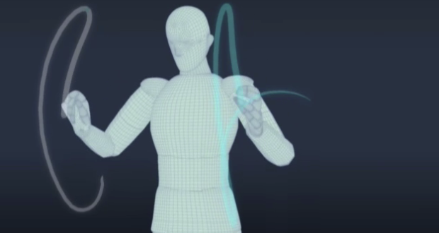
• There are a lot of ways to collect your location, whether it’s for journaling and personal reflection or for sharing with others, but it can be tricky making use of your data once it’s stored behind company servers. OpenPaths lets you collect your data via iPhone or their just released Android app.

    We inhabit a world where data are being collected about us on a massive scale. These data are being stored, analyzed and monetized primarily by corporations; there is limited agency for the people whom the data actually represent. We believe that people who generate data through their own day-to-day activities should have a right to keep a copy of that data. When people have access to their personal data in a useful format all kinds of new things become possible. We can become better consumers: for example, we can know whether a monthly rail pass makes sense for us, or which data-plan would be most economical for our smartphone usage. More importantly, when our personal data is readily accessible and under our control we can become active collaborators in the quest for solutions to important social problems in areas such as public health, genetics or urban planning.

    You can easily view your data in the OpenPaths map interface, or download your data as CSV, JSON, or KML, and do what you want. There’s also an API. Finally, if you choose to, you can contribute your data for researchers, artists, and techonlogists to create their own projects.

    I just installed the mobile app. Looking forward to what happens next.

    [OpenPaths]

  • Jonathan Corum for The New York Times examines word usage by President Barack Obama in his State of the Union addresses and the words used by Republican candidates in their debates. Many of you will be happy to know that no word clouds were harmed in the making of this graphic.

    [New York Times]

  • YouTube surpassed the one hour of video uploaded per second threshold recently. To put that rate into perspective, they launched a fun illustration-based site, One Hour Per Second. Big team effort headed by Punk & Butler, illustrations by Alex Eben Meyer, animation by Justin Young, and development by Use All Five.
    Read More

  • Nicolas Rapp and Anne Vandermey with a straightforward look at new jobs added at the top 100 companies to work for, according to Fortune.

    Fat paychecks, sweet perks, fun colleagues, and over 70,000 jobs ready to be filled — these employers offer dream workplaces. Like Google, which reclaims the top spot this year to become a three-time champion. Meet this year’s top 100, network with the winners on LinkedIn, and more.

    Number of new jobs added or lost is on the horizontal, and number of employees at the start of the year on the vertical. Bubble size represents number of job applicants.

    There were 7.6 million applicants to Starbucks last year. That’s insane.

    [Nicolas Rapp]

  • Eric Fischer has mastered the art of making use of geotagged things from social sites like Twitter and Flickr. In his most recent set, Fischer maps connectedness via geotagged tweet density (using Dijkstra’s algorithm). I just got back from Berkeley a few hours ago, so the map of East Bay travels is of most interest to me.

    The main implication, as far as I am concerned, being that because of its traditional focus on downtown commuters, BART does not do a very good job of serving the most promising corridor in Berkeley and North Oakland, which would run approximately under San Pablo, University, the UC Berkeley campus, Telegraph, a jog over to College, Broadway, 40th/Linda, Grand, and some sort of route from the Grand-Lake district crossing Park Boulevard to near 14th and Foothill. Some of this, especially at the south end, would be difficult because of topography, but it could probably be approximated. Needless to say, if this were to be constructed, it would have to be pretty much entirely in subway to avoid tearing down the neighborhoods it would intend to serve.

    There are also maps for New York and Chicago.

  • Anyone who uses a social music service like Rdio or last.fm has probably noticed an album’s sudden rise in popularity after certain events. For example, when Amy Winehouse died, her album received exponentially more plays than usual. Other times the increase in plays for a certain artist is simple, like the release of a new album. Last.fm takes a look at these patterns in 2011 through the lens of scrobbles, which is basically how last.fm users log what they’re listening to.

    Download the data here [zip file] and have a go yourself.

    [Last.fm | Thanks, @dwtkns]