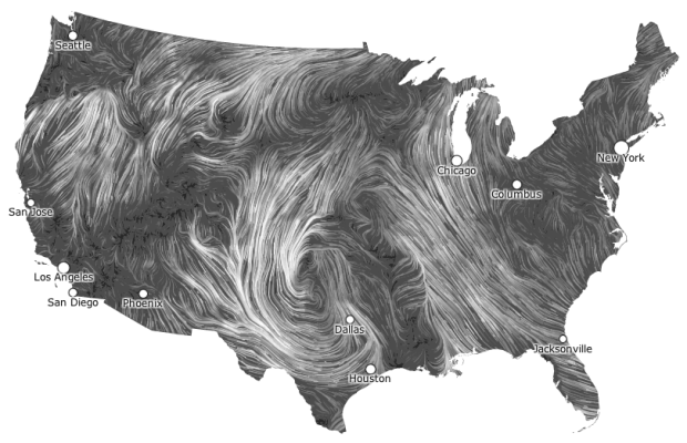
This is totally sunshine and lollipops, but it has a good flow to it, and well, I totally wanted to know more about BBC Knowledge. Too bad it’s not available in my region that is America.
[Video Link via datavisualization]
This is totally sunshine and lollipops, but it has a good flow to it, and well, I totally wanted to know more about BBC Knowledge. Too bad it’s not available in my region that is America.
[Video Link via datavisualization]
We do not provide these tables in Excel or CSV format. You will have to cut and paste from the pdf.
— A government group that provides a lot of data
If you’re going to provide a dataset to the public, or anyone for that matter, please don’t use PDF as your one and only format. At the very least, provide it in Excel. You can easily export spreadsheets to PDF. I don’t hold anything against the person who sent me this message. She was just doing her job. But organizations need to get with the times and provide data in a way that is actually usable.
In a follow-up to his ever popular McMap that showed distance to the nearest McDonald’s in the United States, Stephen Von Worley does the same for the United Kingdom and Ireland.
Read More
Not many people ride the train anymore, but a lot of inventory is still moved via freight. It turns out that 90 percent of that freight market belongs to just four companies in the country, and since deregulation in the 1980s, the number of total railroads has gone down from 50 to just 7. Nicolas Rapp, graphics director at Fortune Magazine, explains. The railroad coverage maps are interesting, too.
With Breast Cancer Awareness Month coming up in October, data visualization firm Periscopic teamed up with GE to explore the conversations about breast cancer on Twitter. Yes, believe it or not, people actually talk about other things besides Justin Bieber with the service.
Read More
Martin Dittus, a former Last.fm employee, grabbed listening data for staff, moderators, and alumni, and visualized 8.7 million scrobbles in an extended calendar format.
Read More
If you’re good with data and looking for a job, you’re in luck. There seem to be quite a few jobs out there. Here are a handful of positions that have showed up on my radar recently.
SENSEable City Lab at MIT — “The SENSEable City Laboratory is seeking exceptional candidates to fill positions involving research on the process of data visualization. Candidates should have a sound experience in the process of visualizing data both in static as well as dynamic form.”
Front-end Engineer at GeoIQ — “[Y]ou will be a key member of our growing platform engineering team building dynamic, interactive visualizations, maps and mobile applications. You will be working directly with our JavaScript and ActionScript components to create compelling interfaces that use cutting edge technology and web standards.”
Front-end Developer at Periscopic — “A passion for dealing with data, making sense of large amounts of disparate information, or statistical analysis would be lovely.”
Stamen Developer — “You’re excited by the possibility of cutting and bending data to fit it through the thin straw of the internet. You can look at a source of information and model it as resources, rows and columns, messages and queues.”
News Developer Jobs — A pretty good list started by Matt Waite that others can edit. Includes openings at the Chicago Tribune, New York Times, Boston Globe, and others.
Got a job you need to fill? Feel free to post it in the forums.
My many thanks to the FlowingData sponsors. I had to upgrade my server for the second time this year, so without these fine groups FlowingData would be a blank screen with a progress wheel most of the time. Check them out below. They help you make sense of and tell stories with data.
InstantAtlas — Enables information analysts and researchers to create highly-interactive online reporting solutions that combine statistics and map data to improve data visualization, enhance communication, and engage people in more informed decision making.
IDV Solutions Visual Fusion — Business intelligence software for building focused apps that unite data from virtually any data source in a visual, interactive context for better insight and understanding.
Tableau Software — Combines data exploration and visual analytics in an easy-to-use data analysis tool you can quickly master. It makes data analysis easy and fun. Customers are working 5 to 20 times faster using Tableau.
Column Five Media — Whether you are a startup that is just beginning to get the word out about your product, or a Fortune 500 company looking to be more social, they can help you create exciting visual content – and then ensure that people actually see it.
Want to sponsor FlowingData? Send interest to [email protected] for more details.
With Girl Scout cookie season around the corner, Wired pies it up with cookies showing percentage of sales. It’s all about the Caramel deLites. [Thanks, Elise]
This Sunday will be 10 years since the attacks on September 11. Amanda Cox and Shan Carter of The New York Times look at the financial tally, an estimated $3.3 trillion:
Al Qaeda spent roughly half a million dollars to destroy the World Trade Center and cripple the Pentagon. What has been the cost to the United States? In a survey of estimates by The New York Times, the answer is $3.3 trillion, or about $7 million for every dollar Al Qaeda spent planning and executing the attacks. While not all of the costs have been borne by the government — and some are still to come — this total equals one-fifth of the current national debt. All figures are shown in today’s dollars.
A single cube in each stack represents $1 billion. The initial view is money spent in five categories. Click on any stack for a subcategory breakdown. Sobering.
[New York Times via @shancarter]
In college, I was one of those guys who sat in the back and doodled in my notebook. Sometimes I fell asleep. One time I fell asleep and woke up in the middle of a different class. I blame the professor. Why would you turn off the lights for a two-hour session in a big lecture hall, while reading verbatim from world’s most boring powerpoint presentation?
Anyways, we all have our seating pockets that we like to settle in. Skyrill, a two-brother design team, took it upon themselves to visualize the seating habits of their graduate student classmates in class 15.514 at MIT.
Read More
Kiva, the microfinance site, lets you give small loans to people around the world to help them get their small business up and running. This animated map shows how 620,000 funded 615,000 borrowers, from the start of Kiva in 2005 up until now. Watch in full-screen for maximum effect.
Colors indicate loan type, which confused me at first, because I thought the map was saying that specific loan types were only given out during each time of year. It’s actually cycling through the loan types though, so you can see the breakdowns as the animation plays through, and then it shows all loans at once at the end of each year.
The only thing that’s missing are some counters for the amount of money passing hands. It’s been an impressive $240 million in loans around the world with a repayment rate of almost 99 percent.
[Thanks, Andy]
In celebration of Chrome’s third birthday, Google teamed up with Hyperakt and Vizzuality to explore the evolution of the Web:
Over time web technologies have evolved to give web developers the ability to create new generations of useful and immersive web experiences. Today’s web is a result of the ongoing efforts of an open web community that helps define these web technologies, like HTML5, CSS3 and WebGL and ensure that they’re supported in all web browsers.
The black timelines show major browser releases. As you click each browser icon, you can see how the browser window has changed for each release, which I think is the most interesting part of the interactive.
Color bands represent browser technologies such as JavaScript, HTML, and Flash, and the bands grow as new browsers integrate the technologies. The intertwining of bands is supposed to show the interaction between different technologies, but it gets fuzzy here. Does the vertical position of bands mean anything? Does shape mean anything, or is it more for show? I think it’s a little of both. More the latter. Fun to poke around memory lane either way.
[Thanks, Deroy]
I know most of you have checked out mentally for Labor Day weekend, so here’s some fodder to help you through the rest of the work day, as you dream of steak, burgers, and cold beer.
Thanks for a great month and have a nice long weekend.
In case you’re wondering whether you should be drinking in that local park (you know, the one with the horsey and swings) this weekend, Jen Cotton for Grubstreet New York offers this guide. [Thanks, Ben]
Slate places cartoon characters from past and present within the frame of a color wheel.
Why are the Smurfs blue? Why is Doug’s Beebe Bluff purple? Our aim is not to answer these existential questions. When asked why the Simpsons are yellow, Yeardley Smith (voice of Lisa) explained only that Matt Groening “thought that it would be really funny if, when people watched The Simpsons, they thought that maybe the color on their TV was off.”
Totally ridiculous. And that’s what makes it fun.
[Thanks, Dean]
Most of us have gone through the paces of algebra through calculus in high school. I remember lots of problems and fact sheets. Sol Garfunkel and David Mumford imagine a math education system that teaches skills for the real world and increases quantitative literacy:
Imagine replacing the sequence of algebra, geometry and calculus with a sequence of finance, data and basic engineering. In the finance course, students would learn the exponential function, use formulas in spreadsheets and study the budgets of people, companies and governments. In the data course, students would gather their own data sets and learn how, in fields as diverse as sports and medicine, larger samples give better estimates of averages. In the basic engineering course, students would learn the workings of engines, sound waves, TV signals and computers. Science and math were originally discovered together, and they are best learned together now.
Mostly because of the popularity of smartphones, location data is all the rage nowadays. You’re almost always connected no matter where you are. Rich location data can help provide you a new sense of place, and at the same time, this sort of data can paint an interesting picture of what’s going on in your country or around the world. Hence, Infochimps, the one-stop shop for data folk and developers, just announced their new Geo API.
Read More
We read the story about the suffering of an individual, and we’re moved. We read in the paper that millions have died over the years due to hunger, and we’re not quite as moved. This is due in part to our inability to imagine big numbers, but as David Ropeik for Psychology Today explains, the way we perceive risk also is a factor:
Paul Slovic, one of the pioneers of research into the way we perceive risk, calls this greater concern for the one than the many “a fundamental deficiency in our humanity.” As the world watches but, insufficiently moved, fails to act to prevent mass starvation or stop genocides in Congo or Kosovo or Cambodia or so many more, who would not agree with such a lament. But as heartless as it seems to care more about the one than the many, it makes perfect sense in terms of human psychology. You are a person, not a number. You don’t see digits in the mirror, you see a face. And you don’t see a crowd. You see an individual. So you and I relate more powerfully to the reality of a single person than to the numbing faceless nameless lifeless abstraction of numbers. “Statistics,” as Slovic put it in a paper titled “Psychic Numbing and Genocide”, “are human beings with the tears dried off.” This tendency to relate more emotionally to the reality of a single person than to two or more people, or to the abstraction of statistics, is especially powerful when it comes to the way we perceive risk and danger, because what might happen to a single real person, might happen to you. As the familiar adage puts it, “There but for the grace of God go I.”
[Psychology Today via @alexlundry]