I’ve been reading papers on how people learn statistics (and thoughts on teaching the subject) and came across the frequently-cited work of mathematical psychologists Amos Tversky and Daniel Kahneman. In 1972, they studied statistical misconceptions. It doesn’t seem much has changed. Joan Garfield (1995) summarizes in How to Learn Statistics [pdf].
Read More
-
-
-
-
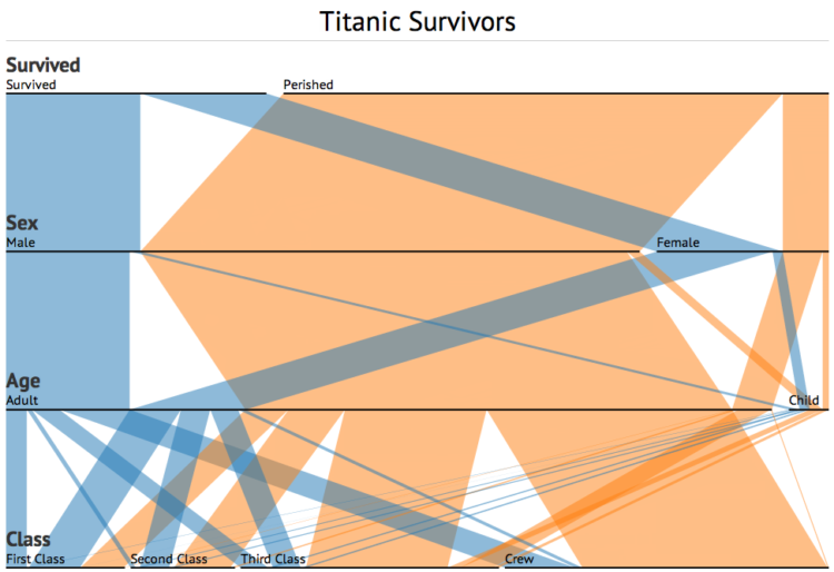
A while back, Robert Kosara and Caroline Ziemkiewicz shared their work on Parallel Sets, a way to visually explore categorical data. Software developer, Jason Davies, just ported the technique to Data-Driven Documents (D3). The interactions for sorting and rearranging are similar to the Kosara and Ziemkiewicz version, but the D3 version of course runs in the browser and has some nifty transitions. Try toggling the show curves box and the icicle plot one.
-
-
-
-
 Glaciers are big, slow-moving objects, and it might seem that not much is happening if you stare at one for a while. The Extreme Ice Survey, founded by James Balog in 2007, aims to provide the ice with a “visual voice” using time-lapse photography.
 One aspect of EIS is an extensive portfolio of single-frame photos celebrating the beauty–the art and architecture–of ice. The other aspect of EIS is time-lapse photography; currently, 27 cameras are deployed at 18 glaciers in Greenland, Iceland, the Nepalese Himalaya, Alaska and the Rocky Mountains of the U.S. These cameras record changes in the glaciers every half hour, year-round during daylight, yielding approximately 8,000 frames per camera per year. We edit the time-lapse images into stunning videos that reveal how fast climate change is transforming large regions of the planet.
Some of the videos span four years, from 2007 to 2011, and it’s amazing to see the sped-up dynamic of the ice. I like this one, which Balog refers to as the cat’s paw. It looks like a big paw of ice reaching into the ocean.
[via Boing Boing]
-
-
-
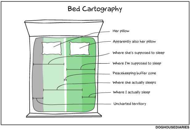
Doghouse Diaries maps bed regions. I relate to this. [Thanks, Robert]
-
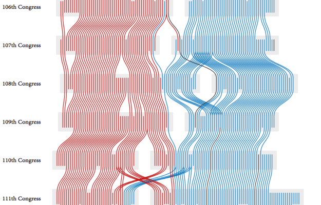
PhD student Adrien Friggeri demonstrates a new clustering algorithm with a visualization of the agreement groups within the United States Senate over time.
As you might imagine, there are two obvious groupings, Republican and Democrat. It gets interesting though when you look at Democrats classified as Republicans and vice versa. For example, the 11 Republicans placed in the Democratic group of the 110th Congress:
Most of whom are either moderates or closer to the Democrats than to their own party. Charles Hagel was critic of the Bush Administration which he described as “the lowest in capacity, in capability, in policy, in consensus — almost every area” of any presidency in the last forty years. George Voinovich has been known to oppose lowering taxes and frequently joined the Democrats on tax issues. John Warner is a moderate Republican and has centrist stances on many issues, to the point that he once faced opposition of other members of his own party when he decided to run for re-election.
Be sure to click on the gray boxes to follow the trajectories of different cohorts.
-
-
-
 What used to be a small specialty in a few newsrooms has grown some larger wings in the past couple of years. The challenge though is that a lot of journalists aren’t used to handling, let alone analyzing, a lot of data. The free and open source Data Journalism Handbook, a set of guides and case studies, hopes to help with that.
It was born at a 48 hour workshop at MozFest 2011 in London. It subsequently spilled over into an international, collaborative effort involving dozens of data journalism’s leading advocates and best practitioners – including from the Australian Broadcasting Corporation, the BBC, the Chicago Tribune, Deutsche Welle, the Guardian, the Financial Times, Helsingin Sanomat, La Nacion, the New York Times, ProPublica, the Washington Post, the Texas Tribune, Verdens Gang, Wales Online, Zeit Online and many others.
At a glance, looks like a promising resource, even if you’re not a journalist.
-
The MIT SENSEable City Lab, in partnership with BBVA, visualizes spending in Spain during Easter of 2011. The animation shows the activity of 1.4 million people and 374,220 businesses, over 4 million transactions.
The map is less interesting to me since I’m a non-Spaniard (population density?), but the categorizations and spending volume over time is fun to see. Groceries are shown in blue, gas stations in yellow, fashion in pink, and red in bars and restaurants. During the day, you see people filling up the tank, and then as evening comes, the city centers and coast lights up red.
[via @pkedrosky]
-
-
-
About three years ago, I shared 37 data-ish blogs you should know about, but a lot has changed since then. Some blogs are no longer in commission, and lots of new blogs have sprung up (and died).
Today, I went through my feed reader again, and here’s what came up. Coincidentally, 37 blogs came up again. (Update: added two I forgot, so 39 now.) I’m subscribed to a lot more than this since I don’t unsubscribe to dried up feeds. But this list is restricted to blogs that have updated in the past two months and are at least four months old.
Read More -


 Visualize This: The FlowingData Guide to Design, Visualization, and Statistics (2nd Edition)


