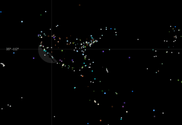
What is Missing? by Maya Lin seeks to raise awareness about the mass extinction of species. It has a beautiful interface. The world map is black on a sea of black. Your mouse acts as a sort of flashlight layered between land and water, showing you glimpses of familiar coastlines and allowing you to select dots that tell the stories of extinction.
Read More
-
-
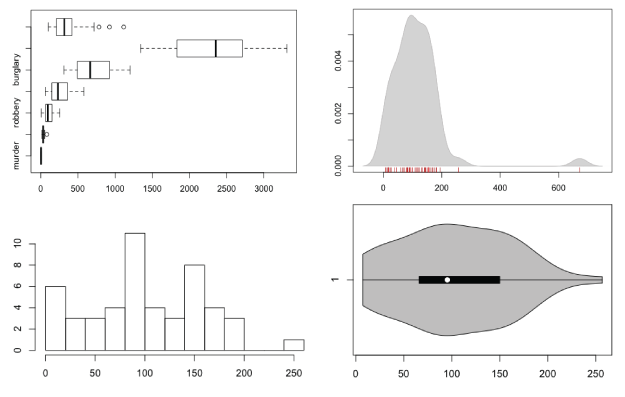
How to Visualize and Compare Distributions in R
Single data points from a large dataset can make it more relatable, but those individual numbers don’t mean much without something to compare to. That’s where distributions come in.
-
Yesterday I visited the ever popular NYU ITP bi-annual show which is a showcase of the students’ experimental and ingenious interactive work.
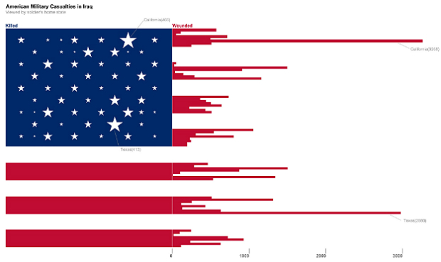
I stopped to talk to data visualization student and self-tracker, Doug Kanter, about his work. His first and smaller piece was about the war in Iraq. The image above depicts the number of wounded US soldiers by state (and territory) using the red stripes. The stars show the number of soldiers killed. I’m sure we could quibble about labels and where the bar chart starts, but to me, the tattered appearance of the flag created by data about war is very arresting.
Read More -
I’m going to be away for a couple of weeks, with little to no Internet access most of the time, so I’ve asked Kim Rees to step in while I’m gone. She’s the co-founder of Periscopic, one of my favorite information visualization firms, and she was the technical editor for Visualize This. You’re in good hands.
You can follow her at @krees.
Be good, and see you all when I get back.
She’s all yours, Kim.
-
-
-
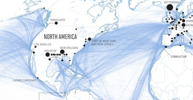
Nicolas Rapp dives into the patterns and growth of worldwide shipping in a six-page spread for Fortune Magazine.
Nearly 90% of all goods traded across borders travel, in part, by sea. Typically a ship will undertake six voyages a year. The fastest-growing routes are between ports in Asia, while goods moving out of that continent account for 43% of all maritime trade, according to IHS Global, an economic forecasting firm. Today the most heavily trafficked sea route is between China and the West Coast of the U.S. The total value of goods that travel from China to the U.S. is four times that of those on the return trip—a clear symbol of America’s trade deficit.
Despite a gap of a few centuries, the routes today still look a lot like the ones from the 18th century.
-
-
I’m pretty sure I’m not in their target audience, but my main takeaway from this video is that now, with easel.ly, you don’t need time, money, or skill to make quality infographics. And the prezi-like video seems fitting.
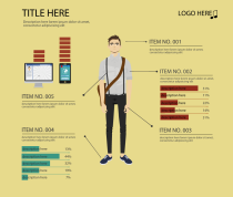 Maybe I’m just stuck in my ways, but I’m having trouble getting on board with these tools. Easel.ly, for example, provides themes, such as the one on the right. There’s a guy in the middle with graphs around him and pointers coming out of his body. You get to edit however you want.
 So in this case, you start with a complete visual and then work your way backwards to the data, which I’m not sure how you can edit other than manually changing the size of the graphs. (Working with the interface takes some patience at this stage in the application’s life.) It’s rare that good graphics are produced when you go this direction.
Instead, start with the data (or information) first and then build around that — don’t try to fit the data (or information) into a space it wasn’t meant for.
Or maybe there’s a lot more in store that we can’t see yet. Either way, right now, the application is rough at best.
-
-
Robert Groves, director of the U.S. Census Bureau, on the Appropriations Bill:
The Appropriations Bill eliminates the Economic Census, which measures the health of our economy. It terminates the American Community Survey, which produces the social and demographic information that monitors the impact of economic trends on communities throughout the country. It halts crucial development of ways to save money on the next decennial census. In the last three years the Census Bureau has reacted to budget and technological challenges by mounting aggressive operational efficiency programs to make these key statistical cornerstones of the country more cost efficient. Eliminating them halts all the progress to build 21st century statistical tools through those innovations. This bill thus devastates the nation’s statistical information about the status of the economy and the larger society.
A lot of the negative comments following the post are from people who have never used Census data, or any substantial amount of data for that matter, and have no clue how a dataset can feed into a model to make other estimates. Then there’s the people who don’t want to answer questions about their toilets. I wonder what their Facebook profiles look like.
-
-
-
Princeton history graduate student Benjamin Schmidt explores changes in language through TV anachronisms. In Schmidt’s most recent analysis, he examines Megan’s use of “callback” in the last episode of Mad Men. Above is the ratio of modern use to period use. Notice callback sticking out in the top left.
The big one from the charts: Megan gets “a callback for” an audition. This is, the data says, a candidate for the worst anachronism of the season. The word “callback” is about 100x more common by the 1990s, and “callback for” is even worse. The OED doesn’t have any examples of a theater-oriented use of “callback” until the 1970s; although I bet one could find some examples somewhere earlier in the New York theater scene, that may not save it. It wouldn’t really suite Megan’s generally dilettantish attitude towards the theater, or the office staff’s lack of knowledge of it, for them to be so au courant. “call-back” and “call back” don’t seem much more likely.
Other anachronisms include the use of “pay phone” and a frequent use of “on the phone with” which didn’t peak until the 1970s.
Don’t miss the look into Downton Abbey anachronisms. Also, more details from Schmidt on his methodology.
[via Revolutions]
-
-
Music visualization with stop motion board games. You can’t go wrong.
[via @jcukier]
-
-
-
-
Jerzy Wieczorek, a statistician with the U.S. Census Bureau, explains why the American Community Survey is worthwhile.
Besides the direct estimates from the ACS itself, the Census Bureau uses ACS data as the backbone of several other programs. For example, the Small Area Income and Poverty Estimates program provides annual data to the Department of Education for use in allocating funds to school districts, based on local counts and rates of children in poverty. Without the ACS we would be limited to using smaller surveys (and thus less accurate information about poverty in each school district) or older data (which can become outdated within a few years, such as during the recent recession). Either way, it would hurt our ability to allocate resources fairly to schoolchildren nationwide.
Similarly, the Census Bureau uses the ACS to produce other timely small-area estimates required by Congressional legislation or requested by other agencies: the number of people with health insurance, people with disabilities, minority language speakers, etc. The legislation requires a data source like the ACS not only so that it can be carried out well, but also so its progress can be monitored.


 Visualize This: The FlowingData Guide to Design, Visualization, and Statistics (2nd Edition)


