A while back, Robert Kosara and Caroline Ziemkiewicz shared their work on Parallel Sets, a way to visually explore categorical data. Software developer, Jason Davies, just ported the technique to Data-Driven Documents (D3). The interactions for sorting and rearranging are similar to the Kosara and Ziemkiewicz version, but the D3 version of course runs in the browser and has some nifty transitions. Try toggling the show curves box and the icicle plot one.
Parallel Sets for categorical data, D3 port
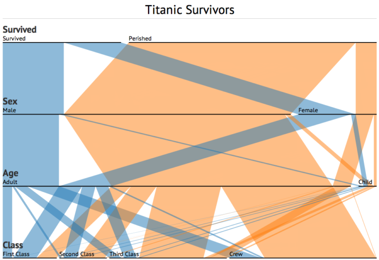
Chart Type Used

6 Comments
Second Edition
 Visualize This: The FlowingData Guide to Design, Visualization, and Statistics (2nd Edition)
 Visualize This: The FlowingData Guide to Design, Visualization, and Statistics (2nd Edition)
New tools, refined process.
Maybe it is just me, but all those intersections create noise and make it hard to understand. Also, it feels more like a flow, rather than a distribution, which is a little unnatural. I like icicle plot more (treemap – even more?): it is clearer and easier to interpret. Credits to the developer, though, great work in giving concept a try!
I am new to data visualization (mechanical engineer who sometimes has to play with a lot of data) but I have a hard time reading this and understanding what I can get from it. I don’t feel that I can learn anything quickly except that there are a lot of males who perished in the Titanic and that they were mostly from the crew or third class.
Matthieu, Thank Goodness you had the honesty to say what you thought! Parallel Sets are difficult to understand. They are an awkard & inconvenient way to present the data. Really this is reference data and should be in a simple reference table. If they had just left it in a table you’d understand it all within seconds. Data Vis is an emerging field and the quality of visualisations varies. Sadly it seems that many people interested in visualisations allow their critical faculties to fly away when confronted by incomprehensible junk.
I have previously seen parallel sets called parallel coordinate plots. I often find them quite useful, though I think the example here is not so good. For me, I guess the main difference is that I use them to visualize continuous data rather than categorical data. If I highlight a range of values in the response variable I can see how the range is connected to the inputs and very quickly visualize correlations and other relationships that numerical statistics just don’t make clear. For the categorical data presented here, though, I think a cross-tabulation would be the better option. Just because you can plot something doesn’t always mean you should….
Does displaying the data this way actually enhance my understanding? I can’t seem to figure out what is really going on. The diagram wants my eyes to flow from sex to age to class for no apparent reason, and the various criss-crossing prevents me from understanding anything.
IMHO mosaic plots are far more effective for what we are trying to do: visualizing categorical data.
see: http://www.theusrus.de/blog/parallel-sets-vs-mosaic-plots-take-i/