• Membership
  • Newsletter
  • Projects
  • Learning
  • About
  • Member Login
  • March Madness power rankings

    March 16, 2012

    Topic

    Network Visualization  /  basketball, rankings, sports

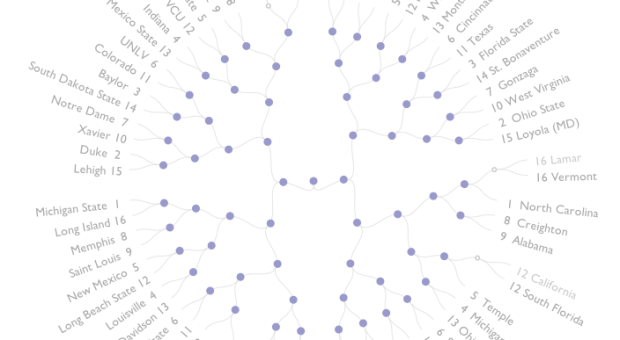
    With NCAA March Madness in full swing, the basketball graphics are out in full force. This one by Angi Chau, shows the probabilities of teams winning each game, and eventually the championship, based on simulated bracket rankings. Done with D3, each node represents a game and teams are circled on the outside. Roll over a team, and get all the probabilities for that team going to the end or roll over a game to see the probability of teams winning that game. Sorry, Colorado. You have a 0% chance of winning it all. You, too, Vermont.

    Hopefully, Chau keeps updating throughout the tournament. And maybe some color-coding to indicate probabilities would be useful here. Now excuse me while I go place some educated bets. (One million on Colorado.)

  • History told with Oreo cookies

    March 16, 2012

    Topic

    Miscellaneous  /  commercial, Oreo

    Celebrating their 100th birthday, Oreo depicts moments in history with the ever popular cookie of nostalgia and milk dunking. This one showing the first step on the moon is the best. Prohibition comes in a close second. [via]

  • New iPad battery size is huge

    March 16, 2012

    Topic

    Mistaken Data  /  iPad, scaling

    From Gizmodo, this shows battery size in the new iPad versus that of the iPad 2. The battery in the former is 70 percent bigger than that of the latter. Something’s not right here.

    [Thanks, David]

  • Calendar Heatmaps to Visualize Time Series Data

    The familiar but underused layout is a good way to look at patterns over time.

  • Comparing heritage in the Melting Pot

    March 15, 2012

    Topic

    Maps  /  demographics, interactive

    At first I thought this map, by David Yanofsky for Bloomberg, was your standard county-level choropleth map of demographics. Select a self-described heritage from the first drop down and you see where all the people are by count. That’s only kind of interesting, but you often just end up highlighting big cities.

    However, select a heritage from the second drop down menu to compare against the first and you get a relative scale. The above for example shows those of Chinese and Indian heritage. It’s a simple calculation that makes a big difference in usefulness.

  • Personal map of 2.5m GPS data points, 3.5 years in the making

    March 14, 2012

    Topic

    Self-surveillance  /  location, tracking

    Aaron Parecki, co-creator of location platform Geoloqi, has collected his location every few seconds for over three years. He put his data on a map.

    Approximately one GPS point was recorded every 2-6 seconds when I was moving, and these images represent about 2.5 million total GPS points. Collectively, they represent a data portrait of my life: everywhere I’ve been and the places I’ve been most frequently. The map is colored by year, so you can see how my footprint changes over the years, depending on where I live.

    We’ve seen projects like this a few times before (Hey, Andy, where’s your 2011 map?), but the longevity still surprises me, in a good way. (I think I’ve got this quantified self thing for the masses figured out. Don’t even bother mentioning tracking, self-improvement, or the gadgets. Just show them stuff like this and attach some sentimental value, and there you go.)

    [via infosthetics]

  • Character relationships in the Iliad

    March 14, 2012

    Topic

    Network Visualization  /  Illiad, Santiago Ortiz

    The Iliad is an epic poem by Homer with a lot of characters and story lines going on at once. I vaguely remember reading bits and pieces in high school and getting totally lost. Santiago Ortiz explores these relationships in his latest work, which draws on the connections i.e. character sentence co-occurrences.
    Read More

  • Odds of losing in roulette

    March 13, 2012

    Topic

    Statistical Visualization  /  gambling, roulette

    Jay Jacobs has some fun with roulette simulations and explores the odds of winning for different bets. Above shows a simulation of 250 spins 20,000 times. Or to put it differently, it’s like simulating the play of 20,000 people, who each took 250 spins and always bet on a single number.

    I’m not sure why it doesn’t start to get red until you’re $500 in the hole, but bottom line: the longer you play, the higher probability you will lose all your money. That was my main takeaway from Probability 101 in undergrad. The rest is a blur.

  • Generative art portrays beauty in movement

    March 12, 2012

    Topic

    Data Art  /  sports, video

    Heading towards the 2012 Olympics in London, Quayola and Memo Aktenvia translate athletic movement, which in itself is often considered beautiful, to generative animations. Collectively, the piece is called Forms, which is on exhibit at the National Media Museum.

    Forms is a digital artwork that responds to the human body in motion. It focuses exclusively on the mechanics of movement, using footage of world-class athletes to illustrate human movement at the extremes of perfection.

    Videos of athletes were processed through custom software to create evolving abstract forms that explore the relationships between the human body and its movements through time and space.

    There’s also a short Q&A with the artists on the Creators Project that’s worth a read.

    [via The Creators Project]

  • Page 289 of 392
  • <
  • 1
  • ...
  • 286
  • 287
  • 288
  • 289
  • 290
  • 291
  • ...
  • 392
  • >

Analyze, visualize, and communicate data usefully, beyond the defaults.

Become a member →

Recently for Members

May 15, 2025
Step Chart, Enhanced

May 8, 2025
When the data is not what it seems

May 1, 2025
Finding the Right Charts

April 24, 2025
Visualization Tools, Datasets, and Resources – April 2025 Roundup

April 17, 2025
Breaking Out of Chart Software Defaults

Get the Book

Visualize This: The FlowingData Guide to Design, Visualization, and Statistics

Available now.

Order: Amazon / Bookshop

Browse by Chart Type See All →

Area Chart Step Chart Baseline Chart Parallel Coordinates Spike Map Network Graph Bar Chart Difference Chart Mosaic Plot Strip Plot

Browse By Topic

  • Visualization

    Seeing data

  • Maps

    Seeing geographic data

  • Infographics

    Explaining data

  • Networks

    Connecting data

  • Statistics

    Analyzing data

  • Software

    Working with data

  • Sources

    Getting data

  • Design

    Making data readable

Made by FlowingData

  • The Process

  • Data Underload

  • Chart Everything

  • Guides

  • Books

  • Shop

  • About
  • Contact
  • Newsletter
  • LinkedIn
  • Instagram
  • Bluesky
  • RSS
Copyright © 2007-Present FlowingData. All rights reserved.