By way of Rafa Irizarry from Simply Statistics, a plot of Nate Silver’s probabilities for Barack Obama winning a state versus the percentage of vote in each state, as of midnight EST.

I guess that’s pretty (100%) good. Looks like the folks at Princeton didn’t do half bad either. It’s a win for Obama and a win for statistics. Well, good statistics, at least. (Looking at you, University of Colorado.)
Update: Drew Linzer at Emory and the Huffington Post Pollster also did well. All in all, it was a good night for statistics.
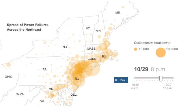
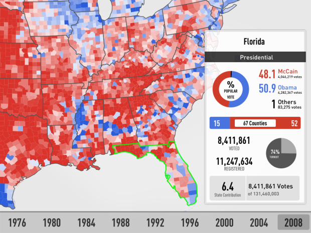
 As the results roll in tonight, you have plenty of options to keep track of who won what and where. These should cover all of your bases.
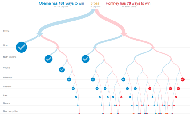

 Visualize This: The FlowingData Guide to Design, Visualization, and Statistics (2nd Edition)


