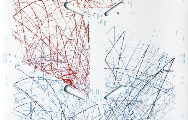
When you plan pinball, the ball bounces around creating paths for itself and the better you play, the more control you have over those paths. Recent design graduate Sam van Doorn modified a machine so that you can see those paths in his project STYN. A poster is placed underneath the flippers, and the ball gets a douse of paint on the way out, so you get a unique sketch each time you play. [via infosthetics]
-
With Google’s driverless cars now street legal in California, Florida, and Nevada, Gary Marcus for the New Yorker ponders a world where machines need a built-in morality system.
That moment will be significant not just because it will signal the end of one more human niche, but because it will signal the beginning of another: the era in which it will no longer be optional for machines to have ethical systems. Your car is speeding along a bridge at fifty miles per hour when errant school bus carrying forty innocent children crosses its path. Should your car swerve, possibly risking the life of its owner (you), in order to save the children, or keep going, putting all forty kids at risk? If the decision must be made in milliseconds, the computer will have to make the call.
Data analysis seems to be headed in the same direction. Where machines will have to start making human-like decisions, data represents more of the real world and looks less like snippets in time. As the gap between numbers and what they represent shrinks, the more we have to think about ethics, privacy, and whether or not what we’re doing is right.
-
-
-
-
Using the Google ngrams corpus, xkcd sized the days of the year based on usage volume. Lots of firsts of the month and September 11th.
-
-
-
-
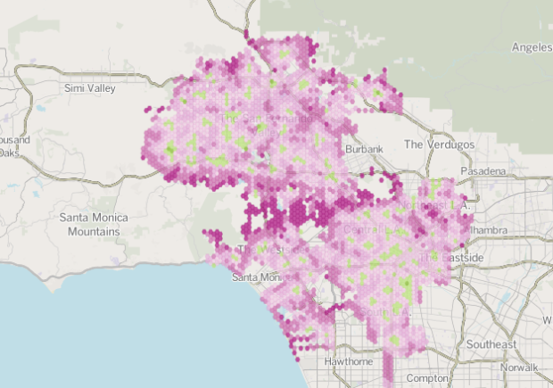
Ben Welsh, Robert Lopez, and Kate Linthicum for the Los Angeles Times analyzed more than a million runs by the Los Angeles Fire Department to estimate response times, based on where you live. The national standard is six minutes. The map shows average response times that are greater in red and those that are under in green (basically, anywhere there is a fire department).
The lead-in mentions that LAFD leaders have said that they routinely fail to meet the national standard, but if you’ve driven in Los Angeles, it’s not hard to imagine why it takes those extra minutes. I wonder how this compares to other high-traffic cities.
-
Now that we’re done giving thanks for all the intangibles like love, friends, family, and drunkenness, it’s time to turn our attention to the physical objects we don’t have yet. It’s the most wonderful time of year! Here are gift ideas for your data geek friends and family. A few of these take a while to make, so be sure to order them now so that you get them in time for Christmas.
Read More -
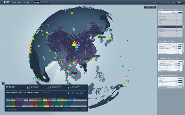
Studio NAND and Moritz Stefaner, along with Jens Franke explore FIFA development programs around the world.
The FIFA Development Globe visualises FIFA’s worldwide involvement in supporting football through educational and infrastructural projects. Using a 3D globe in combination with interconnected interface and visualization elements, the application provides multiple perspectives onto an enormous dataset of FIFA’s activities, grouped by technical support, performance activities, and development projects.
The globe itself is an icosahedron, or essentially a spherical shape made up of triangles. Triangles in each country represent programs and are colored by the three above categories, and you might recognize Moritz’ elastic lists in the sidebar to filter through programs, by country, organization, and type. There’s also a timeline view, which shows program development over the past five years.
Give it a go here. I should warn you though that it runs in Flash (a client requirement), and it could run sluggish depending on your machine. Sometimes I was disorientated by the interaction and animation, especially when I clicked and nothing happened until a few seconds later.
-
-
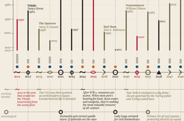
After seeing a timeline on future events as described in novels, designer Giorgia Lupi put it in visual form.
Basing on speculative fiction captions collected by Jane Hu, the visualization analyses 62 foretold future events. For each event the visualization highlights typology (are they mainly social, scientific, technological, political?), year of the prediction, genre of the book and age of the author, while dividing them into positive, neutral or negative events. In the end, good news: in 802,701 the world will exist and everything will be more or less ok.
The vertical bars represent how far in the past a future was described, icons in the middle represent type of event, and the rows underneath provide descriptions of said events.
The sheer amount of fiction makes this a fun one to look at. Although, I wish Lupi spaced events by time instead of just listing them in chronological order. I mean, it’s a giant graphic already. Might as well go all the way with the timeline framework.
-
-
-
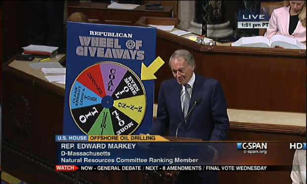
The Floor Charts tumblr shows actual charts used on the United States Congress floor. Some of the paper signs aren’t so flashy, but then there are ones like the Republican Wheel of Giveaways used by Edward Markey that leave you wishing you’d thought of it first.
Remember when Netanyahu used that bomb diagram and we thought it was ridiculous? I guess he was just following the high high standard set by governments around the world.
-
R comes with a lot of datasets, some with the core distribution and others with packages, but you’d never know which ones unless you went through all the examples found at the end of help documents. Luckily, Vincent Arel-Bundock cataloged 596 of them in an easy-to-read page, and you can quickly download them as CSV files.
Many of the datasets are dated, going back to the original distribution of R, but it’s a great resource for teaching or if you’re just looking for some data to play with.
-
-



 Visualize This: The FlowingData Guide to Design, Visualization, and Statistics (2nd Edition)


