Andrew Leonard for Salon fears what might come of the creative process if movies are based on algorithms and data and that we might turn into puppets.
For years Netflix has been analyzing what we watched last night to suggest movies or TV shows that we might like to watch tomorrow. Now it is using the same formula to prefabricate its own programming to fit what it thinks we will like. Isn’t the inevitable result of this that the creative impulse gets channeled into a pre-built canal?
Because tastes never change? We don’t have any choice but to watch what is handed to us? Will creators stop making things that go against the norm? Leonard concludes with us stuck in a trance, in front of our televisions.
The companies that figure out how to generate intelligence from that data will know more about us than we know ourselves, and will be able to craft techniques that push us toward where they want us to go, rather than where we would go by ourselves if left to our own devices. I’m guessing this will be good for Netflix’s bottom line, but at what point do we go from being happy subscribers, to mindless puppets?
Again, the assumption is that we have no say in the matter. But when a company or service suggests that we buy or watch something, we don’t have to follow.
Netflix in particular thrives by providing a service that shows us what they think we might want to watch from a selection of thousands of options. Part of that algorithm depends on our own movie ratings and preferences. If Netflix offers poor suggestions, you can leave the service. Yeah. You can stop paying 8 bucks a month.
Let’s turn it around. What if Netflix analyzed viewing data not to offer their best viewing suggestions or to make shows and movies that people like but to expand people’s viewing windows? Let’s say that the data shows that you watch a lot of “witty, critically acclaimed comedies”, so Netflix suggests you watch more “romantic dramas” to make you more well-rounded. Are you a mindless puppet if you take the suggestion, even if you end up hating the movie? Are you a mindless puppet if you ignore the suggestion and continue watching what you know you like?
From the production perspective, it makes sense to try to make something a lot of people like. From the consumer perspective, we still get to decide what we want to spend our money on.
It’s good to be concerned about how companies use personal data. Data privacy, ownership, and ethics are important issues, but it shouldn’t mean a fear of all things data.


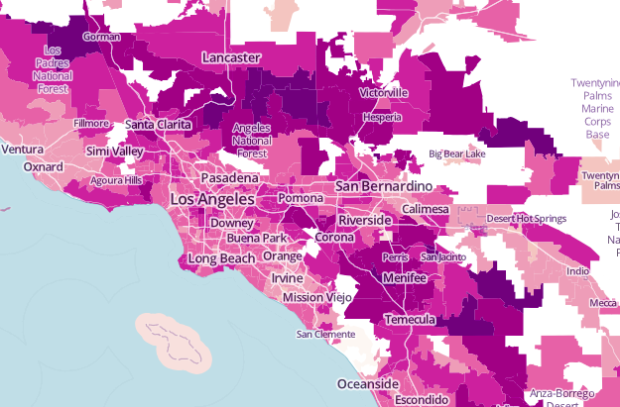
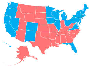 Add another way to make state-level choropleth maps.
  Visualize This: The FlowingData Guide to Design, Visualization, and Statistics (2nd Edition)


